
Component DesignQudus Opoola

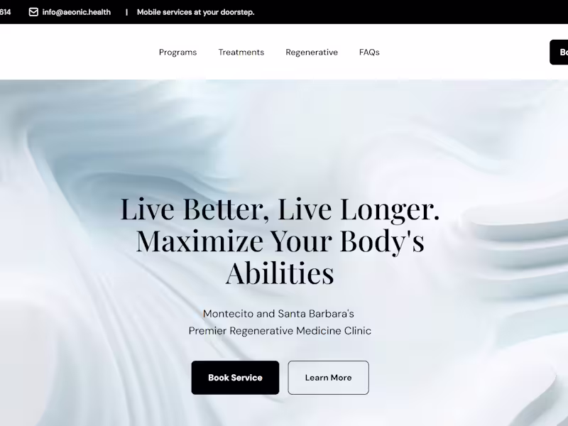
My design systems encompass reusable components, comprehensive typography and color guidelines, cohesive iconography, intuitive interaction patterns, and thorough documentation. With a strong emphasis on accessibility and usability, I create systems that not only elevate the user experience but also ensure seamless alignment with your brand identity and business objectives.
What's included
Typography and Color Guidelines
A well-defined typographic hierarchy paired with a carefully selected color palette, supported by clear usage rules to ensure brand consistency, visual harmony, and accessibility across all platforms.
Iconography Set
A unified collection of standardized icons, thoughtfully designed to align with your app’s visual identity and functional requirements.
Design Tokens
A structured set of design tokens—including spacing, shadows, border radii, and more—created to simplify development and maintain consistency between design and code.
Component Library
A comprehensive library of reusable, fully customizable UI components such as buttons, input fields, and modals, crafted to promote scalability, coherence, and efficiency throughout the application.
Documentation and Usage Guidelines
Detailed documentation outlining component usage, design principles, and best practices to guide both designers and developers in applying the system effectively and consistently.
Qudus's other services
Starting at$1,500
Duration4 weeks
Tags
Figma
Design Systems Specialist
Product Designer
UI Designer
Service provided by
Qudus Opoola Ilorin, Nigeria
- 11
- Followers
Component DesignQudus Opoola
Starting at$1,500
Duration4 weeks
Tags
Figma
Design Systems Specialist
Product Designer
UI Designer
My design systems encompass reusable components, comprehensive typography and color guidelines, cohesive iconography, intuitive interaction patterns, and thorough documentation. With a strong emphasis on accessibility and usability, I create systems that not only elevate the user experience but also ensure seamless alignment with your brand identity and business objectives.
What's included
Typography and Color Guidelines
A well-defined typographic hierarchy paired with a carefully selected color palette, supported by clear usage rules to ensure brand consistency, visual harmony, and accessibility across all platforms.
Iconography Set
A unified collection of standardized icons, thoughtfully designed to align with your app’s visual identity and functional requirements.
Design Tokens
A structured set of design tokens—including spacing, shadows, border radii, and more—created to simplify development and maintain consistency between design and code.
Component Library
A comprehensive library of reusable, fully customizable UI components such as buttons, input fields, and modals, crafted to promote scalability, coherence, and efficiency throughout the application.
Documentation and Usage Guidelines
Detailed documentation outlining component usage, design principles, and best practices to guide both designers and developers in applying the system effectively and consistently.
Qudus's other services
$1,500