
Component DesignRacheal James
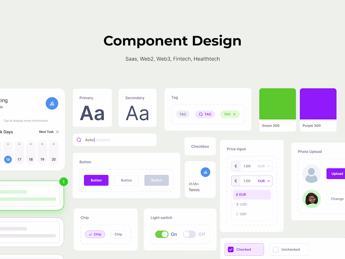
My design systems include reusable components, typography and color guidelines, iconography, interaction patterns, and detailed documentation. With a focus on accessibility and usability, I deliver systems that enhance the user experience while aligning with your brand and business goals.
What's included
Typography and Color Guidelines
A detailed typographic hierarchy and a curated color palette with usage guidelines to ensure brand consistency and accessibility.
Iconography Set
A cohesive set of standardised icons tailored to your app’s style and functional needs.
Design Tokens
A collection of design tokens (spacing, shadows, border radius, etc.) to streamline development and maintain uniformity across design and code.
Component Library
A library of reusable, fully customizable UI components (buttons, input fields, modals, etc.) designed for consistency and scalability across the app.
Documentation and Usage Guidelines
Comprehensive documentation explaining how to use the design system components, style rules, and best practices for developers and designers.
Racheal's other services
Starting at$1,600
Duration4 weeks
Tags
Figma
Design Systems Specialist
Product Designer
UI Designer
Service provided by
Racheal James proLagos, Nigeria
- $25k+
- Earned
- 9
- Paid projects
- 4.96
- Rating
- 469
- Followers
Component DesignRacheal James
Starting at$1,600
Duration4 weeks
Tags
Figma
Design Systems Specialist
Product Designer
UI Designer
My design systems include reusable components, typography and color guidelines, iconography, interaction patterns, and detailed documentation. With a focus on accessibility and usability, I deliver systems that enhance the user experience while aligning with your brand and business goals.
What's included
Typography and Color Guidelines
A detailed typographic hierarchy and a curated color palette with usage guidelines to ensure brand consistency and accessibility.
Iconography Set
A cohesive set of standardised icons tailored to your app’s style and functional needs.
Design Tokens
A collection of design tokens (spacing, shadows, border radius, etc.) to streamline development and maintain uniformity across design and code.
Component Library
A library of reusable, fully customizable UI components (buttons, input fields, modals, etc.) designed for consistency and scalability across the app.
Documentation and Usage Guidelines
Comprehensive documentation explaining how to use the design system components, style rules, and best practices for developers and designers.
Racheal's other services
$1,600