
Brand Identity & UI/UX DesignDESH Group
Most brands don't have a logo problem. They have a systems problem: the typography, color logic, and visual rules that should govern every surface were never actually built, so every new page or deck drifts a little further from the last one.
This engagement builds that system.
What's included
A logo or wordmark, including the lockups your team will actually use.
A typography system: pairings, size scale, hierarchy rules.
A color system: primary, secondary, and neutrals, with accessibility checked in.
A graphic system: shapes, patterns, and treatments that make the brand recognizable beyond the logo alone.
The system tested on real surfaces, a homepage hero, a few social posts, a deck slide, not shown in isolation.
A working brand kit in Figma: exports, tokens, do's and don'ts, organized so a developer or the next designer can pick it up and run.
Best for teams whose brand has stopped matching where the business is heading, whether that's a relaunch, a fundraise, or a move into a more competitive market.
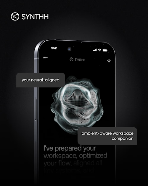
Example work


Contact for pricing
Duration1 week
Tags
Adobe Illustrator

Figma

Brand Designer
Logo Designer
Product Designer
UI Designer
UX Designer
Visual Artist
Web Designer
Service provided by
DESH Group Lviv, 79000
- 118
- Followers
Brand Identity & UI/UX DesignDESH Group
Contact for pricing
Duration1 week
Tags
Adobe Illustrator
Figma
Brand Designer
Logo Designer
Product Designer
UI Designer
UX Designer
Visual Artist
Web Designer
Most brands don't have a logo problem. They have a systems problem: the typography, color logic, and visual rules that should govern every surface were never actually built, so every new page or deck drifts a little further from the last one.
This engagement builds that system.
What's included
A logo or wordmark, including the lockups your team will actually use.
A typography system: pairings, size scale, hierarchy rules.
A color system: primary, secondary, and neutrals, with accessibility checked in.
A graphic system: shapes, patterns, and treatments that make the brand recognizable beyond the logo alone.
The system tested on real surfaces, a homepage hero, a few social posts, a deck slide, not shown in isolation.
A working brand kit in Figma: exports, tokens, do's and don'ts, organized so a developer or the next designer can pick it up and run.
Best for teams whose brand has stopped matching where the business is heading, whether that's a relaunch, a fundraise, or a move into a more competitive market.
Example work
Contact for pricing