
Design System | UI KitChristiano Benicio
What's a design system?
A design system is a set of standardized guidelines, components, and tools that help organizations create consistent, user-friendly digital products and experiences. It includes elements such as typography, color palettes, iconography, and UI components, along with rules for their usage.
Why it's important to have one for your company?
It promotes consistency and efficiency across products, ensures a unified brand experience for users, and facilitates collaboration among design and development teams. It saves time and resources by reducing the need for rework, and helps ensure that products are accessible, usable, and meet industry standards.
If you want to understand the ROI of design systems, try the Knapsack DS ROI calculator: https://www.knapsack.cloud/calculator
What's not included?
Implementation (Development)
QA after Development
What's included
Design Audit
Review of all visual design elements used by the brand or company. The goal here is to ensure that brand image, experience, and communication are consistent and uniform across all channels and outlets.
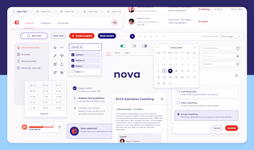
UI Kit & Documentation
- Design Foundations (type hierarchy, color palettes, grids, spacings, etc)
- Components
- Guidelines
- Patterns
Style Guide
A concise document that will encapsulate all the visual foundations of your product (typography, colors, brand applications, grids, imagery, etc) to be distributed across your collaborators.
Design Tokens (optional)
- Structuring and naming convention
- Complete list of global and alias tokens.
Design tokens are named entities that store visual design attributes in an agnostic, human-readable abstraction of visual styles that sync with all the style files in the system. This allows you to create a scalable and consistent visual system for UI development.
Example work
Christiano's other services


Contact for pricing
Tags
Figma
UX Designer
Visual Designer
Service provided by
Christiano Benicio Rio de Janeiro, Brazil
Design System | UI KitChristiano Benicio
What's a design system?
A design system is a set of standardized guidelines, components, and tools that help organizations create consistent, user-friendly digital products and experiences. It includes elements such as typography, color palettes, iconography, and UI components, along with rules for their usage.
Why it's important to have one for your company?
It promotes consistency and efficiency across products, ensures a unified brand experience for users, and facilitates collaboration among design and development teams. It saves time and resources by reducing the need for rework, and helps ensure that products are accessible, usable, and meet industry standards.
If you want to understand the ROI of design systems, try the Knapsack DS ROI calculator: https://www.knapsack.cloud/calculator
What's not included?
Implementation (Development)
QA after Development
What's included
Design Audit
Review of all visual design elements used by the brand or company. The goal here is to ensure that brand image, experience, and communication are consistent and uniform across all channels and outlets.
UI Kit & Documentation
- Design Foundations (type hierarchy, color palettes, grids, spacings, etc)
- Components
- Guidelines
- Patterns
Style Guide
A concise document that will encapsulate all the visual foundations of your product (typography, colors, brand applications, grids, imagery, etc) to be distributed across your collaborators.
Design Tokens (optional)
- Structuring and naming convention
- Complete list of global and alias tokens.
Design tokens are named entities that store visual design attributes in an agnostic, human-readable abstraction of visual styles that sync with all the style files in the system. This allows you to create a scalable and consistent visual system for UI development.
Example work
Christiano's other services
Contact for pricing