
Geospatial Data Visualization ServicesRichard Donohue
I design high-impact data visualizations that blend analytical rigor with intuitive storytelling — from dynamic web maps to interactive dashboards. With a PhD in Geography and deep expertise in Python, D3.js, and MapLibre, I turn messy spatial data into meaningful visual insight. Clients trust me to deliver custom, human-centered visual tools that clarify complexity and spark action.
What's included
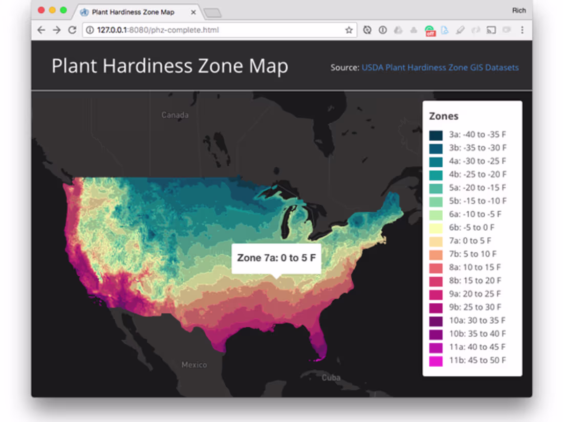
Interactive Web Map
A fully responsive web-based interactive map built with MapLibre or Leaflet, styled to match your brand and optimized for performance. Includes popups, legends, and zoom/pan controls
Data-Driven Story Map
A scrollable, visually engaging story map that combines maps, charts, and narrative text using tools like Observable or custom D3.js. Great for reports, advocacy, or funding proposals.
Custom Vector Tile Set
A set of optimized vector tiles generated using Tippecanoe, suitable for fast web deployment. Delivered with styling schema and documentation for use in MapLibre GL JS.
Analytical Dashboard
A lightweight, interactive dashboard for exploring spatial or health-related datasets. Includes filters, charts (via Plotly/Matplotlib), and exportable views.
Styled Static Map for Print or PDF
High-resolution static map suitable for inclusion in a report, website, or printed material. Delivered in multiple formats (PDF, PNG, SVG) with professional layout and legend design.
Starting at$950
Duration1 week
Tags
D3.js
Matplotlib
Tableau
TensorFlow
three.js
Data Analyst
Data Scientist
Data Visualizer
Service provided by
Richard Donohue Durango, USA
- 1
- Followers
Geospatial Data Visualization ServicesRichard Donohue
Starting at$950
Duration1 week
Tags
D3.js
Matplotlib
Tableau
TensorFlow
three.js
Data Analyst
Data Scientist
Data Visualizer
I design high-impact data visualizations that blend analytical rigor with intuitive storytelling — from dynamic web maps to interactive dashboards. With a PhD in Geography and deep expertise in Python, D3.js, and MapLibre, I turn messy spatial data into meaningful visual insight. Clients trust me to deliver custom, human-centered visual tools that clarify complexity and spark action.
What's included
Interactive Web Map
A fully responsive web-based interactive map built with MapLibre or Leaflet, styled to match your brand and optimized for performance. Includes popups, legends, and zoom/pan controls
Data-Driven Story Map
A scrollable, visually engaging story map that combines maps, charts, and narrative text using tools like Observable or custom D3.js. Great for reports, advocacy, or funding proposals.
Custom Vector Tile Set
A set of optimized vector tiles generated using Tippecanoe, suitable for fast web deployment. Delivered with styling schema and documentation for use in MapLibre GL JS.
Analytical Dashboard
A lightweight, interactive dashboard for exploring spatial or health-related datasets. Includes filters, charts (via Plotly/Matplotlib), and exportable views.
Styled Static Map for Print or PDF
High-resolution static map suitable for inclusion in a report, website, or printed material. Delivered in multiple formats (PDF, PNG, SVG) with professional layout and legend design.
$950