
Design SystemRaktim Chatterjee
I offer customized design systems that ensure consistency, scalability, and efficiency across your product’s design and development processes. From a component library in Figma to a full set of design tokens, typography, color systems, and documentation, I provide everything needed to streamline collaboration between designers and developers. What sets me apart is my focus on creating systems that are not only functional and flexible but also tailored to your unique product needs, enabling seamless integration and long-term scalability.
What's included
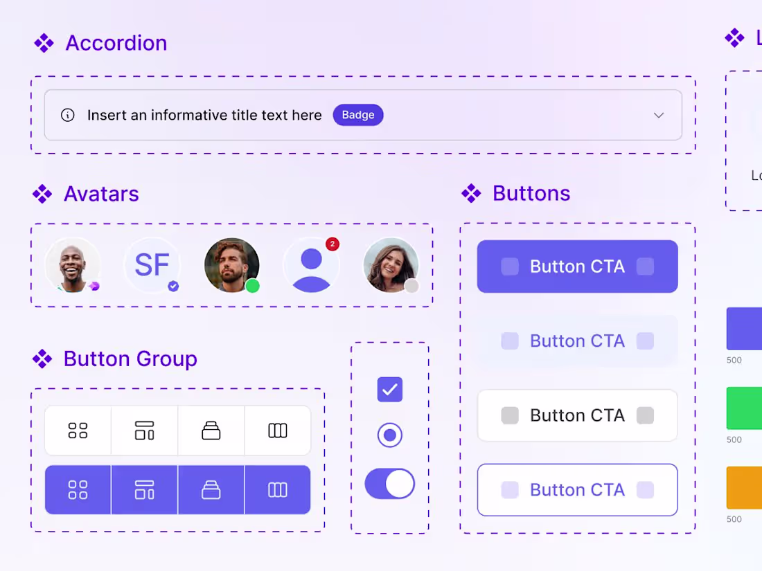
Component Library in Figma
A curated library of reusable UI components tailored to your product’s specific needs, designed to ensure consistency and scalability across your product’s interface.
Typography System
A well-defined typography system including scalable font sizes, styles, and usage guidelines for all text elements like headings, body text, captions, and more, ensuring visual harmony throughout your product.
Color System
A comprehensive and accessible color palette with clear guidelines for primary, secondary, and tertiary colors, as well as usage for different UI components and states, to create a cohesive and visually appealing design.
Design Tokens / Variables
A collection of design tokens—variables for colors, typography, spacing, and other key elements—allowing for consistent and flexible styling across all design components.
Documentation and Usage Guide
A thorough guide that explains how to use the design system effectively, including best practices, examples, and instructions for incorporating it into your workflow.
Interaction Patterns
Documentation of interaction guidelines for each component, ensuring a seamless and consistent user experience through well-defined behavior and interaction rules.
Design Patterns
A set of common design patterns, including layout examples and essential screens (e.g., login, signup), that help standardize your product’s design and improve usability.


Starting at$3,999
Duration2 weeks
Tags
Figma
UI Designer
UX Designer
UX Engineer
Service provided by
Raktim Chatterjee Bengaluru, India
- 1
- Paid projects
- 1
- Followers
Design SystemRaktim Chatterjee
I offer customized design systems that ensure consistency, scalability, and efficiency across your product’s design and development processes. From a component library in Figma to a full set of design tokens, typography, color systems, and documentation, I provide everything needed to streamline collaboration between designers and developers. What sets me apart is my focus on creating systems that are not only functional and flexible but also tailored to your unique product needs, enabling seamless integration and long-term scalability.
What's included
Component Library in Figma
A curated library of reusable UI components tailored to your product’s specific needs, designed to ensure consistency and scalability across your product’s interface.
Typography System
A well-defined typography system including scalable font sizes, styles, and usage guidelines for all text elements like headings, body text, captions, and more, ensuring visual harmony throughout your product.
Color System
A comprehensive and accessible color palette with clear guidelines for primary, secondary, and tertiary colors, as well as usage for different UI components and states, to create a cohesive and visually appealing design.
Design Tokens / Variables
A collection of design tokens—variables for colors, typography, spacing, and other key elements—allowing for consistent and flexible styling across all design components.
Documentation and Usage Guide
A thorough guide that explains how to use the design system effectively, including best practices, examples, and instructions for incorporating it into your workflow.
Interaction Patterns
Documentation of interaction guidelines for each component, ensuring a seamless and consistent user experience through well-defined behavior and interaction rules.
Design Patterns
A set of common design patterns, including layout examples and essential screens (e.g., login, signup), that help standardize your product’s design and improve usability.
$3,999