
Website designJulien Fischer
User-friendly, and high-performing digital experiences that reflect your brand and drive results. It combines aesthetics, functionality, and seamless navigation to engage your audience and achieve your business goals.
• 🎨 Visually Stunning: Clean, modern design tailored to your brand.
• ⚙️ User-Centric: Intuitive navigation for seamless browsing.
• 🚀 Optimized for Performance: Fast, responsive, and accessible across devices.
• 📈 Goal-Driven: Designed to convert visitors into customers.
What's included
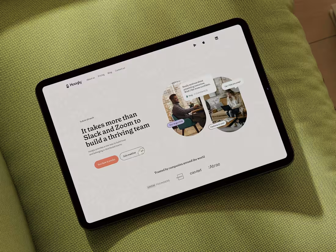
Website
User-friendly, and high-performing digital experiences that reflect your brand and drive results. It combines aesthetics, functionality, and seamless navigation to engage your audience and achieve your business goals.
Responsive
Responsive design ensures your website or app looks and works flawlessly on any screen, whether it’s a phone, tablet, or desktop. It adapts layout, content, and functionality to provide a seamless user experience everywhere.
📱 Adaptive Layouts: Content that fits any screen size perfectly.
⚡ Fast & Smooth: Optimized for performance across devices.
🎨 Consistent Look: Brand integrity maintained on all platforms.
🛠️ User-Friendly: Easy navigation, no matter the device.
Julien's other services
Starting at$15,000
Duration6 weeks
Tags
Figma
Webflow
Frontend Engineer
UX Designer
Web Developer
Service provided by
Julien Fischer Sydney NSW 2000, Australia
- 4
- Followers
Website designJulien Fischer
Starting at$15,000
Duration6 weeks
Tags
Figma
Webflow
Frontend Engineer
UX Designer
Web Developer
User-friendly, and high-performing digital experiences that reflect your brand and drive results. It combines aesthetics, functionality, and seamless navigation to engage your audience and achieve your business goals.
• 🎨 Visually Stunning: Clean, modern design tailored to your brand.
• ⚙️ User-Centric: Intuitive navigation for seamless browsing.
• 🚀 Optimized for Performance: Fast, responsive, and accessible across devices.
• 📈 Goal-Driven: Designed to convert visitors into customers.
What's included
Website
User-friendly, and high-performing digital experiences that reflect your brand and drive results. It combines aesthetics, functionality, and seamless navigation to engage your audience and achieve your business goals.
Responsive
Responsive design ensures your website or app looks and works flawlessly on any screen, whether it’s a phone, tablet, or desktop. It adapts layout, content, and functionality to provide a seamless user experience everywhere.
📱 Adaptive Layouts: Content that fits any screen size perfectly.
⚡ Fast & Smooth: Optimized for performance across devices.
🎨 Consistent Look: Brand integrity maintained on all platforms.
🛠️ User-Friendly: Easy navigation, no matter the device.
Julien's other services
$15,000