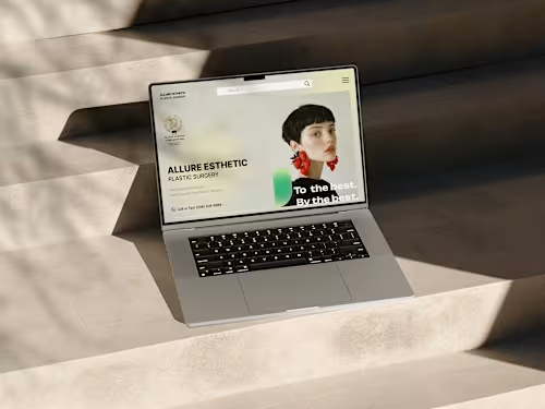
Modern & Responsive Website Design | Figma UI/UX for conversions

Starting at

$

499

About this service

Summary

1. User-Centered & Conversion-Focused Design
I design with the end user in mind, ensuring a seamless, engaging experience that boosts conversions, user retention, and brand trust.
2. Custom & Unique Designs – No Templates
Every design is created from scratch in Figma, tailored to match your brand’s personality, audience, and business goals—no generic templates!
3. Responsive & Adaptive Layouts
I ensure your website looks flawless on desktop, tablet, and mobile, optimizing for accessibility and usability across all devices.
4. Research-Driven Approach
I conduct competitor analysis, industry research, and usability testing to create a UI that stands out and aligns with market trends.
5. Pixel-Perfect & Developer-Friendly Files
Organized Figma files with auto-layout, grids, and design specs, making the development handoff smooth and efficient.
6. Interactive Prototyping for a Realistic Preview
I provide clickable prototypes to showcase the user flow and interactions, helping you visualize the final product before development.
7. Strong Visual Identity & Branding
My designs ensure consistent typography, color schemes, and UI elements, creating a professional and cohesive brand presence.
8. Faster Turnaround with Quality Execution
I work efficiently to deliver high-quality designs on time, ensuring quick revisions and smooth communication.
9. Scalable Design Systems & UI Kits
I provide design systems, reusable components, and style guides so your website remains easy to maintain and scale in the future.
10. Collaboration & Transparent Process
I involve you in every step, from wireframing to final delivery, ensuring your vision is brought to life with creativity and strategy.

What's included

  • A unique, modern, and user-friendly website UI tailored to your brand and target audience.

    Fully Layered Figma File – Organized and well-structured Figma file with named layers for easy handoff to developers. Responsive Design (Desktop, Tablet & Mobile) – Adaptive layouts optimized for different screen sizes to ensure a seamless user experience. High-Fidelity UI Mockups – Visually polished designs that showcase the final look of the website before development. Interactive Prototyping – Clickable prototypes in Figma to demonstrate navigation, user interactions, and overall experience. Custom Icons & Illustrations (If Needed) – Unique visuals that enhance the UI and align with the brand identity. Typography & Color Palette Guide – A carefully selected font pairing and color scheme for brand consistency. Style Guide & Design System – A structured UI kit with components, buttons, forms, and other reusable elements for scalability. Developer Handoff Ready – Well-documented design specs with auto-layout, spacing, and assets prepared for smooth development. Revisions – 5 Iterations based on feedback to fine-tune the design for perfection.


Duration

2 weeks

Skills and tools

User Researcher

UX Designer

UI Designer

Adobe XD

Adobe XD

Figma

Figma

Procreate

Procreate

Squarespace

Squarespace

Wix Studio

Wix Studio

Industries

Design
Design
Design