
UI / UX DesignI Putu Wisnu Ardana
What It Is
End-to-end interface design for web applications, SaaS products, dashboards, and mobile apps. This service is for product teams and founders who need a designer who can think strategically about user experience and execute at a high visual standard - not just make things look good, but make them work well.
What's Included
Every engagement begins with a Discovery & Research Phase: stakeholder interviews, competitive analysis, and (where applicable) user interviews or survey synthesis. The output is a clear problem statement, user personas, and a prioritised list of design requirements.
The Information Architecture Phase produces user flows, site maps, and low-fidelity wireframes that establish the structure and logic of the product before visual design begins. This phase is reviewed and approved before moving forward, preventing expensive rework later.
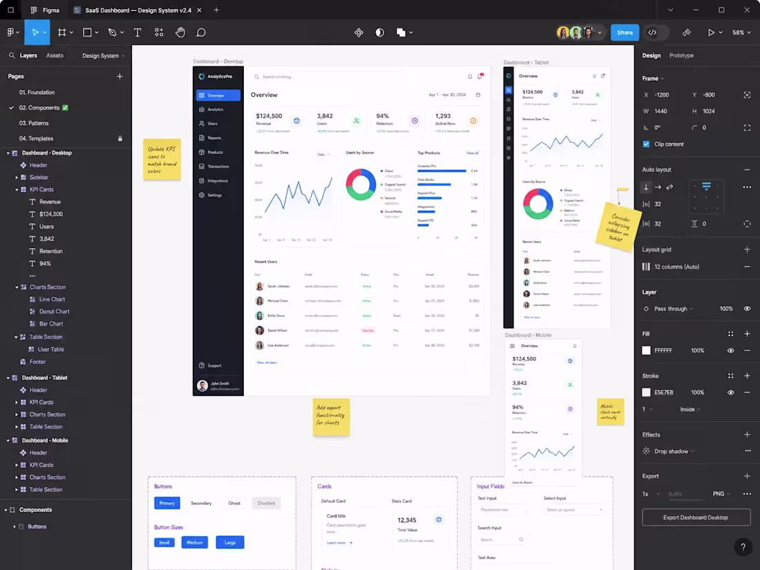
The Visual Design Phase translates the approved wireframes into high-fidelity Figma screens. A design system is built in parallel - colour tokens, typography scale, spacing system, and a component library - so the product can grow consistently after handoff. Interactive prototypes are created for key user journeys (onboarding, core task, error states) and used in usability testing sessions.
The Developer Handoff includes annotated Figma files with spacing, colour, and interaction specifications, an exported asset library, and a short walkthrough session with the engineering team to answer implementation questions.
What's Not Included
•Front-end development (available as a separate engagement)
•User recruitment for research sessions (the client provides access to their users)
•Ongoing design support after handoff (available as a monthly retainer)
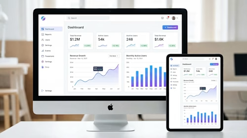
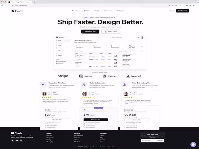
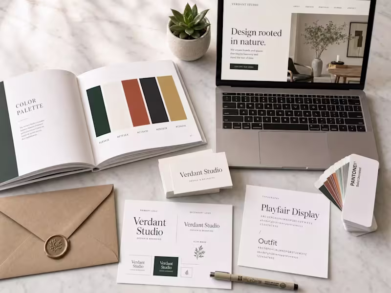
Example work
I Putu's other services
Starting at$1,200
Duration1 week
Tags
UI Designer
UX Designer
Service provided by
I Putu Wisnu Ardana South Sulawesi, Indonesia
- 2
- Followers
UI / UX DesignI Putu Wisnu Ardana
Starting at$1,200
Duration1 week
Tags
UI Designer
UX Designer
What It Is
End-to-end interface design for web applications, SaaS products, dashboards, and mobile apps. This service is for product teams and founders who need a designer who can think strategically about user experience and execute at a high visual standard - not just make things look good, but make them work well.
What's Included
Every engagement begins with a Discovery & Research Phase: stakeholder interviews, competitive analysis, and (where applicable) user interviews or survey synthesis. The output is a clear problem statement, user personas, and a prioritised list of design requirements.
The Information Architecture Phase produces user flows, site maps, and low-fidelity wireframes that establish the structure and logic of the product before visual design begins. This phase is reviewed and approved before moving forward, preventing expensive rework later.
The Visual Design Phase translates the approved wireframes into high-fidelity Figma screens. A design system is built in parallel - colour tokens, typography scale, spacing system, and a component library - so the product can grow consistently after handoff. Interactive prototypes are created for key user journeys (onboarding, core task, error states) and used in usability testing sessions.
The Developer Handoff includes annotated Figma files with spacing, colour, and interaction specifications, an exported asset library, and a short walkthrough session with the engineering team to answer implementation questions.
What's Not Included
•Front-end development (available as a separate engagement)
•User recruitment for research sessions (the client provides access to their users)
•Ongoing design support after handoff (available as a monthly retainer)
Example work
I Putu's other services
$1,200