
Mobile App UI UX DesignTouQeer Hussain
I am an experienced UI/UX designer and my expertise lies in creating user-friendly interfaces for complex technical products. I keep myself updated with the latest technology trends and devices to ensure my designs are cutting-edge. My specialization is in designing modern App UIs. My design process involves thorough research, user flow analysis, and wireframing to lay a strong foundation. I excel in User Interface design and can bring concepts to life, starting from high-fidelity prototypes to the final product.
What's included
In this service, I will provide deliverables.
As a UI/UX designer, my mobile app project deliverables help communicate design vision and ensure smooth development. Common deliverables include.
User Flows:
Illustrative diagrams of user journeys within the app help identify pain points for clients.
Wireframes:
Low-fidelity sketches or digital models of an app's layout and structure. They provide an outline of the placement of key elements without emphasizing visual details.
Design System:
The design system serves as a centralized resource for all design-related components and guidelines. This includes:
Components Library: A collection of reusable UI elements such as buttons, forms, cards, etc., with variations and states.
Typography Guidelines: Specify font choices, sizes, and styles for various content elements.
Color Palette: Present a defined color scheme with usage guidelines, ensuring consistency across the app.
Iconography: Include guidelines for icon usage and provide a library of custom icons.
Spacing and Layout: Define spacing rules and layout principles to maintain visual harmony.
A well-structured design system not only enhances design consistency but also facilitates collaboration between designers and developers, streamlining the development process. It becomes a valuable resource for maintaining a cohesive user experience as the app evolves.
Visual Design:
High-fidelity visual representations of the app showcase its final look and feel, including detailed UI elements, color schemes, typography, and imagery.
Prototypes:
Interactive prototypes enable clients to experience the app's flow and functionality. They help visualize user interactions and test usability.
Feedback and Revisions:
A feedback collection process with revision plan based on input.
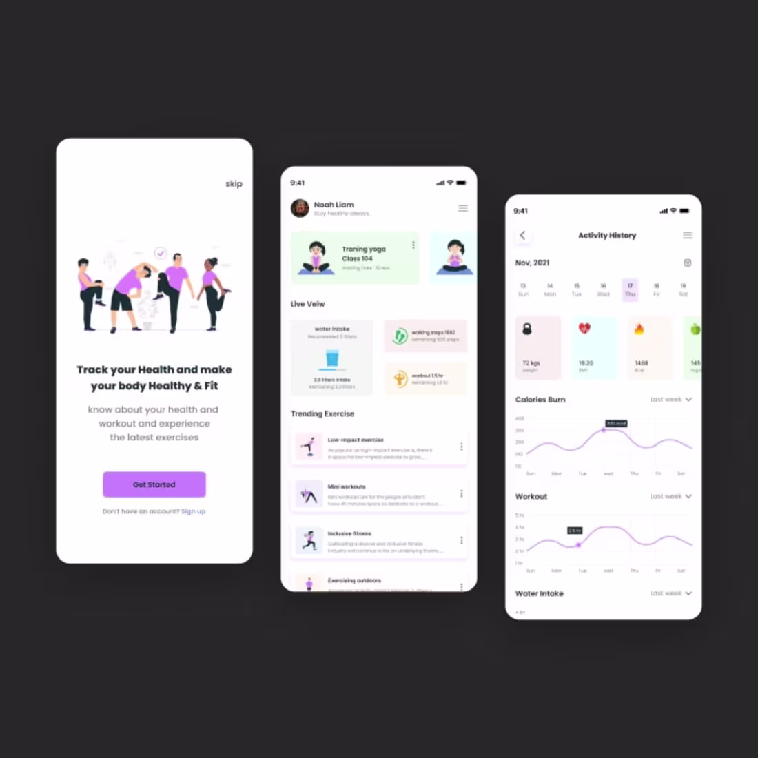
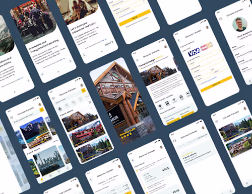
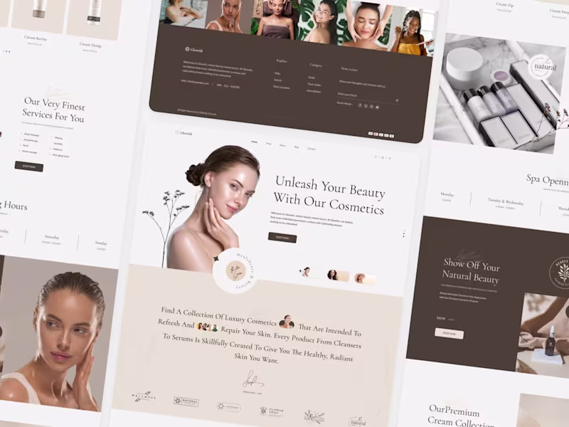
Example work
TouQeer's other services
Contact for pricing
Tags
Adobe Illustrator
Adobe Photoshop
Figma
Notion
Mobile Designer
Product Designer
UI Designer
Service provided by
TouQeer Hussain Pakistan
Mobile App UI UX DesignTouQeer Hussain
Contact for pricing
Tags
Adobe Illustrator
Adobe Photoshop
Figma
Notion
Mobile Designer
Product Designer
UI Designer
I am an experienced UI/UX designer and my expertise lies in creating user-friendly interfaces for complex technical products. I keep myself updated with the latest technology trends and devices to ensure my designs are cutting-edge. My specialization is in designing modern App UIs. My design process involves thorough research, user flow analysis, and wireframing to lay a strong foundation. I excel in User Interface design and can bring concepts to life, starting from high-fidelity prototypes to the final product.
What's included
In this service, I will provide deliverables.
As a UI/UX designer, my mobile app project deliverables help communicate design vision and ensure smooth development. Common deliverables include.
User Flows:
Illustrative diagrams of user journeys within the app help identify pain points for clients.
Wireframes:
Low-fidelity sketches or digital models of an app's layout and structure. They provide an outline of the placement of key elements without emphasizing visual details.
Design System:
The design system serves as a centralized resource for all design-related components and guidelines. This includes:
Components Library: A collection of reusable UI elements such as buttons, forms, cards, etc., with variations and states.
Typography Guidelines: Specify font choices, sizes, and styles for various content elements.
Color Palette: Present a defined color scheme with usage guidelines, ensuring consistency across the app.
Iconography: Include guidelines for icon usage and provide a library of custom icons.
Spacing and Layout: Define spacing rules and layout principles to maintain visual harmony.
A well-structured design system not only enhances design consistency but also facilitates collaboration between designers and developers, streamlining the development process. It becomes a valuable resource for maintaining a cohesive user experience as the app evolves.
Visual Design:
High-fidelity visual representations of the app showcase its final look and feel, including detailed UI elements, color schemes, typography, and imagery.
Prototypes:
Interactive prototypes enable clients to experience the app's flow and functionality. They help visualize user interactions and test usability.
Feedback and Revisions:
A feedback collection process with revision plan based on input.
Example work
TouQeer's other services
Contact for pricing