
Conversion First Responsive DesignStephanie Spencer
I design modern, responsive websites that balance creativity with usability—helping small businesses, startups, and boutique agencies make a powerful digital impression. Unlike template-driven solutions, my approach blends competitive analysis, UX strategy, and agency-quality design into a scalable system of reusable components that keeps your brand consistent as you grow.
What's included
Competitive Analysis & UX Evaluation
An audit of your current site and competitor benchmarks to identify strengths, weaknesses, and opportunities. This ensures your website stands out while meeting user expectations.
Wireframes (Website Blueprints)
Low- to mid-fidelity layouts that outline the structure, hierarchy, and flow of content. Wireframes act as the blueprint for your site, saving time and cost before visual design begins.
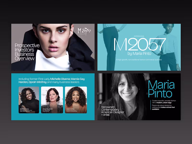
High-Fidelity Mockups
Pixel-perfect visual designs that showcase the look and feel of your website before development. Includes typography, color palette, imagery, and brand elements applied for a polished preview.
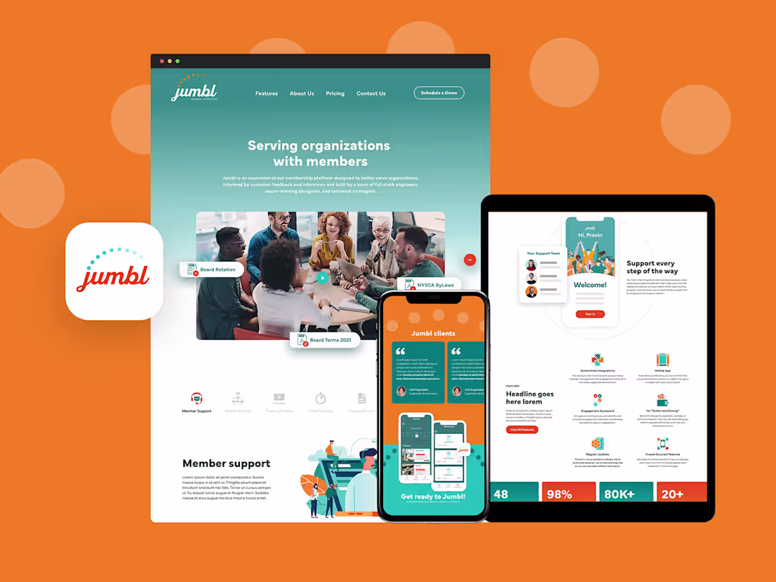
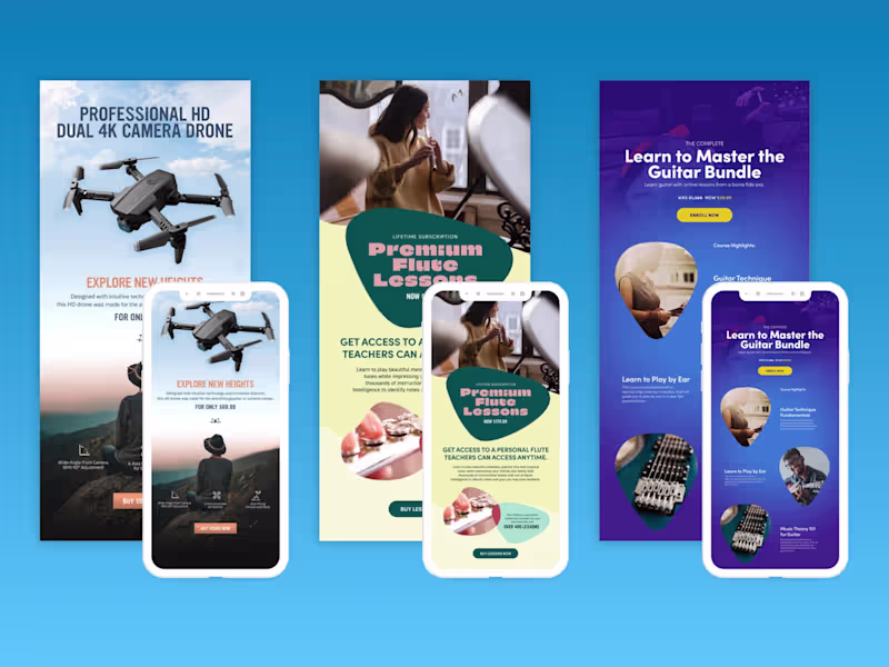
Responsive Design System
Designs tailored for desktop, tablet, and mobile devices, with reusable UI components and elements that ensure consistency, scalability, and efficiency across the entire site.
Final Design Files & Handoff Package
Organized design files (Figma, Sketch, or Adobe XD) plus asset exports and documentation. Developers receive everything needed for a smooth build with no guesswork.
Optional Add-Ons
Basic SEO Setup Guidance, Content Strategy Outline, and Copywriting Support
Stephanie's other services
Starting at$90 /hr
Tags
Adobe XD
Axure RP
Figma
Sketch
Webflow
Creative Director
UI Designer
UX Designer
Service provided by
Stephanie Spencer Chicago, USA
- 2
- Followers
Conversion First Responsive DesignStephanie Spencer
Starting at$90 /hr
Tags
Adobe XD
Axure RP
Figma
Sketch
Webflow
Creative Director
UI Designer
UX Designer
I design modern, responsive websites that balance creativity with usability—helping small businesses, startups, and boutique agencies make a powerful digital impression. Unlike template-driven solutions, my approach blends competitive analysis, UX strategy, and agency-quality design into a scalable system of reusable components that keeps your brand consistent as you grow.
What's included
Competitive Analysis & UX Evaluation
An audit of your current site and competitor benchmarks to identify strengths, weaknesses, and opportunities. This ensures your website stands out while meeting user expectations.
Wireframes (Website Blueprints)
Low- to mid-fidelity layouts that outline the structure, hierarchy, and flow of content. Wireframes act as the blueprint for your site, saving time and cost before visual design begins.
High-Fidelity Mockups
Pixel-perfect visual designs that showcase the look and feel of your website before development. Includes typography, color palette, imagery, and brand elements applied for a polished preview.
Responsive Design System
Designs tailored for desktop, tablet, and mobile devices, with reusable UI components and elements that ensure consistency, scalability, and efficiency across the entire site.
Final Design Files & Handoff Package
Organized design files (Figma, Sketch, or Adobe XD) plus asset exports and documentation. Developers receive everything needed for a smooth build with no guesswork.
Optional Add-Ons
Basic SEO Setup Guidance, Content Strategy Outline, and Copywriting Support
Stephanie's other services
$90 /hr