
Component DesignDominion Ogbaji
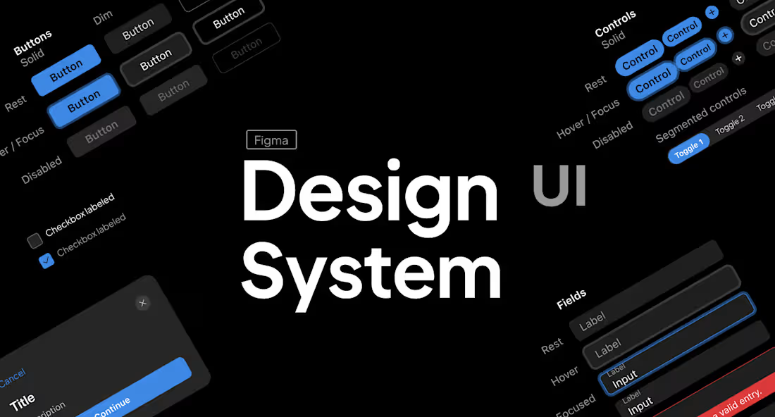
Designing Scalable & Consistent UI Component Systems
I help startups, businesses, and product teams create clean, reusable, and scalable UI component systems that improve design consistency, speed up workflows, and create better user experiences across digital products.
What You’ll Get
I’ll design structured UI components and reusable design systems tailored to your product needs, ensuring visual consistency, scalability, and easier collaboration between designers and developers. Every component is built with usability, responsiveness, and scalability in mind.
I focus on creating systems that simplify product growth, improve efficiency, and maintain a polished user experience across every screen.
What’s Included
UI Component Design
Design of reusable interface components such as buttons, cards, inputs, navigation bars, modals, tables, dropdowns, and more.
Design System Creation
A structured design system including typography, color styles, spacing, grids, icons, and reusable UI patterns for consistency.
Component Variants & States
Creation of multiple component states such as hover, active, disabled, focused, loading, and responsive variations.
Auto Layout & Responsiveness
Components built with responsive behavior and scalable layouts to support multiple screen sizes and devices.
Token & Style Organization
Proper organization of styles, variables, spacing systems, and reusable design tokens for easier maintenance.
Documentation & Guidelines
Clear documentation showing how components should be used to maintain consistency across the product.
Developer-Friendly Structure
Cleanly organized files and components prepared for smoother collaboration and developer handoff.
Figma Component Library
Creation of a reusable component library inside Figma for easier scaling and team collaboration.
Planning
Before starting the project, I’ll review your existing product, design patterns, and business goals to ensure the component system aligns with your product needs and future scalability.
Discovery Call
We’ll discuss your product, workflow challenges, design goals, and the type of component system you need.
Research & Audit
I’ll review your current UI, identify inconsistencies, and analyze opportunities to improve structure and scalability.
Structure & System Planning
This includes defining typography systems, spacing rules, color styles, component categories, and naming conventions.
Component Design
I’ll create reusable and scalable components with consistent variants, interactions, and responsive behaviors.
Design System Organization
All components, styles, and tokens will be organized into a structured and easy-to-manage design library.
Revisions & Refinement
We’ll collaborate through revision rounds to improve usability, organization, and consistency across the system.
Developer Handoff
The final component system will be prepared for smooth collaboration with developers and future product scaling.
FAQs
Dominion's other services
Starting at$1,500
Duration2 weeks
Tags
Figma

Design Systems Specialist
Mobile Designer
UI Designer
UX Designer
Web Designer
Service provided by
Dominion Ogbaji Lagos, Nigeria
Component DesignDominion Ogbaji
Starting at$1,500
Duration2 weeks
Tags
Figma
Design Systems Specialist
Mobile Designer
UI Designer
UX Designer
Web Designer
Designing Scalable & Consistent UI Component Systems
I help startups, businesses, and product teams create clean, reusable, and scalable UI component systems that improve design consistency, speed up workflows, and create better user experiences across digital products.
What You’ll Get
I’ll design structured UI components and reusable design systems tailored to your product needs, ensuring visual consistency, scalability, and easier collaboration between designers and developers. Every component is built with usability, responsiveness, and scalability in mind.
I focus on creating systems that simplify product growth, improve efficiency, and maintain a polished user experience across every screen.
What’s Included
UI Component Design
Design of reusable interface components such as buttons, cards, inputs, navigation bars, modals, tables, dropdowns, and more.
Design System Creation
A structured design system including typography, color styles, spacing, grids, icons, and reusable UI patterns for consistency.
Component Variants & States
Creation of multiple component states such as hover, active, disabled, focused, loading, and responsive variations.
Auto Layout & Responsiveness
Components built with responsive behavior and scalable layouts to support multiple screen sizes and devices.
Token & Style Organization
Proper organization of styles, variables, spacing systems, and reusable design tokens for easier maintenance.
Documentation & Guidelines
Clear documentation showing how components should be used to maintain consistency across the product.
Developer-Friendly Structure
Cleanly organized files and components prepared for smoother collaboration and developer handoff.
Figma Component Library
Creation of a reusable component library inside Figma for easier scaling and team collaboration.
Planning
Before starting the project, I’ll review your existing product, design patterns, and business goals to ensure the component system aligns with your product needs and future scalability.
Discovery Call
We’ll discuss your product, workflow challenges, design goals, and the type of component system you need.
Research & Audit
I’ll review your current UI, identify inconsistencies, and analyze opportunities to improve structure and scalability.
Structure & System Planning
This includes defining typography systems, spacing rules, color styles, component categories, and naming conventions.
Component Design
I’ll create reusable and scalable components with consistent variants, interactions, and responsive behaviors.
Design System Organization
All components, styles, and tokens will be organized into a structured and easy-to-manage design library.
Revisions & Refinement
We’ll collaborate through revision rounds to improve usability, organization, and consistency across the system.
Developer Handoff
The final component system will be prepared for smooth collaboration with developers and future product scaling.
FAQs
Dominion's other services
$1,500