
Scalable Design Systems for Digital ProductsDaniel Joseph
I design systems that bring order, speed, and consistency to digital products.
Each system includes reusable components, design foundations, and documentation crafted for teams to scale effortlessly.
With a focus on usability, accessibility, and developer handoff, I build systems that strengthen your brand and simplify design-to-dev collaboration.
What's included
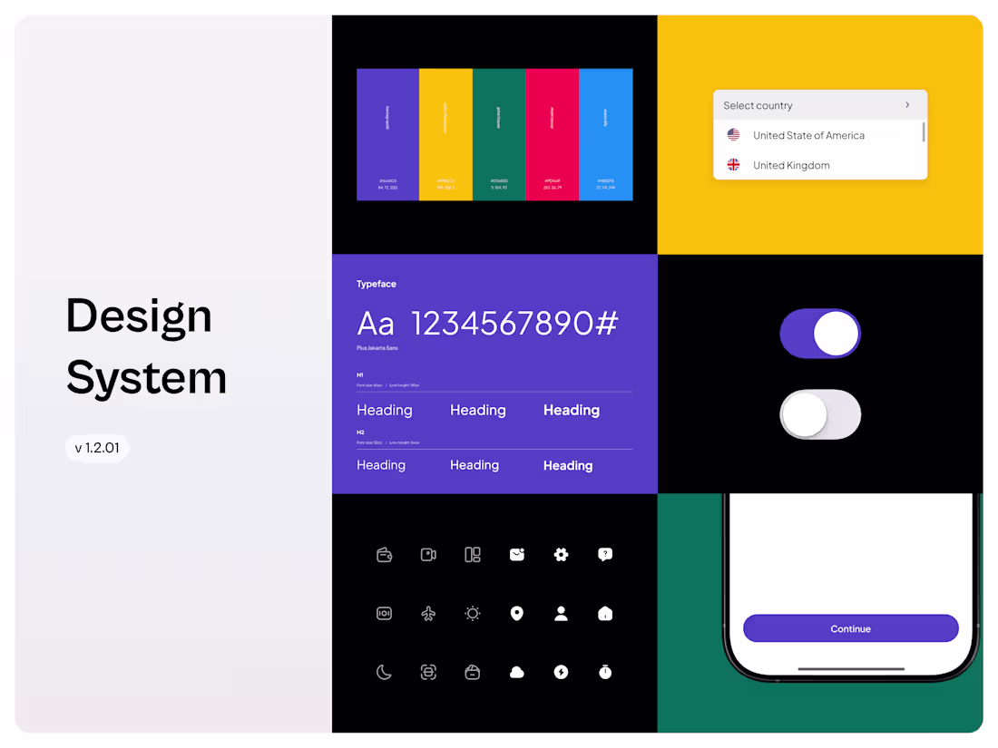
Foundations
Typography, colour palette, and spacing rules that define your product’s visual DNA and ensure design consistency across all screens.
Iconography Set
Licensed free cohesive, reusable icon set tailored to your product’s visual style and accessibility standards.
Component Library
A set of reusable, scalable UI components (buttons, modals, forms, navigation, etc.) built for clarity, speed, and cohesion.
Design Tokens
Standardized values for color, typography, shadows, and spacing to bridge design and development seamlessly.
Usage Guidelines
Clear documentation showing how to apply components and maintain brand consistency across your team.
Starting at$800
Duration2 weeks
Tags
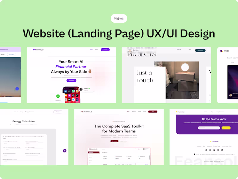
Figma
Product Designer
UI Designer
UX Designer
Service provided by
Daniel Joseph Lagos, Nigeria
- 5.00
- Rating
- 9
- Followers
Scalable Design Systems for Digital ProductsDaniel Joseph
I design systems that bring order, speed, and consistency to digital products.
Each system includes reusable components, design foundations, and documentation crafted for teams to scale effortlessly.
With a focus on usability, accessibility, and developer handoff, I build systems that strengthen your brand and simplify design-to-dev collaboration.
What's included
Foundations
Typography, colour palette, and spacing rules that define your product’s visual DNA and ensure design consistency across all screens.
Iconography Set
Licensed free cohesive, reusable icon set tailored to your product’s visual style and accessibility standards.
Component Library
A set of reusable, scalable UI components (buttons, modals, forms, navigation, etc.) built for clarity, speed, and cohesion.
Design Tokens
Standardized values for color, typography, shadows, and spacing to bridge design and development seamlessly.
Usage Guidelines
Clear documentation showing how to apply components and maintain brand consistency across your team.
$800