
UI UX design, wireframe UX and mobile UI designUkiyo Dsign
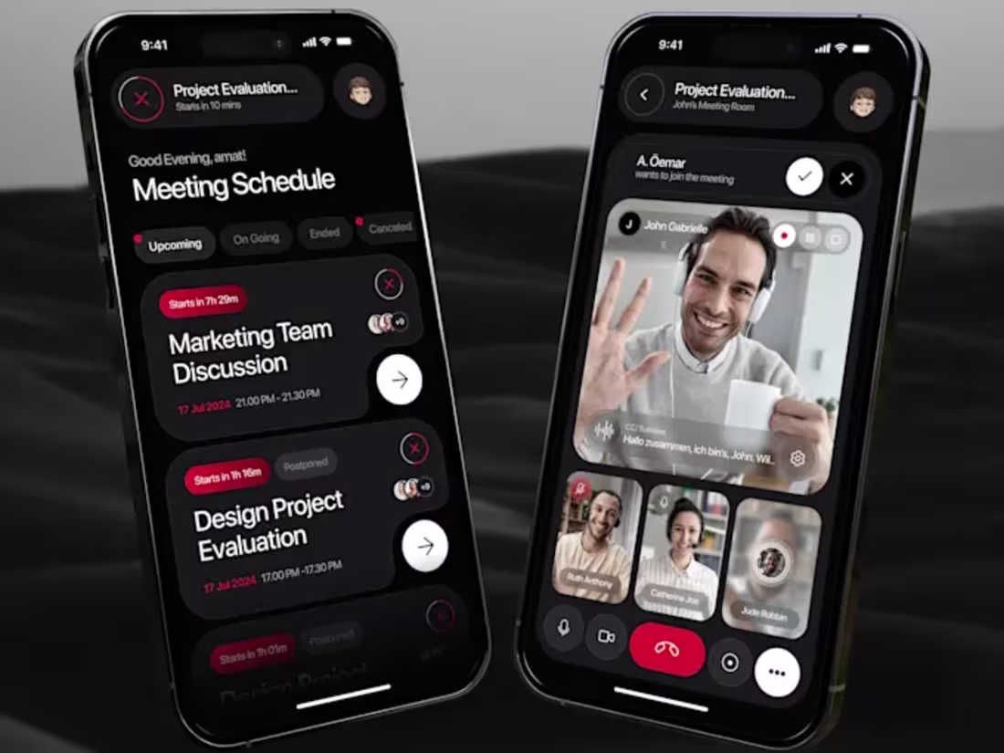
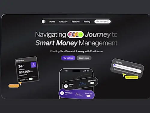
Comprehensive UI design services are offered, including wireframes, high-fidelity mockups, and responsive designs optimized for various devices. Deliverables also include UI kits, style guides, and design specifications to ensure consistency and a seamless handoff to developers.
What's included
UI Components
- Wireframes – Low-fidelity wireframes outlining the basic layout and structure of the UI.
- High-Fidelity Mockups – Polished, detailed designs showcasing the visual style, including colors, typography, and icons.
- UI Kit – A collection of reusable design components such as buttons, input fields, and icons, ensuring consistency across the project.
- Prototype – An interactive prototype to demonstrate how the UI will function, including user flows and transitions.
- Design Assets – All necessary design files (e.g., .PSD, .AI, .Sketch, .Figma) for handoff to developers.
- Style Guide – A document outlining the color palette, typography, iconography, and overall design principles used in the project.
- Responsive Designs – Designs optimized for multiple devices (desktop, tablet, mobile) with appropriate layout adjustments.
- User Flow Diagrams – Visual representation of the user journey and interactions within the application.
- Design Specifications – Detailed notes on measurements, padding, margins, font sizes, and any other specifics that help developers implement the design accurately.
FAQs
Example work


Contact for pricing
Tags
Adobe XD
Figma
Sketch
Graphic Designer
UI Designer
Service provided by
Ukiyo Dsign Malang, Indonesia
UI UX design, wireframe UX and mobile UI designUkiyo Dsign
Contact for pricing
Tags
Adobe XD
Figma
Sketch
Graphic Designer
UI Designer
Comprehensive UI design services are offered, including wireframes, high-fidelity mockups, and responsive designs optimized for various devices. Deliverables also include UI kits, style guides, and design specifications to ensure consistency and a seamless handoff to developers.
What's included
UI Components
- Wireframes – Low-fidelity wireframes outlining the basic layout and structure of the UI.
- High-Fidelity Mockups – Polished, detailed designs showcasing the visual style, including colors, typography, and icons.
- UI Kit – A collection of reusable design components such as buttons, input fields, and icons, ensuring consistency across the project.
- Prototype – An interactive prototype to demonstrate how the UI will function, including user flows and transitions.
- Design Assets – All necessary design files (e.g., .PSD, .AI, .Sketch, .Figma) for handoff to developers.
- Style Guide – A document outlining the color palette, typography, iconography, and overall design principles used in the project.
- Responsive Designs – Designs optimized for multiple devices (desktop, tablet, mobile) with appropriate layout adjustments.
- User Flow Diagrams – Visual representation of the user journey and interactions within the application.
- Design Specifications – Detailed notes on measurements, padding, margins, font sizes, and any other specifics that help developers implement the design accurately.
FAQs
Example work
Contact for pricing