
Component DesignRebecca Adisa
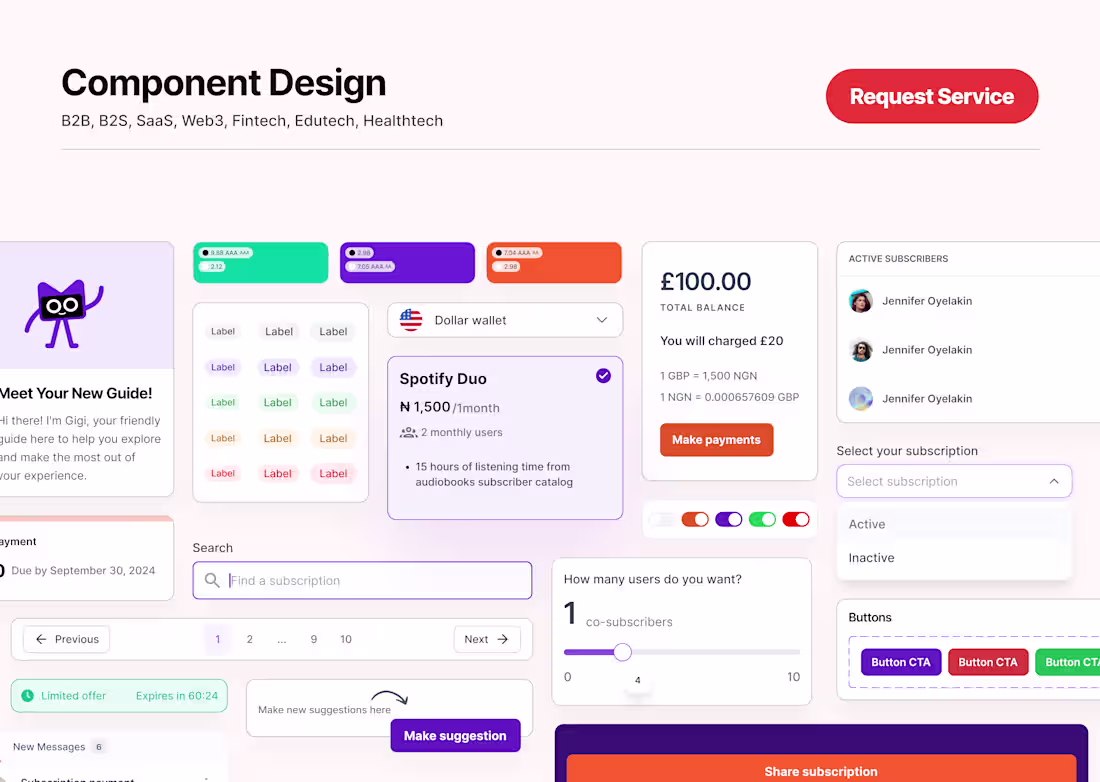
My design systems are built to be scalable, accessible, and easy to use. Each one includes well-structured components, typography and color systems, icon sets, interaction patterns, and clear documentation. I focus on creating systems that not only strengthen brand identity but also improve product consistency and user experience.
What's included
Typography & Color System
A well-structured typography scale and a thoughtfully selected color palette with usage rules to maintain visual harmony and accessibility across all screens.
Icon Set
A unified collection of icons designed to match your app’s aesthetic and meet both visual and functional requirements.
Design Tokens
A centralized set of design variables covering spacing, shadows, borders, and more to ensure consistency and smooth handoff between design and development.
Component Library
A reusable library of customizable UI components like buttons, forms, and modals built for scalability and cohesive design throughout the product.
Guidelines & Documentation
Clear documentation that outlines how to use components, apply visual styles, and follow best practices to help both designers and developers stay aligned.
Rebecca's other services
Starting at$1,500
Duration5 weeks
Tags
Adobe XD
Figma
Design Systems Specialist
Product Designer
UI Designer
Service provided by
Rebecca Adisa Lagos, Nigeria
- 5.00
- Rating
- 6
- Followers
Component DesignRebecca Adisa
Starting at$1,500
Duration5 weeks
Tags
Adobe XD
Figma
Design Systems Specialist
Product Designer
UI Designer
My design systems are built to be scalable, accessible, and easy to use. Each one includes well-structured components, typography and color systems, icon sets, interaction patterns, and clear documentation. I focus on creating systems that not only strengthen brand identity but also improve product consistency and user experience.
What's included
Typography & Color System
A well-structured typography scale and a thoughtfully selected color palette with usage rules to maintain visual harmony and accessibility across all screens.
Icon Set
A unified collection of icons designed to match your app’s aesthetic and meet both visual and functional requirements.
Design Tokens
A centralized set of design variables covering spacing, shadows, borders, and more to ensure consistency and smooth handoff between design and development.
Component Library
A reusable library of customizable UI components like buttons, forms, and modals built for scalability and cohesive design throughout the product.
Guidelines & Documentation
Clear documentation that outlines how to use components, apply visual styles, and follow best practices to help both designers and developers stay aligned.
Rebecca's other services
$1,500