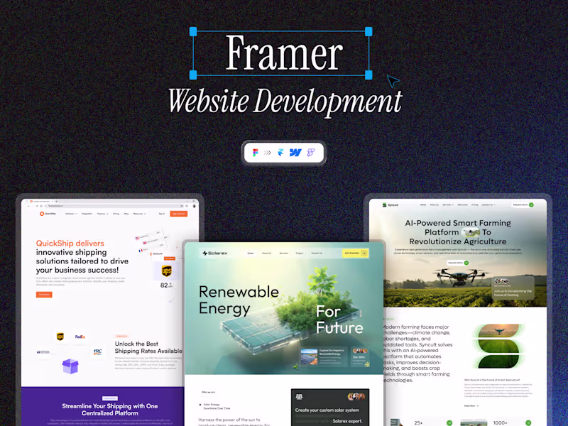
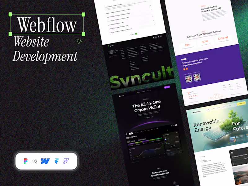
Mobile App UI DesignArtonest Design Studio
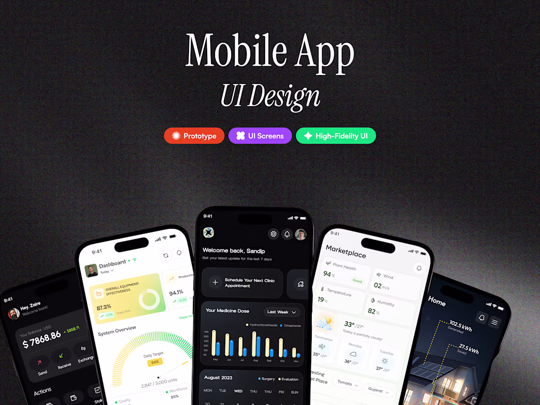
We provide end-to-end mobile app UI design that blends aesthetics, usability, and brand personality.
Our studio focuses on designing elegant, platform-specific mobile experiences that make complex interactions simple and delightful.
From establishing a visual language to delivering pixel-perfect Figma files, we ensure your app stands out on every screen — intuitive, consistent, and visually premium.
What's included
Figma Source File
Complete, layered, and organized design file with all screens, styles, and components.
Design System & UI Library
Reusable, documented components and brand tokens for future scalability.
Typography & Color Guide
Defined hierarchy, font usage, and brand color documentation.
Interactive Prototype
Fully clickable user flow for review and presentation.
UI Kit & Assets Package
Downloadable icons, illustrations, and graphic elements for development.
Dual Mode (Light & Dark)
Interface versions optimized for user preferences and accessibility.
Developer Handoff Documentation
Specs, spacings, and usage guidelines for seamless design-to-code transition.
FAQs
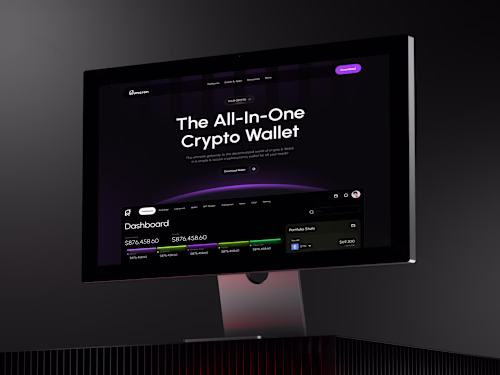
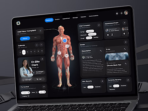
Example work
Contact for pricing
Tags
Adobe XD
FigJam
Figma
Figma Make
Notion
Mobile Designer
UI Designer
UX Designer
Service provided by
Artonest Design Studio proSurat, India
- 5.00
- Rating
- 48
- Followers
Mobile App UI DesignArtonest Design Studio
Contact for pricing
Tags
Adobe XD
FigJam
Figma
Figma Make
Notion
Mobile Designer
UI Designer
UX Designer
We provide end-to-end mobile app UI design that blends aesthetics, usability, and brand personality.
Our studio focuses on designing elegant, platform-specific mobile experiences that make complex interactions simple and delightful.
From establishing a visual language to delivering pixel-perfect Figma files, we ensure your app stands out on every screen — intuitive, consistent, and visually premium.
What's included
Figma Source File
Complete, layered, and organized design file with all screens, styles, and components.
Design System & UI Library
Reusable, documented components and brand tokens for future scalability.
Typography & Color Guide
Defined hierarchy, font usage, and brand color documentation.
Interactive Prototype
Fully clickable user flow for review and presentation.
UI Kit & Assets Package
Downloadable icons, illustrations, and graphic elements for development.
Dual Mode (Light & Dark)
Interface versions optimized for user preferences and accessibility.
Developer Handoff Documentation
Specs, spacings, and usage guidelines for seamless design-to-code transition.
FAQs
Example work
Contact for pricing