
Figma UI KitCameron Duncalfe
This service is for teams who want to move faster and stay consistent by using a custom-built UI kit in Figma. Whether you’re scaling a design team, preparing to hand off to devs, or just need to bring consistency across screens, a UI kit helps reduce rework and speed up decision-making.
I’ll create a polished, modular system based on your brand, built with structure, flexibility, and future scaling in mind. Everything is optimized for Figma workflows and comes with documentation that helps your team understand and apply it.
What's included
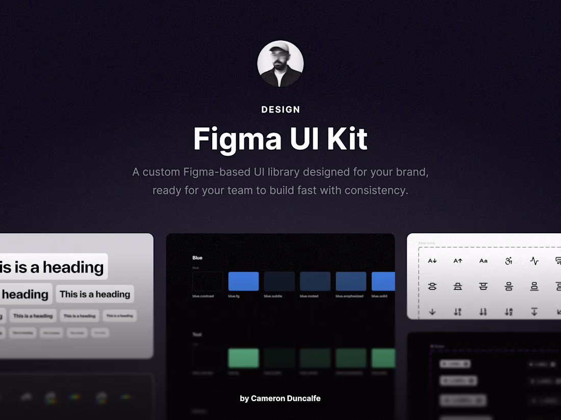
Custom UI Component Library
A library of branded components including buttons, form fields, cards, navs, and layouts, all built with Auto Layout and Figma best practices.
Color + Typography Tokens
A scalable system of color styles and text styles set up for dark and light modes, with clear naming conventions and accessibility in mind.
Documentation Pages
A mini guide inside the Figma file with notes on how to use components, style rules, and UI examples to keep your team aligned.
Ready-to-Build Layouts
Sample page sections and screen templates (like headers, footers, onboarding, etc.) to accelerate product or site development.
FAQs
Cameron's other services
Starting at$2,000
Duration2 weeks
Tags
Figma
Design Systems Specialist
Product Designer
Web Designer
Service provided by
Cameron Duncalfe maxToronto, Canada
- $100k+
- Earned
- 6
- Paid projects
- 5.00
- Rating
- 424
- Followers
Figma UI KitCameron Duncalfe
Starting at$2,000
Duration2 weeks
Tags
Figma
Design Systems Specialist
Product Designer
Web Designer
This service is for teams who want to move faster and stay consistent by using a custom-built UI kit in Figma. Whether you’re scaling a design team, preparing to hand off to devs, or just need to bring consistency across screens, a UI kit helps reduce rework and speed up decision-making.
I’ll create a polished, modular system based on your brand, built with structure, flexibility, and future scaling in mind. Everything is optimized for Figma workflows and comes with documentation that helps your team understand and apply it.
What's included
Custom UI Component Library
A library of branded components including buttons, form fields, cards, navs, and layouts, all built with Auto Layout and Figma best practices.
Color + Typography Tokens
A scalable system of color styles and text styles set up for dark and light modes, with clear naming conventions and accessibility in mind.
Documentation Pages
A mini guide inside the Figma file with notes on how to use components, style rules, and UI examples to keep your team aligned.
Ready-to-Build Layouts
Sample page sections and screen templates (like headers, footers, onboarding, etc.) to accelerate product or site development.
FAQs
Cameron's other services
$2,000