
You will get Scalable Figma Design System for SaaS & Web AppsTitkova Marharyta
Stop wasting time on inconsistent designs and slow development cycles. A robust, scalable design system is the backbone of any successful SaaS product.
I will build a comprehensive, pixel-perfect Figma Design System (UI Kit) tailored specifically to your web application or SaaS platform. By establishing a unified visual language, reusable components, and clear hierarchy, I will help your product scale effortlessly while keeping your design and development teams perfectly aligned.
Whether you are starting a new project from scratch or migrating an existing platform into a clean component library, this service will save your team hundreds of hours of design and coding time.
What’s Included:
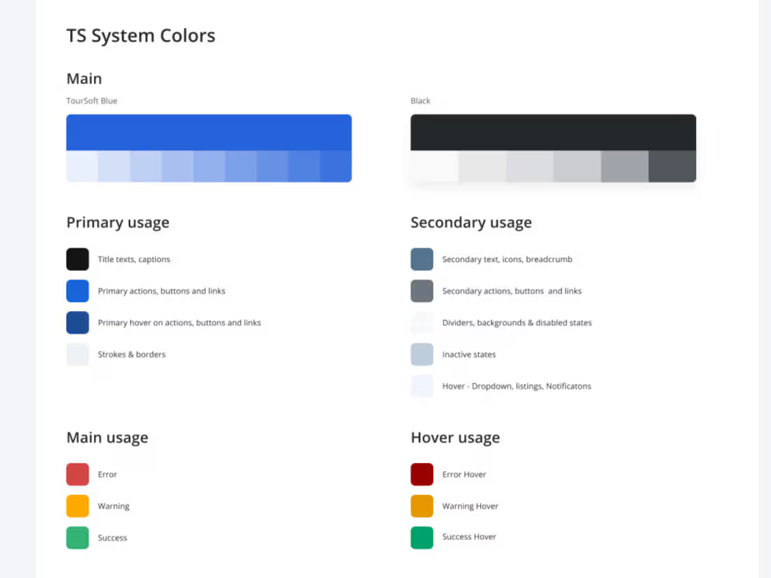
Design Tokens & Variables: Complete set of tokens for colors (primary, semantic, neutral), typography scales, spacing grids, and border-radii.
Core UI Component Library: Fully responsive, interactive components including buttons, input fields, dropdowns, checkboxes, tables, modal windows, and navigation bars.
Auto-Layout & Variants: 100% of components built with Figma’s advanced Auto-Layout, nested components, and interactive component variants (hover, active, disabled states).
Responsive Grid & Layout Templates: Pre-configured grid systems and responsive shell layouts for desktop, tablet, and mobile views.
Dark/Light Mode Setup (Optional): Structured color systems configured to easily switch between light and dark themes using Figma variables.
Documentation & Guidelines: Clear annotations on component usage and state behavior to ensure a flawless handoff for your frontend engineers.
How We Will Work Together:
Product Audit & Alignment: We analyze your existing product (or future requirements) to identify all necessary UI patterns and components.
Foundational Styles (Tokens): I set up the basic brand DNA in Figma—colors, typography, spacing, and grids.
Core Component Building: I design the atomic elements (buttons, inputs, icons) and gradually scale up to complex organisms (tables, cards, navbars).
Layout Stress-Testing: We test the components across actual page layouts to ensure everything is highly responsive and behaves as expected.
Clean Handoff: You receive an organized, publication-ready Figma library with clear instructions for your development team.
Starting at$1,500
Duration1 week
Tags
Canva

Figma

Design Systems Specialist
Graphic Designer
Mobile Designer
UI Designer
UX Designer
Web Designer
Design
Service provided by
Titkova Marharyta Kharkiv, Ukraine
- 5.00
- Rating
- 2
- Followers
You will get Scalable Figma Design System for SaaS & Web AppsTitkova Marharyta
Starting at$1,500
Duration1 week
Tags
Canva
Figma
Design Systems Specialist
Graphic Designer
Mobile Designer
UI Designer
UX Designer
Web Designer
Design
Stop wasting time on inconsistent designs and slow development cycles. A robust, scalable design system is the backbone of any successful SaaS product.
I will build a comprehensive, pixel-perfect Figma Design System (UI Kit) tailored specifically to your web application or SaaS platform. By establishing a unified visual language, reusable components, and clear hierarchy, I will help your product scale effortlessly while keeping your design and development teams perfectly aligned.
Whether you are starting a new project from scratch or migrating an existing platform into a clean component library, this service will save your team hundreds of hours of design and coding time.
What’s Included:
Design Tokens & Variables: Complete set of tokens for colors (primary, semantic, neutral), typography scales, spacing grids, and border-radii.
Core UI Component Library: Fully responsive, interactive components including buttons, input fields, dropdowns, checkboxes, tables, modal windows, and navigation bars.
Auto-Layout & Variants: 100% of components built with Figma’s advanced Auto-Layout, nested components, and interactive component variants (hover, active, disabled states).
Responsive Grid & Layout Templates: Pre-configured grid systems and responsive shell layouts for desktop, tablet, and mobile views.
Dark/Light Mode Setup (Optional): Structured color systems configured to easily switch between light and dark themes using Figma variables.
Documentation & Guidelines: Clear annotations on component usage and state behavior to ensure a flawless handoff for your frontend engineers.
How We Will Work Together:
Product Audit & Alignment: We analyze your existing product (or future requirements) to identify all necessary UI patterns and components.
Foundational Styles (Tokens): I set up the basic brand DNA in Figma—colors, typography, spacing, and grids.
Core Component Building: I design the atomic elements (buttons, inputs, icons) and gradually scale up to complex organisms (tables, cards, navbars).
Layout Stress-Testing: We test the components across actual page layouts to ensure everything is highly responsive and behaves as expected.
Clean Handoff: You receive an organized, publication-ready Figma library with clear instructions for your development team.
$1,500