
UI/UX Design & ResearchYoga Pratama
UX Research Phase
Research Report: Detailed insights featuring User Personas, User Journey Maps, and analysis from interviews or surveys.
Information Architecture: Structured Sitemaps and User Flow diagrams to define the product's logic.
UI Design Phase
Wireframes: Low-fidelity blueprints focusing on layout and structural hierarchy.
High-Fidelity Mockups: The final, polished visual designs including all colors, images, and typography.
Interactive Prototype: A clickable, functional simulation of the product for testing and presentation.
Design System & Handoff
Style Guide/Design System: A comprehensive library of components, UI kits, and branding guidelines to ensure consistency.
Developer Handoff: Production-ready assets (icons, images) and documentation to ensure a smooth transition to the engineering team.
What's included
User Research Report (Personas, User Journey Maps, Survey/Interview Insights)
A summary of user research findings that includes personas, user journey maps, and key insights from surveys and interviews to understand user needs, goals, and pain points.
Information Architecture (Sitemaps & User Flow Diagrams)
The structure and organization of content showing how pages are connected and how users navigate through the product.
Wireframes (Low-Fidelity Blueprints)
Basic layout sketches that outline content structure and core functionality without detailed visual design.
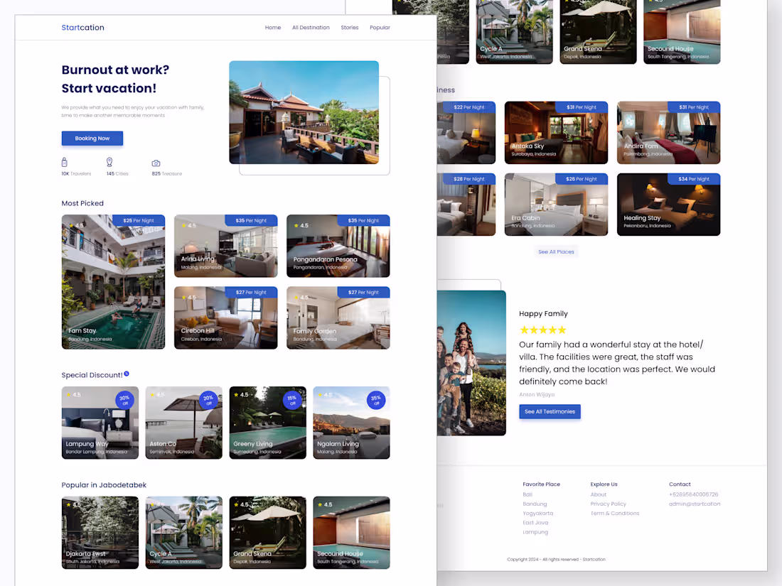
High-Fidelity UI Mockups (Final Visual Designs)
Final interface designs with complete visual details such as colors, typography, icons, and imagery that represent the actual look of the product.
Interactive Prototype (Clickable Demo)
A clickable, interactive version of the design used to simulate user interactions and validate flows before development.
Design System/Style Guide (Typography, Colors, Components)
A centralized set of design guidelines defining typography, color palettes, and UI components to ensure visual and interaction consistency.
Developer Handoff Documentation & Assets (Icons, Images)
Design documentation and assets provided to developers, including specifications, icons, images, and implementation guidelines for smooth development.
Starting at$15 /hr
Tags
Canva
Figma
Researcher
UI Designer
UX Designer
Service provided by
Yoga Pratama Bandar Lampung, Indonesia
UI/UX Design & ResearchYoga Pratama
Starting at$15 /hr
Tags
Canva
Figma
Researcher
UI Designer
UX Designer
UX Research Phase
Research Report: Detailed insights featuring User Personas, User Journey Maps, and analysis from interviews or surveys.
Information Architecture: Structured Sitemaps and User Flow diagrams to define the product's logic.
UI Design Phase
Wireframes: Low-fidelity blueprints focusing on layout and structural hierarchy.
High-Fidelity Mockups: The final, polished visual designs including all colors, images, and typography.
Interactive Prototype: A clickable, functional simulation of the product for testing and presentation.
Design System & Handoff
Style Guide/Design System: A comprehensive library of components, UI kits, and branding guidelines to ensure consistency.
Developer Handoff: Production-ready assets (icons, images) and documentation to ensure a smooth transition to the engineering team.
What's included
User Research Report (Personas, User Journey Maps, Survey/Interview Insights)
A summary of user research findings that includes personas, user journey maps, and key insights from surveys and interviews to understand user needs, goals, and pain points.
Information Architecture (Sitemaps & User Flow Diagrams)
The structure and organization of content showing how pages are connected and how users navigate through the product.
Wireframes (Low-Fidelity Blueprints)
Basic layout sketches that outline content structure and core functionality without detailed visual design.
High-Fidelity UI Mockups (Final Visual Designs)
Final interface designs with complete visual details such as colors, typography, icons, and imagery that represent the actual look of the product.
Interactive Prototype (Clickable Demo)
A clickable, interactive version of the design used to simulate user interactions and validate flows before development.
Design System/Style Guide (Typography, Colors, Components)
A centralized set of design guidelines defining typography, color palettes, and UI components to ensure visual and interaction consistency.
Developer Handoff Documentation & Assets (Icons, Images)
Design documentation and assets provided to developers, including specifications, icons, images, and implementation guidelines for smooth development.
$15 /hr