
Component Design (Design System & Style Guide Design)Anima Agrawal
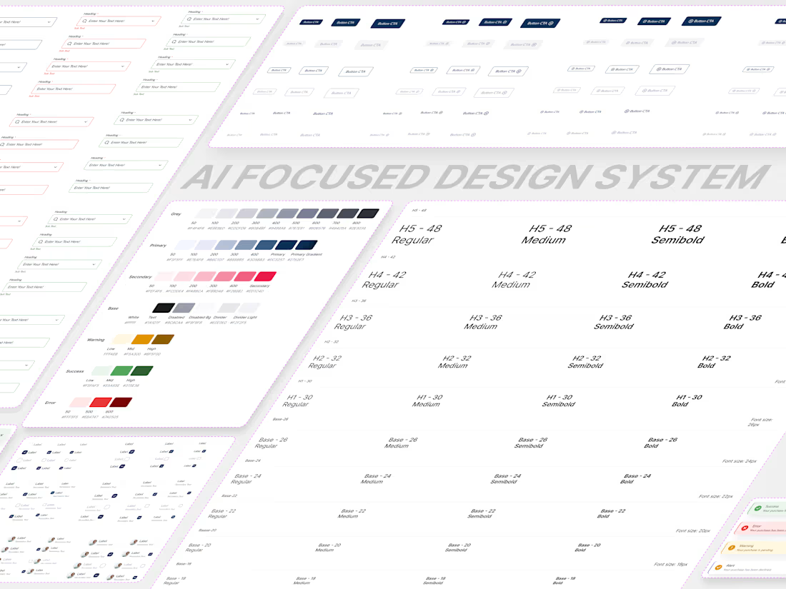
Build a scalable, consistent, and developer-friendly design system that helps your product grow faster while maintaining a seamless user experience.
I create design systems that bring structure, consistency, and efficiency to digital products. Whether you're building a new product or organizing an existing one, a well-crafted design system helps teams design, develop, and scale with confidence.
What's Included
Design Foundations
Color palette and usage guidelines
Typography system and text styles
Spacing, sizing, and layout rules
Elevation, shadows, and border radius standards
Design Tokens
Colors
Spacing
Typography
Shadows
Border radius
Other scalable design variables for design and development consistency
Component Library
Buttons
Inputs & Forms
Dropdowns
Modals
Cards
Navigation Elements
Tables and other reusable UI components
Iconography System
Consistent icon styles
Icon usage guidelines
AI Documentation & Context Guidelines
AI-based Component usage rules
Best practices
Design standards
AI & Developer handoff documentation
Figma Design System Setup
Organized component library
Variants and component properties
Auto Layout implementation
Variables and design tokens setup (if required)
Perfect For
AI Products
SaaS Products
Mobile Applications
Web Applications
Enterprise Software
Startups Scaling Their Products
Teams Looking for Design Consistency
Why It Matters
A strong design system helps:
• Create a consistent user experience
• Speed up design and development workflows
• Reduce design debt and inconsistencies
• Improve collaboration between designers and developers
• Scale products more efficiently
If you're looking to build a scalable, organized, and future-proof design system, I can help create a foundation that keeps your product consistent as it grows.
Anima's other services
Starting at$15 /hr
Tags
Figma

Design Systems Specialist
Product Designer
UI Designer
Style guide
Service provided by
Anima Agrawal Delhi, India
- 1
- Followers
Component Design (Design System & Style Guide Design)Anima Agrawal
Starting at$15 /hr
Tags
Figma
Design Systems Specialist
Product Designer
UI Designer
Style guide
Build a scalable, consistent, and developer-friendly design system that helps your product grow faster while maintaining a seamless user experience.
I create design systems that bring structure, consistency, and efficiency to digital products. Whether you're building a new product or organizing an existing one, a well-crafted design system helps teams design, develop, and scale with confidence.
What's Included
Design Foundations
Color palette and usage guidelines
Typography system and text styles
Spacing, sizing, and layout rules
Elevation, shadows, and border radius standards
Design Tokens
Colors
Spacing
Typography
Shadows
Border radius
Other scalable design variables for design and development consistency
Component Library
Buttons
Inputs & Forms
Dropdowns
Modals
Cards
Navigation Elements
Tables and other reusable UI components
Iconography System
Consistent icon styles
Icon usage guidelines
AI Documentation & Context Guidelines
AI-based Component usage rules
Best practices
Design standards
AI & Developer handoff documentation
Figma Design System Setup
Organized component library
Variants and component properties
Auto Layout implementation
Variables and design tokens setup (if required)
Perfect For
AI Products
SaaS Products
Mobile Applications
Web Applications
Enterprise Software
Startups Scaling Their Products
Teams Looking for Design Consistency
Why It Matters
A strong design system helps:
• Create a consistent user experience
• Speed up design and development workflows
• Reduce design debt and inconsistencies
• Improve collaboration between designers and developers
• Scale products more efficiently
If you're looking to build a scalable, organized, and future-proof design system, I can help create a foundation that keeps your product consistent as it grows.
Anima's other services
$15 /hr