
Data Analysis using PythonIkram Aissiou

I provide end-to-end data analysis services focused on delivering actionable insights through well-documented Python-based code, comprehensive reports, and high-quality visualizations. By leveraging libraries such as Seaborn, Matplotlib, NumPy, and Pandas, I ensure thorough analysis and clear communication of findings.
What's included
Analysis Report
A detailed report summarizing the key findings, insights, and actionable recommendations from the data analysis. This document provides a clear overview of trends, patterns, and results, offering valuable guidance for decision-making and strategy development.
Analytical Code
The Python scripts and algorithms used throughout the analysis process are thoroughly documented and structured for transparency and scalability. These scripts handle data preprocessing, cleaning, exploratory analysis, modeling, and visualization, ensuring a seamless and reproducible workflow.
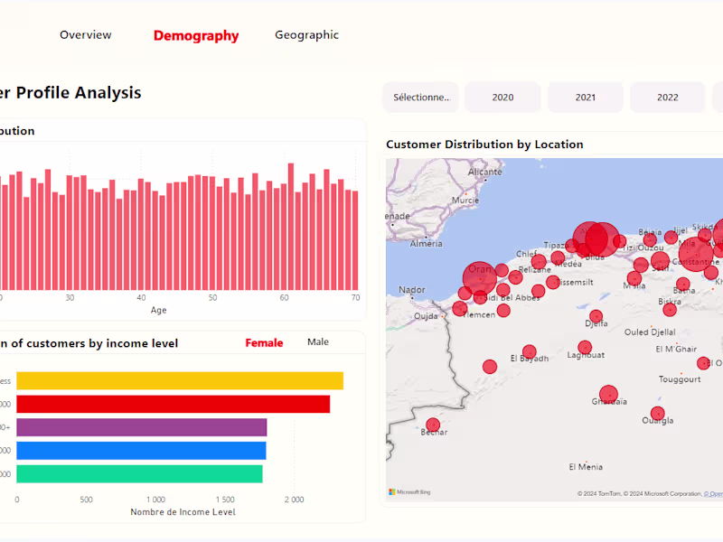
Visualizations
Customizable and high-quality visual outputs, including charts, graphs, and dashboards, are created to showcase the insights and relationships discovered in the data. Using Python libraries like Seaborn, Matplotlib, NumPy, and Pandas, these visuals help simplify complex data and enhance interpretation for clearer communication of results.
Ikram's other services
Starting at$25 /hr
Tags
MATLAB
pandas
Python
seaborn
Data Analyst
Data Modelling Analyst
Data Scientist
Service provided by
Ikram Aissiou Algiers, Algeria
- 1
- Followers
Data Analysis using PythonIkram Aissiou
Starting at$25 /hr
Tags
MATLAB
pandas
Python
seaborn
Data Analyst
Data Modelling Analyst
Data Scientist
I provide end-to-end data analysis services focused on delivering actionable insights through well-documented Python-based code, comprehensive reports, and high-quality visualizations. By leveraging libraries such as Seaborn, Matplotlib, NumPy, and Pandas, I ensure thorough analysis and clear communication of findings.
What's included
Analysis Report
A detailed report summarizing the key findings, insights, and actionable recommendations from the data analysis. This document provides a clear overview of trends, patterns, and results, offering valuable guidance for decision-making and strategy development.
Analytical Code
The Python scripts and algorithms used throughout the analysis process are thoroughly documented and structured for transparency and scalability. These scripts handle data preprocessing, cleaning, exploratory analysis, modeling, and visualization, ensuring a seamless and reproducible workflow.
Visualizations
Customizable and high-quality visual outputs, including charts, graphs, and dashboards, are created to showcase the insights and relationships discovered in the data. Using Python libraries like Seaborn, Matplotlib, NumPy, and Pandas, these visuals help simplify complex data and enhance interpretation for clearer communication of results.
Ikram's other services
$25 /hr