
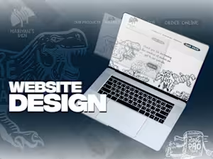
Website Landing Page & Mobile App Ui Design

Contact for pricing
About this service
Summary
What's included
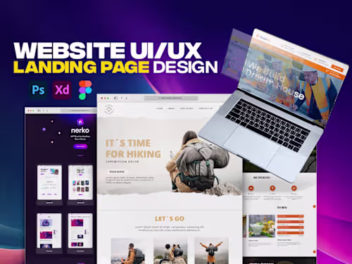
Professional Figma Landing Page Deliverables
When you opt for a professional Figma landing page, you're not just getting a static image; you're receiving a comprehensive, pixel-perfect design ready for development. Here's what's included: Custom UI/UX Design: A unique, aesthetically pleasing, and user-friendly interface designed from scratch, tailored to your brand's identity and target audience. This includes thoughtful user experience (UX) flows to guide visitors efficiently. Responsive Design for Key Breakpoints: The landing page will be optimized to look and function flawlessly across various devices. This typically includes designs for desktop (e.g., 1440px or 1920px width), tablet (e.g., 768px width), and mobile (e.g., 375px width). Figma Source File: A well-organized and clearly labeled Figma file. This includes all design assets, components, and pages, making it easy for developers to inspect and implement. Interactive Prototype (Optional/If Requested): A clickable prototype within Figma that simulates the user journey, demonstrating interactions, animations, and navigation flow. This helps visualize the user experience before development. High-Quality Image Assets: Exported images (e.g., PNG, JPG, SVG) for all graphical elements used in the design, optimized for web performance. Typography Guidelines: Clear specifications for all fonts used, including font families, sizes, weights, and line heights, ensuring consistency. Color Palette Documentation: A comprehensive guide to the primary and secondary color palettes, including HEX, RGB, and potentially CMYK values for branding consistency. Iconography Set: A complete set of all icons used throughout the landing page, provided in scalable formats like SVG. Component Library (Basic): Reusable UI elements (e.g., buttons, input fields, cards) defined within Figma to ensure consistency and speed up future design iterations. Design System Documentation (Basic): A concise overview of design principles, styles, and components to maintain brand consistency across all digital touchpoints.
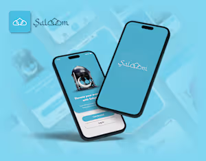
Mobile App UI Design Deliverables
Comprehensive UI/UX Screens: Fully designed screens for all core functionalities and user flows of your mobile application. This includes onboarding, main navigation, feature screens, settings, and more. User Flow Diagrams: Visual representations of how users will navigate through the app, outlining key interactions and decision points. Interactive Prototype: A robust, clickable prototype in Figma that simulates the app's functionality, allowing you to experience the user journey and interactions firsthand. Figma Source File: A meticulously organized Figma project file containing all app screens, components, and design assets, structured for developer handoff. Platform-Specific Design Considerations: Design elements and interactions optimized for either iOS (Human Interface Guidelines) or Android (Material Design), or both, depending on your project's needs. Component Library (Advanced): A detailed and extensive library of reusable UI components (e.g., navigation bars, tab bars, cards, forms, buttons, modals), ensuring consistency and scalability. Design System Documentation: A comprehensive guide detailing typography, color palettes, iconography, spacing rules, and component usage, essential for future development and scaling. State Designs: Visual designs for different states of UI elements (e.g., empty states, error states, loading states, active/inactive states for buttons and inputs). High-Resolution Assets for Development: Exported graphic assets (icons, illustrations, images) in various resolutions and formats suitable for both iOS and Android development. Accessibility Considerations: Designs that account for accessibility best practices, such as sufficient color contrast and touch target sizes, to ensure inclusivity.
Example projects


Skills and tools
UI Designer
UX Designer
Web Designer

Adobe Photoshop

Adobe XD

Figma