
Mobile or Web App DesignMuhammad Rehmat
Up to 15 Unique Screens 📱💻: Tailored design for web and mobile apps
Figma Design File 📁: Delivered for future reference and updates
10-15 Working Days Turnaround ⏳: Efficient project completion
Interactive Clickable Prototype 🔗 (upon request): Experience your app flow before development
Comprehensive Design System 🎨: Includes color styles, typography, and reusable components
Low-Fidelity Wireframes 📝: Clear layout and structure for effective planning
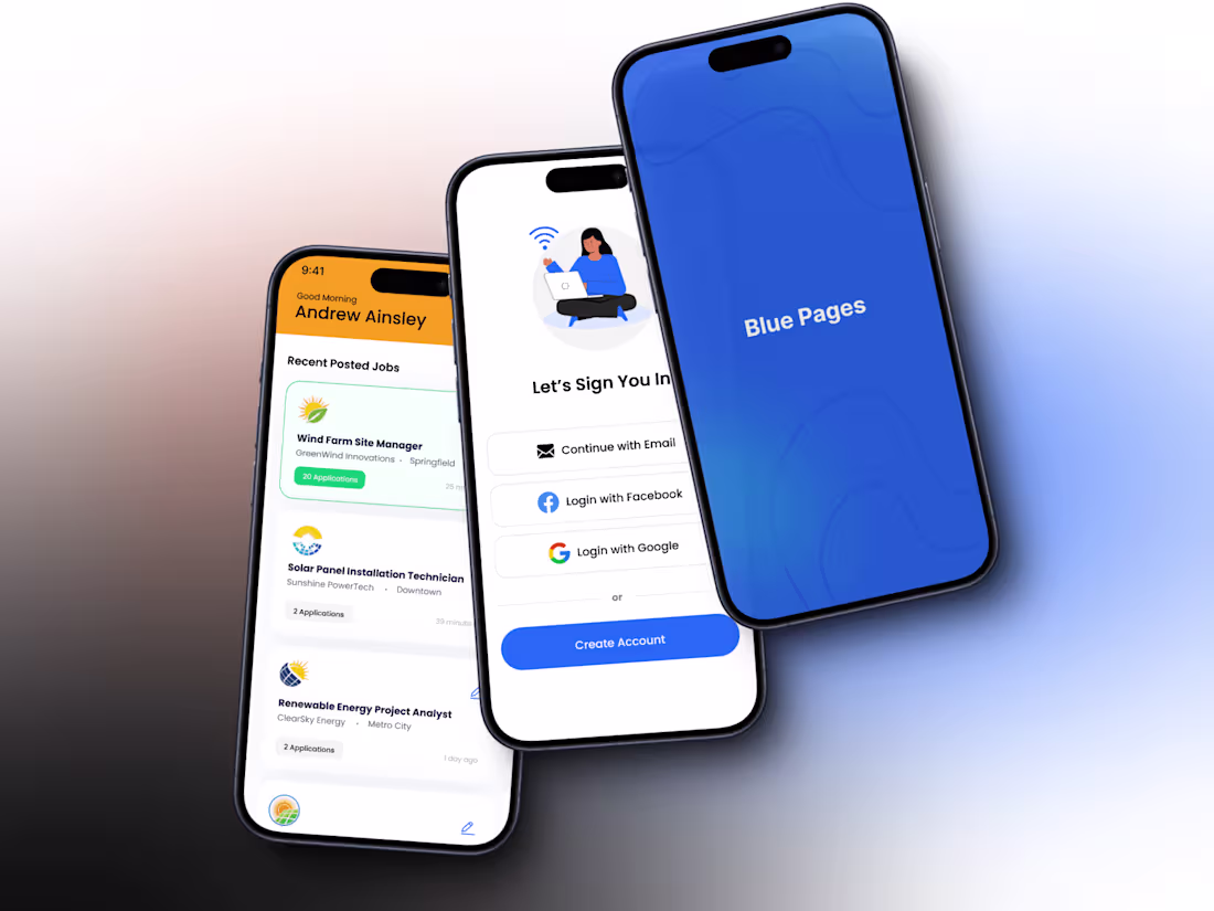
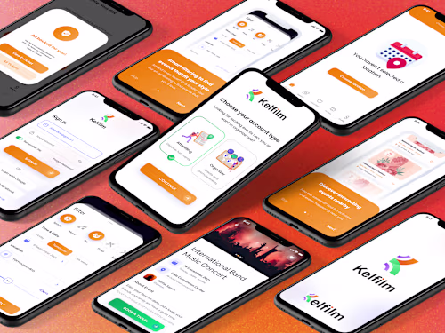
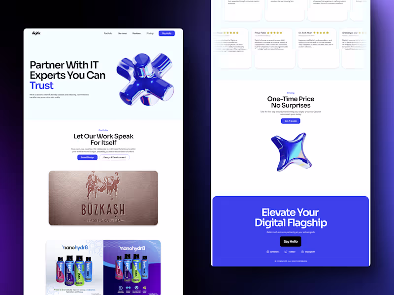
High-Fidelity Mockups 🌟: Stunning visual designs showcasing your app’s look and feel
Micro Interactions ✨: Engaging animations for a delightful user experience
Smooth Developer Handoff 🚀: Complete package with assets and guidelines for easy development
Up to 3 Revisions 🔄: Adjustments based on your feedback
What's included
🌐 User Flow & Information Architecture
Maps out user journeys and organizes content to ensure an intuitive and engaging experience for both web and mobile apps.
📝 Low-Fidelity Wireframes
Basic wireframes that outline your app’s structure and layout, providing a clear blueprint for the design process.
🎨 High-Fidelity Mockups in Figma
Detailed and visually stunning mockups, organized by user flow, showcasing the final design with precision.
🔗 Interactive Clickable Prototype (Optional)
A dynamic prototype that simulates user interactions, allowing you to experience and refine the app before development.
🛠️ Design System & Component Library
A comprehensive library of design elements including color schemes, typography, and reusable components to ensure consistency and ease of future updates.
✨ Micro Interactions & Animations
Subtle and engaging animations that enhance user interactions, making the app more enjoyable and intuitive.
🚀 Developer Handoff Package
A complete package with all design assets, guidelines, and annotations, facilitating a smooth transition from design to development.
FAQs
Starting at$75 /hr
Tags
Figma
Relume
Product Designer
UI Designer
UX Designer
Service provided by
Muhammad Rehmat Netherlands
- 5.00
- Rating
- 12
- Followers
Mobile or Web App DesignMuhammad Rehmat
Up to 15 Unique Screens 📱💻: Tailored design for web and mobile apps
Figma Design File 📁: Delivered for future reference and updates
10-15 Working Days Turnaround ⏳: Efficient project completion
Interactive Clickable Prototype 🔗 (upon request): Experience your app flow before development
Comprehensive Design System 🎨: Includes color styles, typography, and reusable components
Low-Fidelity Wireframes 📝: Clear layout and structure for effective planning
High-Fidelity Mockups 🌟: Stunning visual designs showcasing your app’s look and feel
Micro Interactions ✨: Engaging animations for a delightful user experience
Smooth Developer Handoff 🚀: Complete package with assets and guidelines for easy development
Up to 3 Revisions 🔄: Adjustments based on your feedback
What's included
🌐 User Flow & Information Architecture
Maps out user journeys and organizes content to ensure an intuitive and engaging experience for both web and mobile apps.
📝 Low-Fidelity Wireframes
Basic wireframes that outline your app’s structure and layout, providing a clear blueprint for the design process.
🎨 High-Fidelity Mockups in Figma
Detailed and visually stunning mockups, organized by user flow, showcasing the final design with precision.
🔗 Interactive Clickable Prototype (Optional)
A dynamic prototype that simulates user interactions, allowing you to experience and refine the app before development.
🛠️ Design System & Component Library
A comprehensive library of design elements including color schemes, typography, and reusable components to ensure consistency and ease of future updates.
✨ Micro Interactions & Animations
Subtle and engaging animations that enhance user interactions, making the app more enjoyable and intuitive.
🚀 Developer Handoff Package
A complete package with all design assets, guidelines, and annotations, facilitating a smooth transition from design to development.
FAQs
$75 /hr