
Digital Brilliance: Elevate with UI/UX DesignSyed Omer

I provide a unique UI/UX design package, blending creativity with user experience expertise. Elevate your digital presence with tailored wireframes, mockups, and prototypes for visually stunning and seamlessly functional designs.
What's included
Comprehensive Design Package: Empowering Your Digital Vision
1. Wireframes: Initial skeletal designs that outline the basic structure and layout of the website or application.
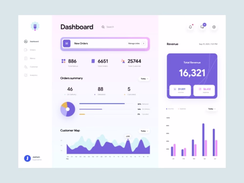
2. Mockups: High-fidelity visual representations of the final design, including detailed color schemes, typography, and imagery.
3. Prototypes: Interactive models that allow clients to experience the user flow and functionality of the design before development.
4. User Flows: Diagrams illustrating the paths a user may take through the website or app, helping to identify potential pain points and optimize the user experience.
5. Style Guides: Documentation specifying design elements like colors, fonts, and image guidelines to ensure consistency across the platform.
6. Responsive Designs: Adaptations of the design for various screen sizes and devices, ensuring a seamless user experience on desktops, tablets, and mobile devices.
7. Iconography and Graphics: Custom-designed icons and graphics that enhance the visual appeal and usability of the interface.
8. Final Design Files: All necessary files in a format suitable for development, often including layered design files and assets.
9. Collaboration and Communication: Ongoing communication throughout the design process, including feedback loops, revisions, and updates based on client input.
11. Handover Documentation: Comprehensive documentation outlining design choices, rationale, and instructions for developers, ensuring a smooth transition from design to implementation.
12. Client Training (if required): Guidance and training on how to manage and update the design elements, ensuring clients can maintain the integrity of the design post-launch.
Syed's other services

Starting at$15
Duration1 week
Tags
Adobe Illustrator
Adobe Photoshop
Figma
Interaction Designer
UX Designer
Web Designer
Service provided by
Syed Omer United Arab Emirates
Digital Brilliance: Elevate with UI/UX DesignSyed Omer
Starting at$15
Duration1 week
Tags
Adobe Illustrator
Adobe Photoshop
Figma
Interaction Designer
UX Designer
Web Designer
I provide a unique UI/UX design package, blending creativity with user experience expertise. Elevate your digital presence with tailored wireframes, mockups, and prototypes for visually stunning and seamlessly functional designs.
What's included
Comprehensive Design Package: Empowering Your Digital Vision
1. Wireframes: Initial skeletal designs that outline the basic structure and layout of the website or application.
2. Mockups: High-fidelity visual representations of the final design, including detailed color schemes, typography, and imagery.
3. Prototypes: Interactive models that allow clients to experience the user flow and functionality of the design before development.
4. User Flows: Diagrams illustrating the paths a user may take through the website or app, helping to identify potential pain points and optimize the user experience.
5. Style Guides: Documentation specifying design elements like colors, fonts, and image guidelines to ensure consistency across the platform.
6. Responsive Designs: Adaptations of the design for various screen sizes and devices, ensuring a seamless user experience on desktops, tablets, and mobile devices.
7. Iconography and Graphics: Custom-designed icons and graphics that enhance the visual appeal and usability of the interface.
8. Final Design Files: All necessary files in a format suitable for development, often including layered design files and assets.
9. Collaboration and Communication: Ongoing communication throughout the design process, including feedback loops, revisions, and updates based on client input.
11. Handover Documentation: Comprehensive documentation outlining design choices, rationale, and instructions for developers, ensuring a smooth transition from design to implementation.
12. Client Training (if required): Guidance and training on how to manage and update the design elements, ensuring clients can maintain the integrity of the design post-launch.
Syed's other services
$15