
B2B SaaS Dashboard & Web App UI/UX Design in FigmaTanjim G
Your SaaS dashboard looks great in Figma. But users still churn, support tickets keep climbing, and your activation rate hasn't moved in months. The problem isn't your UI — it's that nobody designed for the metrics that matter.
Gr8r Studio designs B2B SaaS dashboards and complex web app interfaces that reduce churn, increase user activation, and cut support tickets. We work exclusively with funded SaaS companies (Series A-C) and bring pattern recognition from designing dashboards for CRM platforms, analytics tools, workflow builders, spend management products, and AI-powered applications. 50,000+ customers served. 99% client retention rate.
We don't open Figma until we understand your data. Most dashboard redesigns fail because agencies skip discovery and jump straight into pixels. We start with the hard questions — where users drop off, which workflows generate support tickets, and what power users do differently — then design around real problems, not assumptions.
What's included:
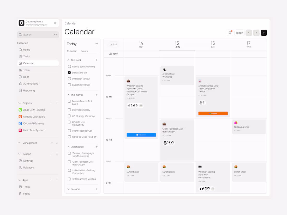
→ Complete dashboard UI/UX design in Figma with auto-layout components
→ Reusable design system (structured for Shadcn UI + Tailwind CSS)
→ Responsive layouts (desktop + tablet breakpoints)
→ Data visualization design (charts, graphs, KPI cards, tables)
→ Role-based dashboard views (admin, manager, end user)
→ Interactive Figma prototype for stakeholder review
→ Developer handoff documentation with specs, annotations, and component mapping
→ Loom walkthrough of every screen and the reasoning behind each design decision
How we work:
Discovery & UX audit (Week 1) — We audit your current product, analyze user behavior data, review support tickets, and map friction points. This is where 80% of redesign value comes from. We identify exactly what's broken before touching a single frame.
Wireframes & information architecture (Week 1-2) — Low-fidelity flows to align on structure, navigation patterns, and user journeys. You approve the logic before we invest in visuals.
High-fidelity UI design (Week 2-3) — Pixel-perfect screens with your brand system, component library, and design tokens applied. Every component is production-ready — not a concept deck that needs "translation" for developers.
Developer handoff (Week 3-4) — Organized Figma files structured for React + Shadcn UI + Tailwind CSS implementation. Named layers, auto-layout components, responsive variants, and a Loom walkthrough so your engineering team can build with zero guesswork.
We deliver in 2-4 weeks. Not 2-3 months. We move fast because discovery eliminates the revision cycles that slow everyone else down.
This isn't a Dribbble redesign. We don't design dashboards to win design awards. We design them so your users find value faster, complete tasks without confusion, and never need to open a support ticket for something the interface should have made obvious.
Best for:
Full SaaS dashboard redesigns and new dashboard builds
Admin panels and multi-role manager views
CRM dashboards and pipeline visualization
Analytics dashboards and reporting interfaces
Workflow builders and task management UI
Data-heavy enterprise web applications
AI product interfaces, chatbot design, and copilot UX
Who hires us:
VP Product, Head of Design, and technical founders at B2B SaaS companies with 50-500 employees. Typically Series A through Series C with a product that's outgrown its original UI but doesn't have the in-house design bandwidth to fix it properly. If your engineering team is waiting on designs and your PM is doing design work in Google Slides — we should talk.
FAQs
Example work

Contact for pricing
Duration1 week
Tags
Dashboard design
Product Designer
UI Designer
UX Designer
B2B SaaS dashboard
saas
SaaS Dashboard
Web app design in figma
Web App SaaS Dashboard design
Service provided by
Tanjim G maxBangladesh
- $100k+
- Earned
- 19
- Paid projects
- 5.00
- Rating
- 191
- Followers
B2B SaaS Dashboard & Web App UI/UX Design in FigmaTanjim G
Contact for pricing
Duration1 week
Tags
Dashboard design
Product Designer
UI Designer
UX Designer
B2B SaaS dashboard
saas
SaaS Dashboard
Web app design in figma
Web App SaaS Dashboard design
Your SaaS dashboard looks great in Figma. But users still churn, support tickets keep climbing, and your activation rate hasn't moved in months. The problem isn't your UI — it's that nobody designed for the metrics that matter.
Gr8r Studio designs B2B SaaS dashboards and complex web app interfaces that reduce churn, increase user activation, and cut support tickets. We work exclusively with funded SaaS companies (Series A-C) and bring pattern recognition from designing dashboards for CRM platforms, analytics tools, workflow builders, spend management products, and AI-powered applications. 50,000+ customers served. 99% client retention rate.
We don't open Figma until we understand your data. Most dashboard redesigns fail because agencies skip discovery and jump straight into pixels. We start with the hard questions — where users drop off, which workflows generate support tickets, and what power users do differently — then design around real problems, not assumptions.
What's included:
→ Complete dashboard UI/UX design in Figma with auto-layout components
→ Reusable design system (structured for Shadcn UI + Tailwind CSS)
→ Responsive layouts (desktop + tablet breakpoints)
→ Data visualization design (charts, graphs, KPI cards, tables)
→ Role-based dashboard views (admin, manager, end user)
→ Interactive Figma prototype for stakeholder review
→ Developer handoff documentation with specs, annotations, and component mapping
→ Loom walkthrough of every screen and the reasoning behind each design decision
How we work:
Discovery & UX audit (Week 1) — We audit your current product, analyze user behavior data, review support tickets, and map friction points. This is where 80% of redesign value comes from. We identify exactly what's broken before touching a single frame.
Wireframes & information architecture (Week 1-2) — Low-fidelity flows to align on structure, navigation patterns, and user journeys. You approve the logic before we invest in visuals.
High-fidelity UI design (Week 2-3) — Pixel-perfect screens with your brand system, component library, and design tokens applied. Every component is production-ready — not a concept deck that needs "translation" for developers.
Developer handoff (Week 3-4) — Organized Figma files structured for React + Shadcn UI + Tailwind CSS implementation. Named layers, auto-layout components, responsive variants, and a Loom walkthrough so your engineering team can build with zero guesswork.
We deliver in 2-4 weeks. Not 2-3 months. We move fast because discovery eliminates the revision cycles that slow everyone else down.
This isn't a Dribbble redesign. We don't design dashboards to win design awards. We design them so your users find value faster, complete tasks without confusion, and never need to open a support ticket for something the interface should have made obvious.
Best for:
Full SaaS dashboard redesigns and new dashboard builds
Admin panels and multi-role manager views
CRM dashboards and pipeline visualization
Analytics dashboards and reporting interfaces
Workflow builders and task management UI
Data-heavy enterprise web applications
AI product interfaces, chatbot design, and copilot UX
Who hires us:
VP Product, Head of Design, and technical founders at B2B SaaS companies with 50-500 employees. Typically Series A through Series C with a product that's outgrown its original UI but doesn't have the in-house design bandwidth to fix it properly. If your engineering team is waiting on designs and your PM is doing design work in Google Slides — we should talk.
FAQs
Example work
Contact for pricing