
RESPONSIVE WEBSITE DESIGN

Starting at
$
850
About this service
Summary
Process
FAQs
Who is This for?
This design service is ideal for individuals, startups, and businesses across various industries who need a beautiful, functional website. Whether you're in e-commerce, tech, real estate, education, health, lifestyle, nonprofit work, or building a personal brand, this is for you.
What is included in your responsive website design service
My service includes everything from initial consultation, user research, and strategy development, to designing responsive wireframes, high-fidelity mockups, and creating interactive prototypes. I also offer design system handoff for developers, testing.
How will we communicate?
Once we begin, I’ll be available through the channel that’s most convenient for you—whether that’s email, WhatsApp, Telegram, or even a quick Zoom or Google Meet call when needed. I’ll make sure communication is smooth, clear, and consistent from start to finish.
How do you approach the design process?
I follow a user-centered design approach that starts with understanding your goals, audience, and competitors. From there, I craft wireframes and design solutions that are not only visually appealing but also intuitive and functional across all devices.
Can you help with content creation?
Yes! In addition to design, I offer content copywriting assistance. Whether you need help with messaging, tone, or structuring content for optimal user experience, I’ll collaborate with you to ensure your website speaks effectively to your audience.
Will my website be optimized for all devices?
Absolutely! I specialize in responsive design, ensuring that your website provides a seamless experience on desktops, tablets, and mobile devices. Your site will adapt perfectly to any screen size and offer a consistent user experience.
What if I need more revisions?
If you’d like additional changes beyond the three rounds included, I can absolutely continue refining the design. These will just be added as an extension to the project and billed at my current hourly design rate.
Can I request updates in the future?
Absolutely! If you ever want to update your site or add new pages after we finish, just let me know—I’d love to help. These updates are billed hourly and we’ll find a time that works for both of us, so everything stays clear and easy.
Can you work with my development team?
Yes, I work closely with your developers, providing detailed design specifications, assets, and guidance to ensure smooth implementation.
What's included
Information Architecture (IA)
A visual layout of how content will be grouped and structured—usually in the form of a sitemap. It ensures users can find what they need easily.
Wireframes
Basic, grayscale layouts that map out page structure and content placement. This allows for fast iterations and early feedback without focusing on aesthetics.
UI Design System / Style Guide
A collection of reusable UI elements—like buttons, typography, color schemes, and spacing rules—to ensure consistency across the website.
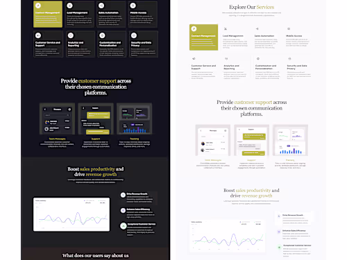
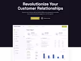
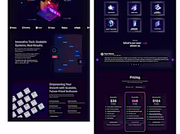
High-Fidelity Mockups
Fully designed versions of the key pages, in color and with visual assets. These mockups show exactly what the website will look like.
High-Fidelity Interactive Prototype
A clickable prototype that mimics real interaction, useful for feedback and user testing before development begins.
Handoff Documentation
1. Explanations of how components function, responsiveness rules, hover states, and interaction guidelines. This bridges the gap between design and development. 2. Assets Export All necessary icons, images, and graphics, optimized for web (usually in SVG, PNG, or JPEG format), ready for developers to use directly. 3. Design Files (Figma.) Organized, labeled design files with components and assets clearly defined. This ensures developers know what to build and how it behaves.
Example projects

Duration
1 week
Skills and tools
UI Designer
UX Designer
Web Designer

Adobe XD

Figma

Framer