
Creating a Design System from ScratchKiera Perryman
A design system can be a transformative tool when building a digital product. It ensures consistent design across your platform, especially when multiple designers or teams are involved, and significantly accelerates the design process.
If you're finding it difficult to keep your designs consistent or you're looking to create a strong design foundation from scratch, I can assist you.
I will craft a custom library of reusable UI components in Figma, specifically tailored to meet your product's unique needs. With my experience in accessibility, I ensure that every component is inclusive and meets accessibility standards, making your product usable for everyone.
What's included
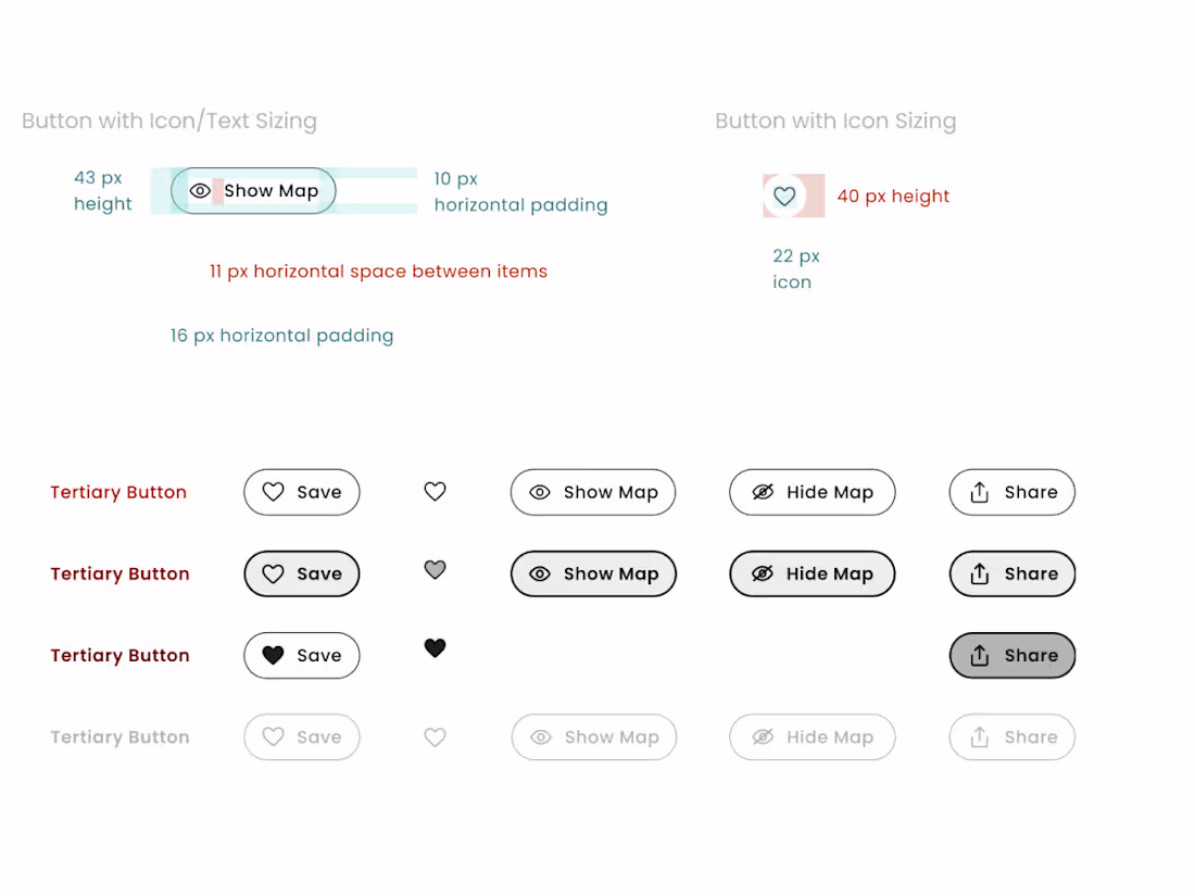
Figma Component Library Overview
A comprehensive collection of UI components designed to meet your product’s unique requirements. It serves as the backbone for building a consistent and cohesive user experience.
Typography & Color Systems
A structured typography system with scalable fonts, styles, and clear usage guidelines for headings, body text, and captions. Paired with an accessible color palette, including primary, secondary, and tertiary colors, this ensures consistency and accessibility across all UI elements.
Design Tokens & Variables
A set of reusable design tokens standardizing key properties like colors, typography, and spacing. These variables help maintain consistency and efficiency across all designs.
Component Interaction Guidelines
Documentation that outlines the interaction behavior of each component, ensuring a seamless and cohesive user experience across the entire interface.
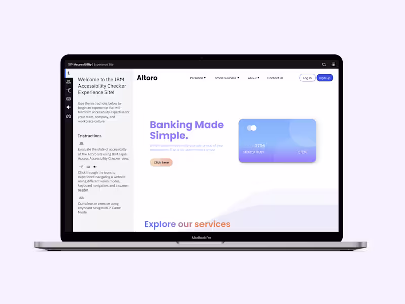
Design Patterns & Layouts
A library of common design patterns and essential screens, such as login and signup pages, which accelerate both the design and development process while maintaining visual consistency.
Documentation & Best Practices
Comprehensive guidelines on how to effectively implement and use the design system. This section includes detailed examples and best practices for both designers and developers.
Kiera's other services
Starting at$35 /hr
Tags
Adobe XD
Elementor
Figma
Design Systems Specialist
UX Designer
Web Designer
Service provided by
Kiera Perryman Boston, USA
- 1
- Followers
Creating a Design System from ScratchKiera Perryman
Starting at$35 /hr
Tags
Adobe XD
Elementor
Figma
Design Systems Specialist
UX Designer
Web Designer
A design system can be a transformative tool when building a digital product. It ensures consistent design across your platform, especially when multiple designers or teams are involved, and significantly accelerates the design process.
If you're finding it difficult to keep your designs consistent or you're looking to create a strong design foundation from scratch, I can assist you.
I will craft a custom library of reusable UI components in Figma, specifically tailored to meet your product's unique needs. With my experience in accessibility, I ensure that every component is inclusive and meets accessibility standards, making your product usable for everyone.
What's included
Figma Component Library Overview
A comprehensive collection of UI components designed to meet your product’s unique requirements. It serves as the backbone for building a consistent and cohesive user experience.
Typography & Color Systems
A structured typography system with scalable fonts, styles, and clear usage guidelines for headings, body text, and captions. Paired with an accessible color palette, including primary, secondary, and tertiary colors, this ensures consistency and accessibility across all UI elements.
Design Tokens & Variables
A set of reusable design tokens standardizing key properties like colors, typography, and spacing. These variables help maintain consistency and efficiency across all designs.
Component Interaction Guidelines
Documentation that outlines the interaction behavior of each component, ensuring a seamless and cohesive user experience across the entire interface.
Design Patterns & Layouts
A library of common design patterns and essential screens, such as login and signup pages, which accelerate both the design and development process while maintaining visual consistency.
Documentation & Best Practices
Comprehensive guidelines on how to effectively implement and use the design system. This section includes detailed examples and best practices for both designers and developers.
Kiera's other services
$35 /hr