
Website & Mobile UI Design: Where Creativity Meets Usability🔥💻Rabiya Ijaz
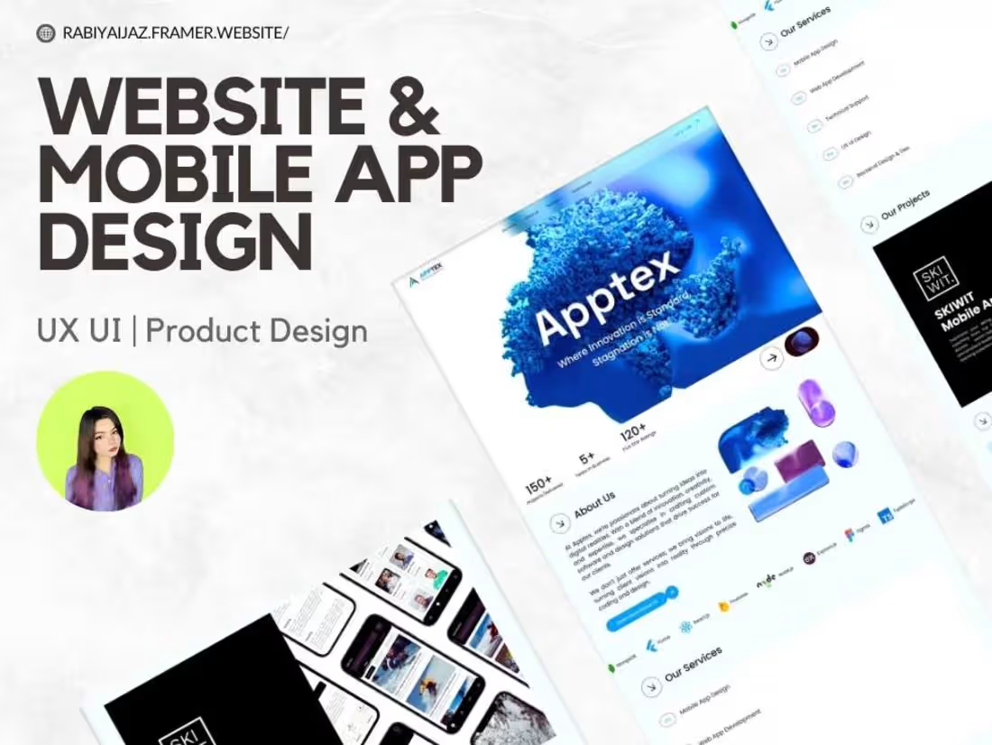
I craft eye-catching websites and mobile app designs that not only turn heads but also keep users hooked. My secret sauce? A blend of sharp design skills and a sprinkle of fun, making the whole process as enjoyable as the final product. Stand out with a design that beyond expectations!
What's included
Website Design Deliverables
Design Concept 🎨
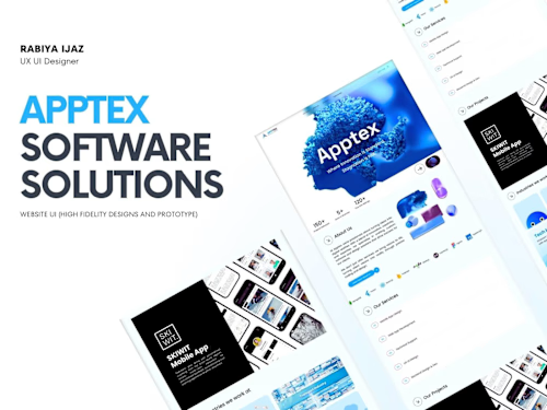
The design concept captures the overall visual style of the website, including the chosen colour palette, typography, and imagery. This serves as the foundation for the website’s look and feel, ensuring a cohesive and appealing user experience.
Wireframes 🗺️
Wireframes provide a clear visual guide of the website's layout and structure. They map out where key elements such as buttons, images, and text will be placed, helping to visualize user flow and functionality before the design is fully developed.
Design Files 💻
These are the complete and fully designed versions of the website’s structure, including every detail such as text, images, and interactive components like buttons. This is what will be handed off for the next phase: development.
Development Package 📦
The development package includes all the assets needed to bring the design to life, such as optimized photos, icons, and the HTML/CSS code. This ensures that the transition from design to development is smooth and efficient.
Responsive Design 📱💻
Responsive design ensures that the website is adaptable and looks great on every device, from smartphones to desktop computers. This guarantees that users will have an optimal experience no matter how they access the site.
User Testing 🧪
User testing is a critical phase where the website is evaluated for usability. We’ll test how real users interact with the site, making sure it's easy to navigate, functional, and provides a seamless experience.
Website Pages 📄
The current package includes the following essential pages:
✅ Homepage
✅ About Page
✅ Services Page
✅ Blog + Post Page
✅ Contact Us Page
Additional pages can be discussed and quoted based on your needs.
Mobile App Design Deliverables
Design Concept 🎨
The design concept will set the overall visual style for the mobile app, outlining key elements such as the colour palette, typography, and imagery. This stage ensures that the app has a cohesive and appealing aesthetic that aligns with its purpose.
Wireframes 🗺️
Wireframes provide a clear visual layout of the app’s structure. These serve as the blueprint for the app, showing the placement of key elements like buttons, text, and images, as well as how users will navigate through the interface.
Design Files 📱
The fully designed screens of the app’s user interface will include all necessary elements such as text, images, and buttons, ensuring that each screen is ready for development. Every detail is fine-tuned to create a polished, user-friendly experience.
Development Package 📦
The development package contains all the assets needed to build the app, such as icons, images, and development-ready design files. This also includes essential code snippets like CSS or style guides to ensure smooth implementation.
Responsive Design 📱📐
The app's design is optimized for different mobile devices, making sure that it looks great and functions smoothly on various screen sizes, whether it's on a smartphone or tablet.
User Testing 🧪
We will conduct thorough user testing to ensure that the app provides an intuitive, seamless experience. By gathering real user feedback, we’ll refine any issues with usability and interaction, ensuring an optimized user journey.
App Screens 📲
The main app design includes the following key screens:
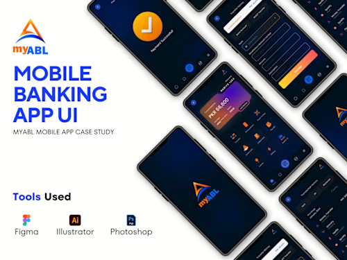
✅ Splash Screen – The first impression screen, introducing the app’s branding.
✅ Login & Signup Screen – For new users to sign up and existing users to log in effortlessly.
✅ Home Screen – The central hub, providing access to core app features and a clear navigation flow.
✅ Profile Screen – Allowing users to view and edit their personal information.
✅ Settings Screen – Where users can adjust preferences and app settings.
Additional screens, if needed, can be quoted separately.
Example work
Rabiya's other services
Starting at$20 /hr
Tags
Adobe Illustrator

Adobe Photoshop

Figma

Framer

UI Designer
UX Designer
Web Designer
Service provided by
Rabiya Ijaz Peshawar, Pakistan
Website & Mobile UI Design: Where Creativity Meets Usability🔥💻Rabiya Ijaz
Starting at$20 /hr
Tags
Adobe Illustrator
Adobe Photoshop
Figma
Framer
UI Designer
UX Designer
Web Designer
I craft eye-catching websites and mobile app designs that not only turn heads but also keep users hooked. My secret sauce? A blend of sharp design skills and a sprinkle of fun, making the whole process as enjoyable as the final product. Stand out with a design that beyond expectations!
What's included
Website Design Deliverables
Design Concept 🎨
The design concept captures the overall visual style of the website, including the chosen colour palette, typography, and imagery. This serves as the foundation for the website’s look and feel, ensuring a cohesive and appealing user experience.
Wireframes 🗺️
Wireframes provide a clear visual guide of the website's layout and structure. They map out where key elements such as buttons, images, and text will be placed, helping to visualize user flow and functionality before the design is fully developed.
Design Files 💻
These are the complete and fully designed versions of the website’s structure, including every detail such as text, images, and interactive components like buttons. This is what will be handed off for the next phase: development.
Development Package 📦
The development package includes all the assets needed to bring the design to life, such as optimized photos, icons, and the HTML/CSS code. This ensures that the transition from design to development is smooth and efficient.
Responsive Design 📱💻
Responsive design ensures that the website is adaptable and looks great on every device, from smartphones to desktop computers. This guarantees that users will have an optimal experience no matter how they access the site.
User Testing 🧪
User testing is a critical phase where the website is evaluated for usability. We’ll test how real users interact with the site, making sure it's easy to navigate, functional, and provides a seamless experience.
Website Pages 📄
The current package includes the following essential pages:
✅ Homepage
✅ About Page
✅ Services Page
✅ Blog + Post Page
✅ Contact Us Page
Additional pages can be discussed and quoted based on your needs.
Mobile App Design Deliverables
Design Concept 🎨
The design concept will set the overall visual style for the mobile app, outlining key elements such as the colour palette, typography, and imagery. This stage ensures that the app has a cohesive and appealing aesthetic that aligns with its purpose.
Wireframes 🗺️
Wireframes provide a clear visual layout of the app’s structure. These serve as the blueprint for the app, showing the placement of key elements like buttons, text, and images, as well as how users will navigate through the interface.
Design Files 📱
The fully designed screens of the app’s user interface will include all necessary elements such as text, images, and buttons, ensuring that each screen is ready for development. Every detail is fine-tuned to create a polished, user-friendly experience.
Development Package 📦
The development package contains all the assets needed to build the app, such as icons, images, and development-ready design files. This also includes essential code snippets like CSS or style guides to ensure smooth implementation.
Responsive Design 📱📐
The app's design is optimized for different mobile devices, making sure that it looks great and functions smoothly on various screen sizes, whether it's on a smartphone or tablet.
User Testing 🧪
We will conduct thorough user testing to ensure that the app provides an intuitive, seamless experience. By gathering real user feedback, we’ll refine any issues with usability and interaction, ensuring an optimized user journey.
App Screens 📲
The main app design includes the following key screens:
✅ Splash Screen – The first impression screen, introducing the app’s branding.
✅ Login & Signup Screen – For new users to sign up and existing users to log in effortlessly.
✅ Home Screen – The central hub, providing access to core app features and a clear navigation flow.
✅ Profile Screen – Allowing users to view and edit their personal information.
✅ Settings Screen – Where users can adjust preferences and app settings.
Additional screens, if needed, can be quoted separately.
Example work
Rabiya's other services
$20 /hr