
Figma Design Systems & Reusable UI Component LibraryAhmed Arslan
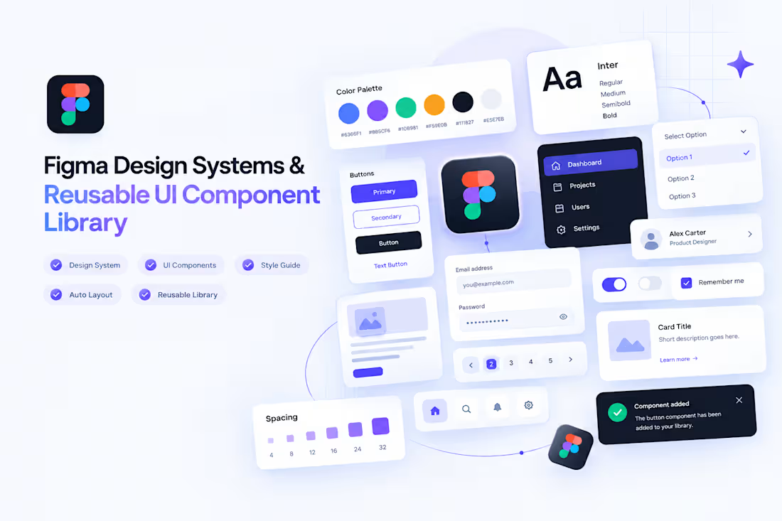
Figma Design Systems & Reusable UI Component Library
Need a consistent UI design that can scale as your product grows? I'll organize your Figma designs into a reusable component library with clear styles, consistent layouts, and structured design foundations.
I create Figma design systems, reusable UI components, component libraries, and scalable interface foundations for websites, SaaS dashboards, web applications, and digital products.
Whether you're starting a new product or improving an existing Figma file, I'll help establish visual consistency and make future UI design work more efficient.
Figma Design System Services
Reusable UI Components
Create reusable buttons, input fields, form elements, cards, navigation items, badges, and other interface components.
Figma Component Library
Organize components into a structured Figma library so your team can reuse consistent UI elements across multiple screens.
Typography & Color Styles
Define consistent color palettes, typography styles, spacing rules, borders, shadows, and other core visual styles.
Auto Layout & Component Variants
Use Figma Auto Layout, component properties, and variants where appropriate to make components easier to reuse and adapt.
SaaS & Dashboard UI Systems
Create reusable interface foundations for SaaS platforms, admin panels, analytics dashboards, and web applications.
Existing Figma File Organization
Improve an existing design file by organizing components, standardizing styles, and making the library easier to navigate.
What's Included
Core color and typography styles
Consistent spacing and visual rules
Up to 10 reusable UI components
Component variants where appropriate
Figma Auto Layout setup
Organized component naming and grouping
A structured, reusable Figma library
Basic usage notes for the delivered components
My Design System Process
Review: Understand your product, existing Figma files, and visual requirements.
Define: Establish core styles and consistent visual foundations.
Build: Create reusable components and appropriate variants.
Organize: Structure the Figma library with clear names and groupings.
Deliver: Provide the organized Figma file and basic usage notes.
Starter Package — $35
Get a small, organized Figma UI library to establish consistency in your interface design.
Includes:
Core color and typography styles
Up to 10 reusable UI components
Auto Layout where appropriate
Basic component variants where needed
An organized Figma library
Basic usage notes
Estimated delivery: 1 week.
Large enterprise design systems, extensive documentation, hundreds of components, coded React component libraries, and complex multi-brand systems require a custom quote.
Tools & Design Practices
Figma, Auto Layout, components, variants, reusable UI patterns, typography systems, color styles, and component libraries.
Let's Build a More Consistent UI
Looking for a Figma designer to create a reusable design system or organize your existing component library? Share your Figma file, product requirements, and the components you need, and let's build a consistent foundation for your digital product.
FAQs
Ahmed's other services

Starting at$35
Duration1 week
Tags
FigJam

Figma
styled-components
Design Systems Specialist
Product Designer
Design
Component libraries
UI kits
UI/UX Designer
Service provided by
Ahmed Arslan Lahore, Pakistan
- 1
- Followers
Figma Design Systems & Reusable UI Component LibraryAhmed Arslan
Starting at$35
Duration1 week
Tags
FigJam
Figma
styled-components
Design Systems Specialist
Product Designer
Design
Component libraries
UI kits
UI/UX Designer
Figma Design Systems & Reusable UI Component Library
Need a consistent UI design that can scale as your product grows? I'll organize your Figma designs into a reusable component library with clear styles, consistent layouts, and structured design foundations.
I create Figma design systems, reusable UI components, component libraries, and scalable interface foundations for websites, SaaS dashboards, web applications, and digital products.
Whether you're starting a new product or improving an existing Figma file, I'll help establish visual consistency and make future UI design work more efficient.
Figma Design System Services
Reusable UI Components
Create reusable buttons, input fields, form elements, cards, navigation items, badges, and other interface components.
Figma Component Library
Organize components into a structured Figma library so your team can reuse consistent UI elements across multiple screens.
Typography & Color Styles
Define consistent color palettes, typography styles, spacing rules, borders, shadows, and other core visual styles.
Auto Layout & Component Variants
Use Figma Auto Layout, component properties, and variants where appropriate to make components easier to reuse and adapt.
SaaS & Dashboard UI Systems
Create reusable interface foundations for SaaS platforms, admin panels, analytics dashboards, and web applications.
Existing Figma File Organization
Improve an existing design file by organizing components, standardizing styles, and making the library easier to navigate.
What's Included
Core color and typography styles
Consistent spacing and visual rules
Up to 10 reusable UI components
Component variants where appropriate
Figma Auto Layout setup
Organized component naming and grouping
A structured, reusable Figma library
Basic usage notes for the delivered components
My Design System Process
Review: Understand your product, existing Figma files, and visual requirements.
Define: Establish core styles and consistent visual foundations.
Build: Create reusable components and appropriate variants.
Organize: Structure the Figma library with clear names and groupings.
Deliver: Provide the organized Figma file and basic usage notes.
Starter Package — $35
Get a small, organized Figma UI library to establish consistency in your interface design.
Includes:
Core color and typography styles
Up to 10 reusable UI components
Auto Layout where appropriate
Basic component variants where needed
An organized Figma library
Basic usage notes
Estimated delivery: 1 week.
Large enterprise design systems, extensive documentation, hundreds of components, coded React component libraries, and complex multi-brand systems require a custom quote.
Tools & Design Practices
Figma, Auto Layout, components, variants, reusable UI patterns, typography systems, color styles, and component libraries.
Let's Build a More Consistent UI
Looking for a Figma designer to create a reusable design system or organize your existing component library? Share your Figma file, product requirements, and the components you need, and let's build a consistent foundation for your digital product.
FAQs
Ahmed's other services
$35