
Web application designOlayinka Fadare

I design intuitive, scalable web applications that connect user needs with business goals. With 6+ years of experience in UX and AI-driven design, I create digital products that are both visually engaging and strategically impactful and turn complex ideas into seamless user experiences.
What's included
Information Architecture
A clear structure showing how content and features are organized to ensure easy navigation and usability.
User Flows & Wireframes
Low-fidelity visuals mapping out user journeys and page layouts to validate functionality early on.
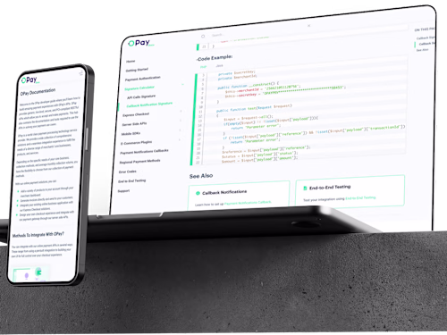
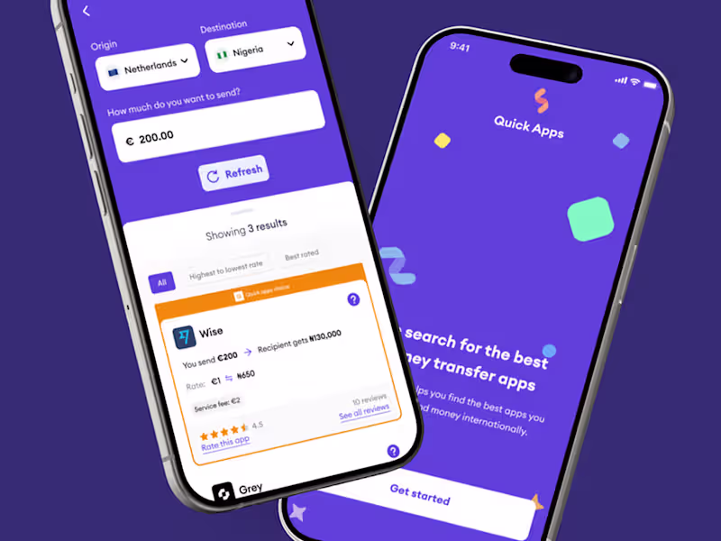
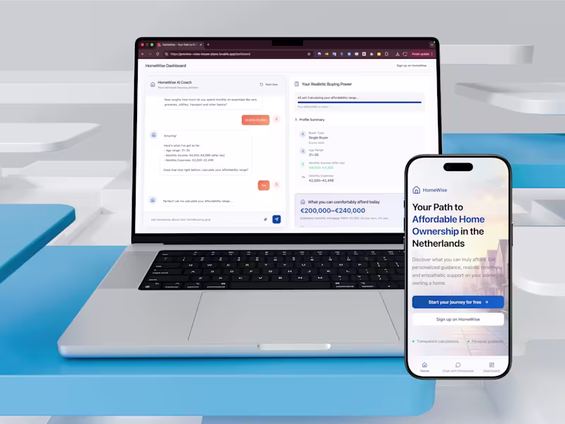
High-Fidelity UI Designs
Pixel-perfect, accessible, and responsive screen designs built in Figma, ready for review.
Interactive Prototype
Clickable prototype demonstrating interactions, animations, and overall product experience.
Design System / Style Guide
A reusable component library with guidelines for typography, colors, icons, and UI patterns to maintain consistency.
Developer Handoff Package
All design files, specs, and assets organized for smooth collaboration with your dev team.
Example work


Olayinka's other services
Contact for pricing
Tags
Figma
Miro
Sketch
Product Designer
UX Designer
Web Designer
Service provided by
Olayinka Fadare Amsterdam, Netherlands
- 1
- Followers
Web application designOlayinka Fadare
Contact for pricing
Tags
Figma
Miro
Sketch
Product Designer
UX Designer
Web Designer
I design intuitive, scalable web applications that connect user needs with business goals. With 6+ years of experience in UX and AI-driven design, I create digital products that are both visually engaging and strategically impactful and turn complex ideas into seamless user experiences.
What's included
Information Architecture
A clear structure showing how content and features are organized to ensure easy navigation and usability.
User Flows & Wireframes
Low-fidelity visuals mapping out user journeys and page layouts to validate functionality early on.
High-Fidelity UI Designs
Pixel-perfect, accessible, and responsive screen designs built in Figma, ready for review.
Interactive Prototype
Clickable prototype demonstrating interactions, animations, and overall product experience.
Design System / Style Guide
A reusable component library with guidelines for typography, colors, icons, and UI patterns to maintain consistency.
Developer Handoff Package
All design files, specs, and assets organized for smooth collaboration with your dev team.
Example work
Olayinka's other services
Contact for pricing