
Full Resposive Figma UX/UI DesignBenhur Troche
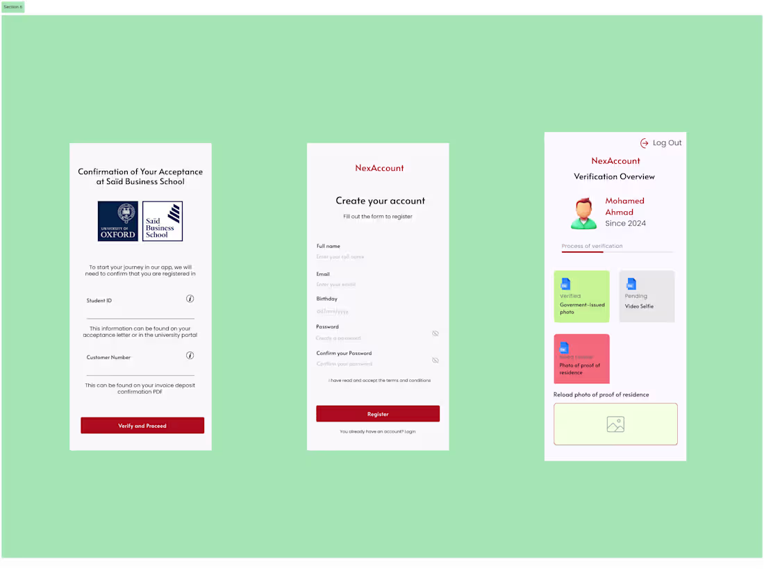
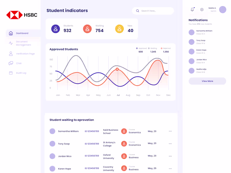
Responsive app design and interactive prototype crafted in Figma, fully optimized for desktop, tablet, and mobile. I will transform your idea into a clean, modern, and user-friendly interface that adapts perfectly to any screen size.
What you get:
High-quality responsive UX/UI for desktop, tablet, and mobile
Interactive Figma prototype showing the full user flow
Scalable design system & components
Consistent layouts across all breakpoints
Developer-ready Figma file, neatly organized and easy to implement
Ideal for SaaS platforms, dashboards, multi-device apps, and any product that needs a seamless experience across all screens.
What's included
Complete Responsive Design
Desktop version
Tablet version
Mobile version
Full adaptation of all components and sections for each breakpoint
Interactive Prototype
Fully clickable user flow in Figma
Smooth animations and transitions where needed
Functional preview of the full user experience
UI Kit / Design System
Color palette
Typography styles
Reusable components (buttons, inputs, cards, navbars, etc.)
Spacing, grid, and style rules
Proper Auto Layout setup
Variants for all states (hover, focus, disabled, etc.)
Organized Visual Architecture
Clean, structured, and professionally named frames
Layers organized by sections
Consistent use of global styles
A scalable system ready for future screens
Asset Export
Icons, logos, and images prepared for development
Export in PNG / SVG when required
Developer-Ready File
Figma file prepared for handoff (inspection, spacing, tokens)
Clear structure for an easy development phase
Breakpoint and responsive rules fully documented
Benhur's other services
Starting at$500
Duration1 week
Tags
Figma
UI Designer
UX Designer
Web Designer
Service provided by
Benhur Troche proObligado, Paraguay
- 15
- Followers
Full Resposive Figma UX/UI DesignBenhur Troche
Starting at$500
Duration1 week
Tags
Figma
UI Designer
UX Designer
Web Designer
Responsive app design and interactive prototype crafted in Figma, fully optimized for desktop, tablet, and mobile. I will transform your idea into a clean, modern, and user-friendly interface that adapts perfectly to any screen size.
What you get:
High-quality responsive UX/UI for desktop, tablet, and mobile
Interactive Figma prototype showing the full user flow
Scalable design system & components
Consistent layouts across all breakpoints
Developer-ready Figma file, neatly organized and easy to implement
Ideal for SaaS platforms, dashboards, multi-device apps, and any product that needs a seamless experience across all screens.
What's included
Complete Responsive Design
Desktop version
Tablet version
Mobile version
Full adaptation of all components and sections for each breakpoint
Interactive Prototype
Fully clickable user flow in Figma
Smooth animations and transitions where needed
Functional preview of the full user experience
UI Kit / Design System
Color palette
Typography styles
Reusable components (buttons, inputs, cards, navbars, etc.)
Spacing, grid, and style rules
Proper Auto Layout setup
Variants for all states (hover, focus, disabled, etc.)
Organized Visual Architecture
Clean, structured, and professionally named frames
Layers organized by sections
Consistent use of global styles
A scalable system ready for future screens
Asset Export
Icons, logos, and images prepared for development
Export in PNG / SVG when required
Developer-Ready File
Figma file prepared for handoff (inspection, spacing, tokens)
Clear structure for an easy development phase
Breakpoint and responsive rules fully documented
Benhur's other services
$500