
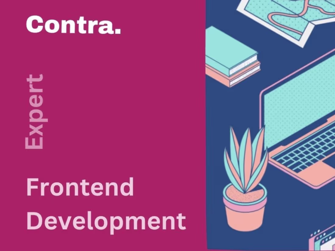
Fully-functional pixel-perfect Frontend DevelopmentOghenenyoreme Chadere
Oghenenyoreme will provide you a fully functional website, web application that looks beautiful and arranged on mobile phones and large screen sizes.
This web application Integrates well with your backend API if any and also uses analytics software to manage how users interact with the website along with Search Engine Optimization to reach a wider audience.
Oghenenyoreme now deploys your website with a low cost infrastructure so that you can serve your customer base but also save infrastructure costs because of the service I will choose to host the web app.
What's included
Create Mobile First Frontend Website
Here, you will get a website which is already fully functional and working on mobile phones. This is what is known as responsiveness.
More than 60% of people browsing the web, browse with their mobile devices, so for a web application to reach a wide audience, it has to work and look well on mobile and for some, this is the hardest part.
But this is the point where I deliver a mobile-first web app for you without hassle.
At this point, your web application or website will look like the way it was designed, either in Figma, AdobeXD, sketch or other designing tools but only for mobile phone sizes.
All screens of website looking pixel perfect
We have now finished making it look good on mobile, this deliverable will now get you a web application looking real good, exactly the way it was designed for bigger screen sizes, like your laptop, your desktop and other larger screens.
API Integration
Do you have a Backend already built for the application or one underway?
This deliverable is the part where your web app now integrates seamlessly with the backend, calls the API and makes the app fully functional.
SEO, CMS and Analytics
Your web application is now working, it is now beautiful on both mobile and larger screens and is also integrated with your backend API.
Now time for Search Engine Optimization, let's get your website discovered by people on Google and reach a wider audience.
In addition to using semantic HTML and other technical SEO tools another thing that helps SEO is a blog or a help page, we will implement that using a Modern Content Management System where you can write articles and the code automatically pulls in updates.
On This part of the deliverable, I will also integrate analytics software for you, to see live data of people browsing your website, which pages they view the most, the average time they spend on the site, buttons they click and many more useful data to track your progress.
Finishing Touches and Deployment
What remains? In coding, sometimes code might get dirty but they still work.
So this is the part of the deliverable where I clean up any dirty code I might not have cleaned up before and also use better Coding principles for places where I might have skipped them.
After that comes the biggest and most joyful part of the journey.
Your application goes live.
Your Application is now fully functional with all benefits, now is the time where your application launches so that people can discover it.
Oghenenyoreme's other services
Starting at$75 /hr
Tags
Adobe XD
Figma
Next.js
TypeScript
Vue.js
Frontend Engineer
UX Designer
Web Developer
Service provided by
Oghenenyoreme Chadere Lagos, Nigeria
- $1k+
- Earned
- 2
- Paid projects
- 5.00
- Rating
- 7
- Followers
Fully-functional pixel-perfect Frontend DevelopmentOghenenyoreme Chadere
Starting at$75 /hr
Tags
Adobe XD
Figma
Next.js
TypeScript
Vue.js
Frontend Engineer
UX Designer
Web Developer
Oghenenyoreme will provide you a fully functional website, web application that looks beautiful and arranged on mobile phones and large screen sizes.
This web application Integrates well with your backend API if any and also uses analytics software to manage how users interact with the website along with Search Engine Optimization to reach a wider audience.
Oghenenyoreme now deploys your website with a low cost infrastructure so that you can serve your customer base but also save infrastructure costs because of the service I will choose to host the web app.
What's included
Create Mobile First Frontend Website
Here, you will get a website which is already fully functional and working on mobile phones. This is what is known as responsiveness.
More than 60% of people browsing the web, browse with their mobile devices, so for a web application to reach a wide audience, it has to work and look well on mobile and for some, this is the hardest part.
But this is the point where I deliver a mobile-first web app for you without hassle.
At this point, your web application or website will look like the way it was designed, either in Figma, AdobeXD, sketch or other designing tools but only for mobile phone sizes.
All screens of website looking pixel perfect
We have now finished making it look good on mobile, this deliverable will now get you a web application looking real good, exactly the way it was designed for bigger screen sizes, like your laptop, your desktop and other larger screens.
API Integration
Do you have a Backend already built for the application or one underway?
This deliverable is the part where your web app now integrates seamlessly with the backend, calls the API and makes the app fully functional.
SEO, CMS and Analytics
Your web application is now working, it is now beautiful on both mobile and larger screens and is also integrated with your backend API.
Now time for Search Engine Optimization, let's get your website discovered by people on Google and reach a wider audience.
In addition to using semantic HTML and other technical SEO tools another thing that helps SEO is a blog or a help page, we will implement that using a Modern Content Management System where you can write articles and the code automatically pulls in updates.
On This part of the deliverable, I will also integrate analytics software for you, to see live data of people browsing your website, which pages they view the most, the average time they spend on the site, buttons they click and many more useful data to track your progress.
Finishing Touches and Deployment
What remains? In coding, sometimes code might get dirty but they still work.
So this is the part of the deliverable where I clean up any dirty code I might not have cleaned up before and also use better Coding principles for places where I might have skipped them.
After that comes the biggest and most joyful part of the journey.
Your application goes live.
Your Application is now fully functional with all benefits, now is the time where your application launches so that people can discover it.
Oghenenyoreme's other services
$75 /hr