
Landing Page — Design & DevelopmentDasha Dzisko
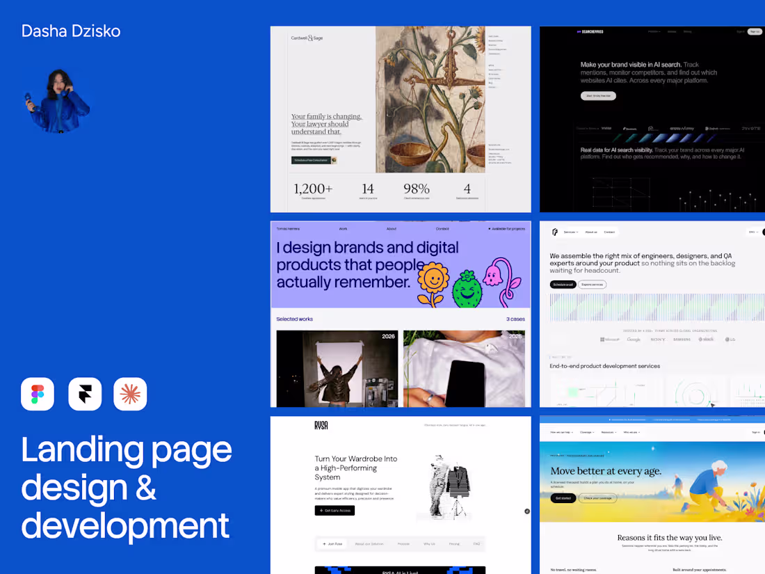
I’ve spent the last 5 years working with growth teams across B2B, B2C, and mixed acquisition models, so the work is informed by activation and conversion strategy.
The process starts in Figma with a high-fidelity design system (semantic tokens, breakpoints) and clear content hierarchy. From there, the site is built either in Framer or as a custom-coded frontend using Claude Code + a structured
design.md workflow when the project needs more flexibility or long-term scalability.My approach:
define the user path (entry points, traffic sources, activation triggers)
structure the page around decision-making
remove friction
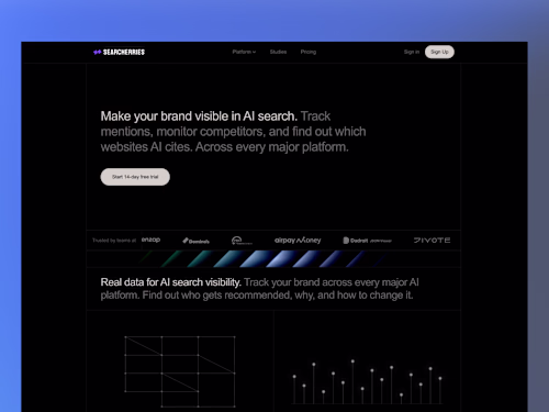
build visuals that feel current, clear, and aligned with the brand
The CRO side doesn’t come at the expense of design.
The goal is still to make the page look sharp, modern, and distinctive — just without sacrificing usability or clarity to get there.
What’s included:
High-fidelity UI design in Figma
CRO-focused landing page structure
Framer development or custom frontend build
Responsive implementation across devices
Motion and interactions where they improve usability
Performance optimization
SEO and analytics setup if needed
Scalable structure for future expansion
What development path to choose:
Figma file only if you already have an internal developer team or just need the design system, page structure, and UI direction without implementation.
Framer works well for fast iteration, marketing sites, and teams that want to edit content internally without relying on developers.
Custom code is better when the site needs tighter control, more complexity, product-specific interactions, or room to scale beyond a standard marketing setup.
Good fit for:
SaaS
AI products
product launches
paid acquisition landing pages
teams improving activation or signup conversion
The outcome is a landing page that looks modern, fits the brand properly, and is built around conversion from the start.

Starting at$2,500
Duration3 weeks
Tags
Claude
Figma
Framer
Brand Designer
Visual Designer
Web Designer
Web Developer
Service provided by
Dasha Dzisko proPoznań, Poland
- 1
- Paid projects
- 3
- Followers
Landing Page — Design & DevelopmentDasha Dzisko
Starting at$2,500
Duration3 weeks
Tags
Claude
Figma
Framer
Brand Designer
Visual Designer
Web Designer
Web Developer
I’ve spent the last 5 years working with growth teams across B2B, B2C, and mixed acquisition models, so the work is informed by activation and conversion strategy.
The process starts in Figma with a high-fidelity design system (semantic tokens, breakpoints) and clear content hierarchy. From there, the site is built either in Framer or as a custom-coded frontend using Claude Code + a structured
design.md workflow when the project needs more flexibility or long-term scalability.My approach:
define the user path (entry points, traffic sources, activation triggers)
structure the page around decision-making
remove friction
build visuals that feel current, clear, and aligned with the brand
The CRO side doesn’t come at the expense of design.
The goal is still to make the page look sharp, modern, and distinctive — just without sacrificing usability or clarity to get there.
What’s included:
High-fidelity UI design in Figma
CRO-focused landing page structure
Framer development or custom frontend build
Responsive implementation across devices
Motion and interactions where they improve usability
Performance optimization
SEO and analytics setup if needed
Scalable structure for future expansion
What development path to choose:
Figma file only if you already have an internal developer team or just need the design system, page structure, and UI direction without implementation.
Framer works well for fast iteration, marketing sites, and teams that want to edit content internally without relying on developers.
Custom code is better when the site needs tighter control, more complexity, product-specific interactions, or room to scale beyond a standard marketing setup.
Good fit for:
SaaS
AI products
product launches
paid acquisition landing pages
teams improving activation or signup conversion
The outcome is a landing page that looks modern, fits the brand properly, and is built around conversion from the start.
$2,500