
Hero Section RevampKhadijah (Dija) 💥
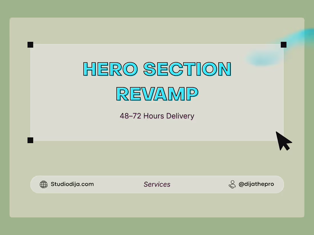
Most visitors decide within seconds if your product is worth their time.
If your hero section is unclear, cluttered, or generic, they leave.
This service focuses on redesigning your hero section so users instantly understand:
What your product does
Who it’s for
Why it matters
We simplify your message, improve visual hierarchy, and guide users toward action without overcomplicating your design.
Why This Converts Better
👉 Calls out the real fear: “people are leaving my site”
👉 Speaks in outcomes, not design terms
👉 Feels product-focused, not decorative
What You Get
Desktop + Mobile hero redesign
Clear value-focused layout
Strong CTA placement
Improved visual hierarchy
1–2 design directions
Figma source file
FREE Source code
1 revision
FAQs
Example work

Khadijah (Dija)'s other services
Starting at$249
Duration1 week
Tags
Figma
Landing Page
UI Designer
UX Designer
Conversion Design
SaaS
Service provided by
Khadijah (Dija) 💥 proLagos, Nigeria
- 2
- Paid projects
- 52
- Followers
Hero Section RevampKhadijah (Dija) 💥
Starting at$249
Duration1 week
Tags
Figma
Landing Page
UI Designer
UX Designer
Conversion Design
SaaS
Most visitors decide within seconds if your product is worth their time.
If your hero section is unclear, cluttered, or generic, they leave.
This service focuses on redesigning your hero section so users instantly understand:
What your product does
Who it’s for
Why it matters
We simplify your message, improve visual hierarchy, and guide users toward action without overcomplicating your design.
Why This Converts Better
👉 Calls out the real fear: “people are leaving my site”
👉 Speaks in outcomes, not design terms
👉 Feels product-focused, not decorative
What You Get
Desktop + Mobile hero redesign
Clear value-focused layout
Strong CTA placement
Improved visual hierarchy
1–2 design directions
Figma source file
FREE Source code
1 revision
FAQs
Example work
Khadijah (Dija)'s other services
$249