
Data Visualization, Reporting and ChartingOluwatomisin Bamidele
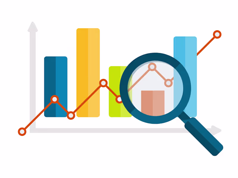
Creation of compelling, interactive data visualizations and comprehensive reports to transform your raw data into meaningful insights. Using state-of-the-art tools and techniques, I will design visualizations that highlight trends, uncover patterns, and support data-driven decision-making.
What's included
Cleaned and Prepared Dataset
A dataset that has been cleaned and preprocessed to ensure it is in the optimal format for creating accurate visualizations.
Formats: CSV, Excel, or as specified.
Interactive Dashboards
User-friendly interactive dashboards created using tools like Tableau, Power BI, or Python libraries. These dashboards will include filters, drill-down capabilities, and various views to explore the data dynamically.
Formats: Tableau/Power BI files or HTML for web-based dashboards.
Documentation and User Guide
Detailed documentation and a user guide explaining how to use and interact with the visualizations and dashboards. This includes instructions for any custom features or filters.
Formats: PDF.
Final Project Package
A consolidated package of all final deliverables, including the cleaned dataset, interactive dashboards, static visualizations, comprehensive report, and documentation. This ensures the client has all necessary materials in one place.
Formats: ZIP file or google drive link
FAQs
Oluwatomisin's other services

Starting at$200
Duration2 weeks
Tags
D3.js
Matplotlib
Microsoft Power BI
TensorFlow
three.js
Data Analyst
Data Scientist
Data Visualizer
Service provided by
Oluwatomisin Bamidele London, UK
Data Visualization, Reporting and ChartingOluwatomisin Bamidele
Starting at$200
Duration2 weeks
Tags
D3.js
Matplotlib
Microsoft Power BI
TensorFlow
three.js
Data Analyst
Data Scientist
Data Visualizer
Creation of compelling, interactive data visualizations and comprehensive reports to transform your raw data into meaningful insights. Using state-of-the-art tools and techniques, I will design visualizations that highlight trends, uncover patterns, and support data-driven decision-making.
What's included
Cleaned and Prepared Dataset
A dataset that has been cleaned and preprocessed to ensure it is in the optimal format for creating accurate visualizations.
Formats: CSV, Excel, or as specified.
Interactive Dashboards
User-friendly interactive dashboards created using tools like Tableau, Power BI, or Python libraries. These dashboards will include filters, drill-down capabilities, and various views to explore the data dynamically.
Formats: Tableau/Power BI files or HTML for web-based dashboards.
Documentation and User Guide
Detailed documentation and a user guide explaining how to use and interact with the visualizations and dashboards. This includes instructions for any custom features or filters.
Formats: PDF.
Final Project Package
A consolidated package of all final deliverables, including the cleaned dataset, interactive dashboards, static visualizations, comprehensive report, and documentation. This ensures the client has all necessary materials in one place.
Formats: ZIP file or google drive link
FAQs
Oluwatomisin's other services
$200