
Mobile App DesignDarshan Jiyani
Wireframes: These are basic, black-and-white sketches of the app's layout and user interface. They show the placement of buttons, text, and images, and give an idea of the app's flow.
Mockups: These are more detailed visual representations of the app's design. They may include color, typography, and other visual elements that give a sense of the app's overall look and feel.
Interactive Prototypes: These are functional models of the app that allow users to click through the different screens and interact with the app's features. This can help designers and developers test the user experience and identify any issues before the app is fully built.
Style Guides: These documents establish the visual and design standards for the app. They outline things like color schemes, typography, and iconography, and ensure that the app has a consistent look and feel across all screens.
Design Specifications: These documents provide detailed instructions to developers about how to build the app's design. They may include information on things like spacing, typography, and color codes.
User Flow Diagrams: These are visual representations of how a user moves through the app's features and screens. They can help designers and developers ensure that the app is easy to navigate and that users can quickly find the information they need.
Asset Library: This is a collection of visual assets that can be used in the app's design, such as icons, images, and animations.
What's included
Wireframes:
These are basic, black-and-white sketches of the app's layout and user interface. They show the placement of buttons, text, and images, and give an idea of the app's flow.
Mockups:
These are more detailed visual representations of the app's design. They may include color, typography, and other visual elements that give a sense of the app's overall look and feel.
Interactive Prototypes:
These are functional models of the app that allow users to click through the different screens and interact with the app's features. This can help designers and developers test the user experience and identify any issues before the app is fully built.
Style Guides:
These documents establish the visual and design standards for the app. They outline things like color schemes, typography, and iconography, and ensure that the app has a consistent look and feel across all screens.
Design Specifications:
These documents provide detailed instructions to developers about how to build the app's design. They may include information on things like spacing, typography, and color codes.
User Flow Diagrams:
These are visual representations of how a user moves through the app's features and screens. They can help designers and developers ensure that the app is easy to navigate and that users can quickly find the information they need.
Asset Library:
This is a collection of visual assets that can be used in the app's design, such as icons, images, and animations.
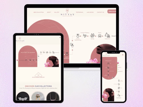
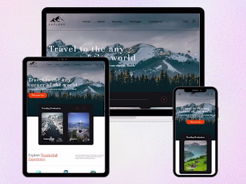
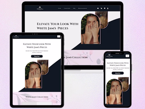
Example work
Darshan's other services

Contact for pricing
Tags
Figma
Notion
ProtoPie
Brand Designer
UX Designer
Visual Designer
Service provided by
Darshan Jiyani Surat, India
Mobile App DesignDarshan Jiyani
Contact for pricing
Tags
Figma
Notion
ProtoPie
Brand Designer
UX Designer
Visual Designer
Wireframes: These are basic, black-and-white sketches of the app's layout and user interface. They show the placement of buttons, text, and images, and give an idea of the app's flow.
Mockups: These are more detailed visual representations of the app's design. They may include color, typography, and other visual elements that give a sense of the app's overall look and feel.
Interactive Prototypes: These are functional models of the app that allow users to click through the different screens and interact with the app's features. This can help designers and developers test the user experience and identify any issues before the app is fully built.
Style Guides: These documents establish the visual and design standards for the app. They outline things like color schemes, typography, and iconography, and ensure that the app has a consistent look and feel across all screens.
Design Specifications: These documents provide detailed instructions to developers about how to build the app's design. They may include information on things like spacing, typography, and color codes.
User Flow Diagrams: These are visual representations of how a user moves through the app's features and screens. They can help designers and developers ensure that the app is easy to navigate and that users can quickly find the information they need.
Asset Library: This is a collection of visual assets that can be used in the app's design, such as icons, images, and animations.
What's included
Wireframes:
These are basic, black-and-white sketches of the app's layout and user interface. They show the placement of buttons, text, and images, and give an idea of the app's flow.
Mockups:
These are more detailed visual representations of the app's design. They may include color, typography, and other visual elements that give a sense of the app's overall look and feel.
Interactive Prototypes:
These are functional models of the app that allow users to click through the different screens and interact with the app's features. This can help designers and developers test the user experience and identify any issues before the app is fully built.
Style Guides:
These documents establish the visual and design standards for the app. They outline things like color schemes, typography, and iconography, and ensure that the app has a consistent look and feel across all screens.
Design Specifications:
These documents provide detailed instructions to developers about how to build the app's design. They may include information on things like spacing, typography, and color codes.
User Flow Diagrams:
These are visual representations of how a user moves through the app's features and screens. They can help designers and developers ensure that the app is easy to navigate and that users can quickly find the information they need.
Asset Library:
This is a collection of visual assets that can be used in the app's design, such as icons, images, and animations.
Example work
Darshan's other services
Contact for pricing