
Design SystemsChoose Blueprint
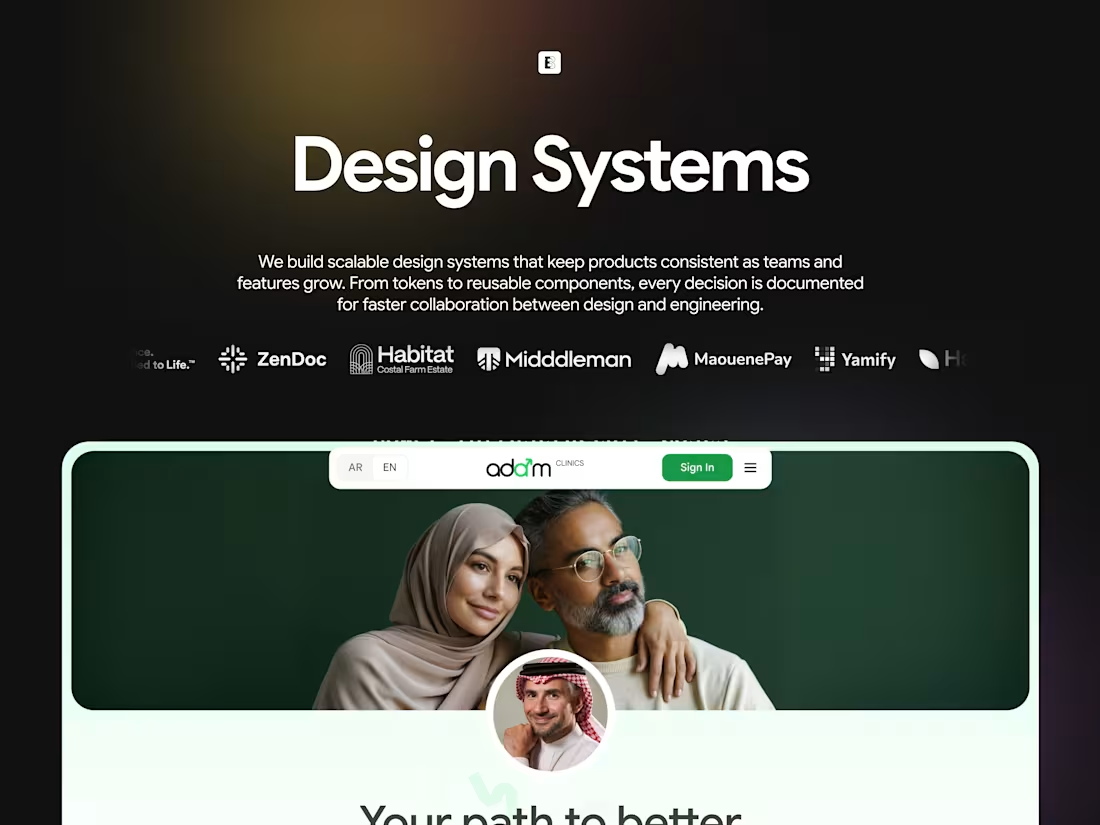
We build design systems that scale with your product. A single source of truth for every component, pattern, and decision, so your team ships faster, your product stays consistent, and every new screen or feature starts from a solid foundation instead of from scratch. A good design system is the difference between a product that scales cleanly and one that accumulates design debt with every release.
DELIVERABLES
Full component library built in Figma with every UI element named, organised, and documented, covering buttons, inputs, navigation, cards, modals, and every pattern your product uses
Token documentation covering colour, typography, spacing, elevation, and border radius, all defined, named, and applied consistently across every component
Usage guidelines for every component explaining when to use it, when not to, and how it behaves across different contexts and states
Responsive behaviour documentation showing how every component adapts from mobile to desktop
Pattern library for complex UI patterns including forms, data tables, empty states, error handling, and notifications, with annotated examples
Contribution guide so your team can maintain and extend the system without breaking consistency
Developer handoff documentation structured so engineers can build directly from the system without ambiguity
PROCESS
Audit — reviewing your existing product to inventory every component, identify inconsistencies, and define the scope of what the system needs to cover
Token Definition — establishing the foundational layer of colour, typography, spacing, and other design decisions that everything else is built on
Component Build — designing and documenting every component from atomic elements up to complex patterns, with all states and variants
Usage Documentation — writing clear guidelines for every component so anyone on the team knows how and when to use it
Responsive Behaviour — defining how every component scales and adapts across breakpoints
Pattern Library — documenting complex patterns that combine components into reusable, consistent UI solutions
Review — working through the system with your team to make sure it covers everything they need
Handoff — delivering a complete, structured Figma file with documentation, contribution guidelines, and everything the team needs to maintain and extend it
FAQs


Contact for pricing
Duration3 weeks
Tags
Dora AI
Figma
Framer
Artificial Intelligence
E-Commerce
FinTech & Payments
Healthcare
Social networking
Service provided by
Choose Blueprint Lagos, Nigeria
Design SystemsChoose Blueprint
Contact for pricing
Duration3 weeks
Tags
Dora AI
Figma
Framer
Artificial Intelligence
E-Commerce
FinTech & Payments
Healthcare
Social networking
We build design systems that scale with your product. A single source of truth for every component, pattern, and decision, so your team ships faster, your product stays consistent, and every new screen or feature starts from a solid foundation instead of from scratch. A good design system is the difference between a product that scales cleanly and one that accumulates design debt with every release.
DELIVERABLES
Full component library built in Figma with every UI element named, organised, and documented, covering buttons, inputs, navigation, cards, modals, and every pattern your product uses
Token documentation covering colour, typography, spacing, elevation, and border radius, all defined, named, and applied consistently across every component
Usage guidelines for every component explaining when to use it, when not to, and how it behaves across different contexts and states
Responsive behaviour documentation showing how every component adapts from mobile to desktop
Pattern library for complex UI patterns including forms, data tables, empty states, error handling, and notifications, with annotated examples
Contribution guide so your team can maintain and extend the system without breaking consistency
Developer handoff documentation structured so engineers can build directly from the system without ambiguity
PROCESS
Audit — reviewing your existing product to inventory every component, identify inconsistencies, and define the scope of what the system needs to cover
Token Definition — establishing the foundational layer of colour, typography, spacing, and other design decisions that everything else is built on
Component Build — designing and documenting every component from atomic elements up to complex patterns, with all states and variants
Usage Documentation — writing clear guidelines for every component so anyone on the team knows how and when to use it
Responsive Behaviour — defining how every component scales and adapts across breakpoints
Pattern Library — documenting complex patterns that combine components into reusable, consistent UI solutions
Review — working through the system with your team to make sure it covers everything they need
Handoff — delivering a complete, structured Figma file with documentation, contribution guidelines, and everything the team needs to maintain and extend it
FAQs
Contact for pricing