
Design SystemShaheryar Baig
A design system is a game-changer when building a digital product—it helps maintain consistency (especially when multiple designers or teams are involved) and speeds up the design process.
If you're struggling to maintain design consistency across your product or want to establish a solid design foundation from scratch, I'm here to help.
I’ll build a library of reusable UI components in Figma, tailored specifically to the needs of your product.
What's included
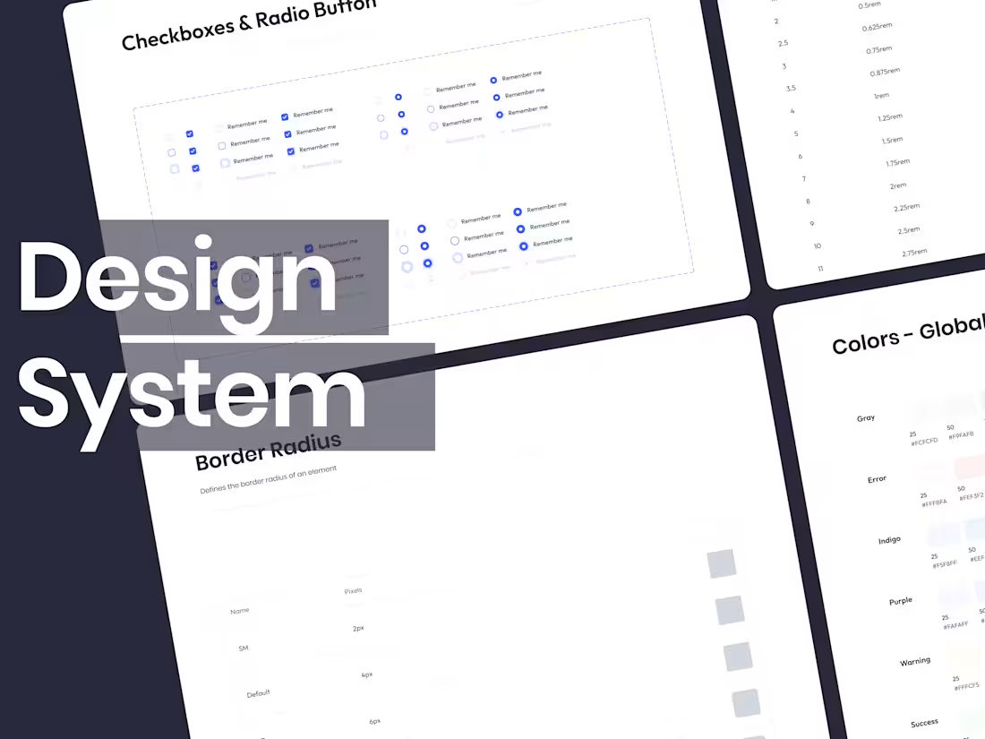
📚 Component Library in Figma
Library of UI components created specifically for the needs of your product.
🔤 Typography System
Defined typography scales, font styles, and usage guidelines for different text elements (headings, paragraphs, captions, etc.).
🎨 Color System
A comprehensive & accessible color palette with primary, secondary, and tertiary colors, along with usage guidelines for different UI elements and states.
🧬 Design Tokens / Variables
Collection of variables for maintaining consistency in design elements such as colors, typography, spacing, and more.
📖 Documentation and Usage Guide
Comprehensive documentation detailing how to use the design system, including examples and best practices.
🧩 Design Patterns
Collection of common design patterns – layout examples, essential screens like login/signup, etc.
Shaheryar's other services
Contact for pricing
Tags
Figma
Interaction Designer
Product Designer
UX Designer
Service provided by
Shaheryar Baig Islamabad, Pakistan
- 5.00
- Rating
- 15
- Followers
Design SystemShaheryar Baig
A design system is a game-changer when building a digital product—it helps maintain consistency (especially when multiple designers or teams are involved) and speeds up the design process.
If you're struggling to maintain design consistency across your product or want to establish a solid design foundation from scratch, I'm here to help.
I’ll build a library of reusable UI components in Figma, tailored specifically to the needs of your product.
What's included
📚 Component Library in Figma
Library of UI components created specifically for the needs of your product.
🔤 Typography System
Defined typography scales, font styles, and usage guidelines for different text elements (headings, paragraphs, captions, etc.).
🎨 Color System
A comprehensive & accessible color palette with primary, secondary, and tertiary colors, along with usage guidelines for different UI elements and states.
🧬 Design Tokens / Variables
Collection of variables for maintaining consistency in design elements such as colors, typography, spacing, and more.
📖 Documentation and Usage Guide
Comprehensive documentation detailing how to use the design system, including examples and best practices.
🧩 Design Patterns
Collection of common design patterns – layout examples, essential screens like login/signup, etc.
Shaheryar's other services
Contact for pricing