
Design System Creation & ScalingNico Ramella
A robust, scalable design system built for real-world products. Combining design precision with developer-ready structure.
I design and structure systems that help teams move faster, stay consistent, and scale without design debt. From foundations to complex components, everything is built in Figma using advanced features to ensure clean handoff, reliable code export, and long-term maintainability.
I work closely with product and engineering teams, taking full ownership of the system as if it were my own. My focus is not just visual consistency, but speed, clarity, and real usability for designers, developers, and the product itself.
What's included
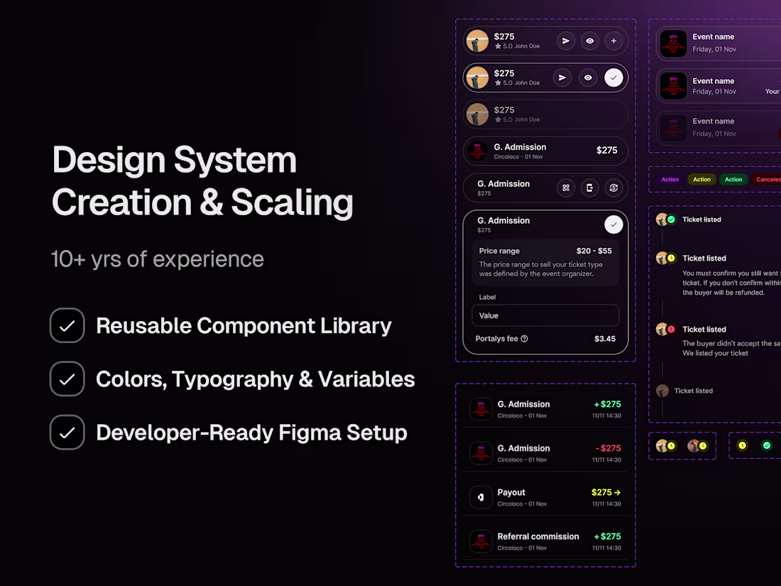
Design System Foundations
Definition of core foundations, including color variables, typography scales, spacing, grids, and elevation. Structured for scalability and consistency.
Component Library
Reusable UI components such as buttons, inputs, cards, modals, tables, and navigation elements, built with variants, states, booleans, and auto layout.
Advanced Figma Setup
Use of Figma variables, components, properties, and naming conventions to ensure clean structure, easy updates, and reliable developer handoff.
Developer Handover & Support
Organized, annotated Figma files ready for implementation, plus direct collaboration with developers to ensure accurate and efficient execution.
FAQs
Example work


Contact for pricing
Tags
Figma
Design Systems Specialist
UI Designer
UX Designer
Service provided by
Nico Ramella maxBoston, USA
- $25k+
- Earned
- 17
- Paid projects
- 5.00
- Rating
- 199
- Followers
Design System Creation & ScalingNico Ramella
A robust, scalable design system built for real-world products. Combining design precision with developer-ready structure.
I design and structure systems that help teams move faster, stay consistent, and scale without design debt. From foundations to complex components, everything is built in Figma using advanced features to ensure clean handoff, reliable code export, and long-term maintainability.
I work closely with product and engineering teams, taking full ownership of the system as if it were my own. My focus is not just visual consistency, but speed, clarity, and real usability for designers, developers, and the product itself.
What's included
Design System Foundations
Definition of core foundations, including color variables, typography scales, spacing, grids, and elevation. Structured for scalability and consistency.
Component Library
Reusable UI components such as buttons, inputs, cards, modals, tables, and navigation elements, built with variants, states, booleans, and auto layout.
Advanced Figma Setup
Use of Figma variables, components, properties, and naming conventions to ensure clean structure, easy updates, and reliable developer handoff.
Developer Handover & Support
Organized, annotated Figma files ready for implementation, plus direct collaboration with developers to ensure accurate and efficient execution.
FAQs
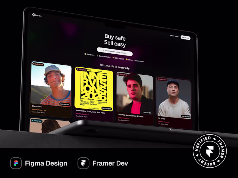
Example work
Contact for pricing