

Data Visualization (Tableau/Excel/Python) and Dashboard

Contact for pricing
About this service
Summary
FAQs
What tools do you use?
Tableau (mainly) and Excel for dashboards; Python (Matplotlib/Seaborn) for custom visualizations.
Do you help decide which KPIs to show?
Yes — I can recommend the best metrics and visual types based on your goals.
Is data cleaning included?
Basic cleaning is included.
What's included
Interactive Dashboard (Tableau)
A clean, well-structured dashboard showing KPIs, trends, filters, and actionable insights.
Visualization Pack (Charts & Insights)
A collection of charts/plots created using Tableau, Excel, or Python (Matplotlib/Seaborn), formatted consistently and ready for presentations.
KPI Layout & Navigation Design
A clear dashboard structure with intuitive navigation, grouping metrics by categories (sales, performance, operations, etc.).
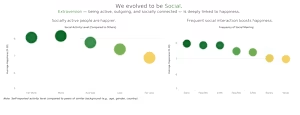
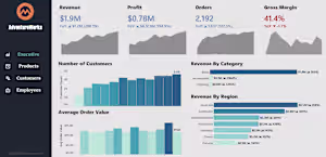
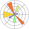
Example projects

Skills and tools
Data Analyst
Data Scientist
Data Visualizer
Matplotlib

Microsoft Excel

Python

R

Tableau
Industries