
Data Visualization and Dashboard (Tableau/Excel/Python)Wongyu Jeon
I design clean, professional dashboards and visualizations using Tableau, Excel, and Python. My focus is on clarity, usability, and turning your data into visuals that support decisions — not clutter. You’ll receive a polished dashboard that highlights key insights and is easy to update.
What's included
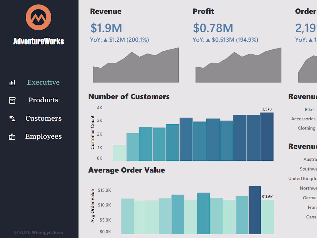
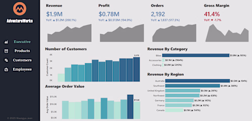
Interactive Dashboard (Tableau)
A clean, well-structured dashboard showing KPIs, trends, filters, and actionable insights.
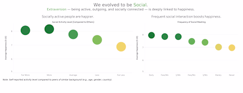
Visualization Pack (Charts & Insights)
A collection of charts/plots created using Tableau, Excel, or Python (Matplotlib/Seaborn), formatted consistently and ready for presentations.
KPI Layout & Navigation Design
A clear dashboard structure with intuitive navigation, grouping metrics by categories (sales, performance, operations, etc.).
FAQs
Example work
Contact for pricing
Tags
Matplotlib
Microsoft Excel
Python
R
Tableau
Data Analyst
Data Scientist
Data Visualizer
Service provided by
Wongyu Jeon Seoul, South Korea
- 37
- Followers
Data Visualization and Dashboard (Tableau/Excel/Python)Wongyu Jeon
Contact for pricing
Tags
Matplotlib
Microsoft Excel
Python
R
Tableau
Data Analyst
Data Scientist
Data Visualizer
I design clean, professional dashboards and visualizations using Tableau, Excel, and Python. My focus is on clarity, usability, and turning your data into visuals that support decisions — not clutter. You’ll receive a polished dashboard that highlights key insights and is easy to update.
What's included
Interactive Dashboard (Tableau)
A clean, well-structured dashboard showing KPIs, trends, filters, and actionable insights.
Visualization Pack (Charts & Insights)
A collection of charts/plots created using Tableau, Excel, or Python (Matplotlib/Seaborn), formatted consistently and ready for presentations.
KPI Layout & Navigation Design
A clear dashboard structure with intuitive navigation, grouping metrics by categories (sales, performance, operations, etc.).
FAQs
Example work
Contact for pricing