
Web App UI DesignArtonest Design Studio
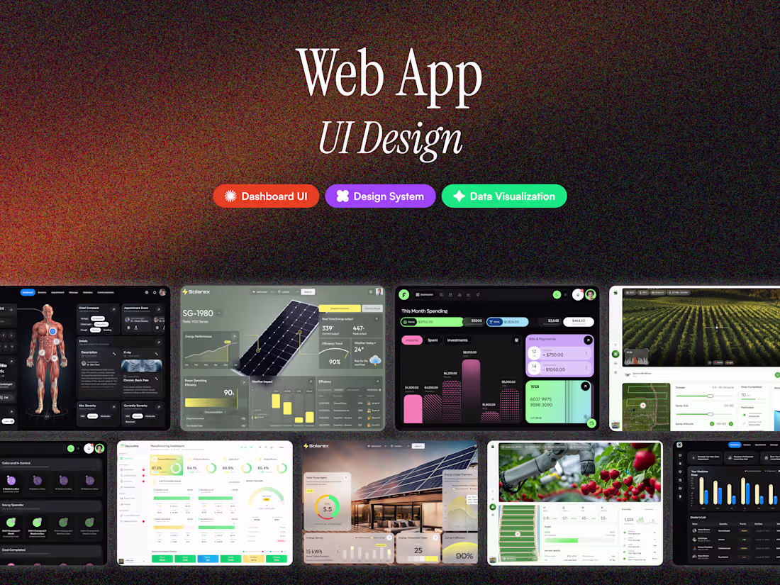
We specialize in web app UI design that merges clarity, structure, and performance.
Our team builds modular, component-based designs optimized for data-heavy interfaces.
The result is a web app that’s clean, intuitive, and development-ready — perfect for teams that scale fast.
What's included
Figma Design File
Clean, component-based structure.
Comprehensive Design System
Scalable library for ongoing product growth.
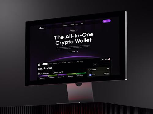
Dashboard & Module UI Screens
Detailed and visually consistent layouts.
Interactive Prototype
Clickable demo for navigation and user flow.
Color & Typography Documentation
Centralized style guide.
Icon & Chart Asset Kit
Vector assets for easy integration.
Light & Dark Mode Variants
Dual interface options.
Developer Handoff Pack
Ready-to-deploy documentation and annotations.
FAQs
Example work


Contact for pricing
Tags
Adobe XD
FigJam
Figma
Figma Make
Notion
UI Designer
UX Designer
Web Designer
Service provided by
Artonest Design Studio proSurat, India
- 5.00
- Rating
- 48
- Followers
Web App UI DesignArtonest Design Studio
Contact for pricing
Tags
Adobe XD
FigJam
Figma
Figma Make
Notion
UI Designer
UX Designer
Web Designer
We specialize in web app UI design that merges clarity, structure, and performance.
Our team builds modular, component-based designs optimized for data-heavy interfaces.
The result is a web app that’s clean, intuitive, and development-ready — perfect for teams that scale fast.
What's included
Figma Design File
Clean, component-based structure.
Comprehensive Design System
Scalable library for ongoing product growth.
Dashboard & Module UI Screens
Detailed and visually consistent layouts.
Interactive Prototype
Clickable demo for navigation and user flow.
Color & Typography Documentation
Centralized style guide.
Icon & Chart Asset Kit
Vector assets for easy integration.
Light & Dark Mode Variants
Dual interface options.
Developer Handoff Pack
Ready-to-deploy documentation and annotations.
FAQs
Example work
Contact for pricing