
Dashboard & Admin Panel UI/UX DesignNazar Koliano
Complex data doesn't have to mean complex interfaces. If your users are struggling with your dashboard, getting lost in settings, or submitting support tickets because they can't find what they need, your UI is costing you money.
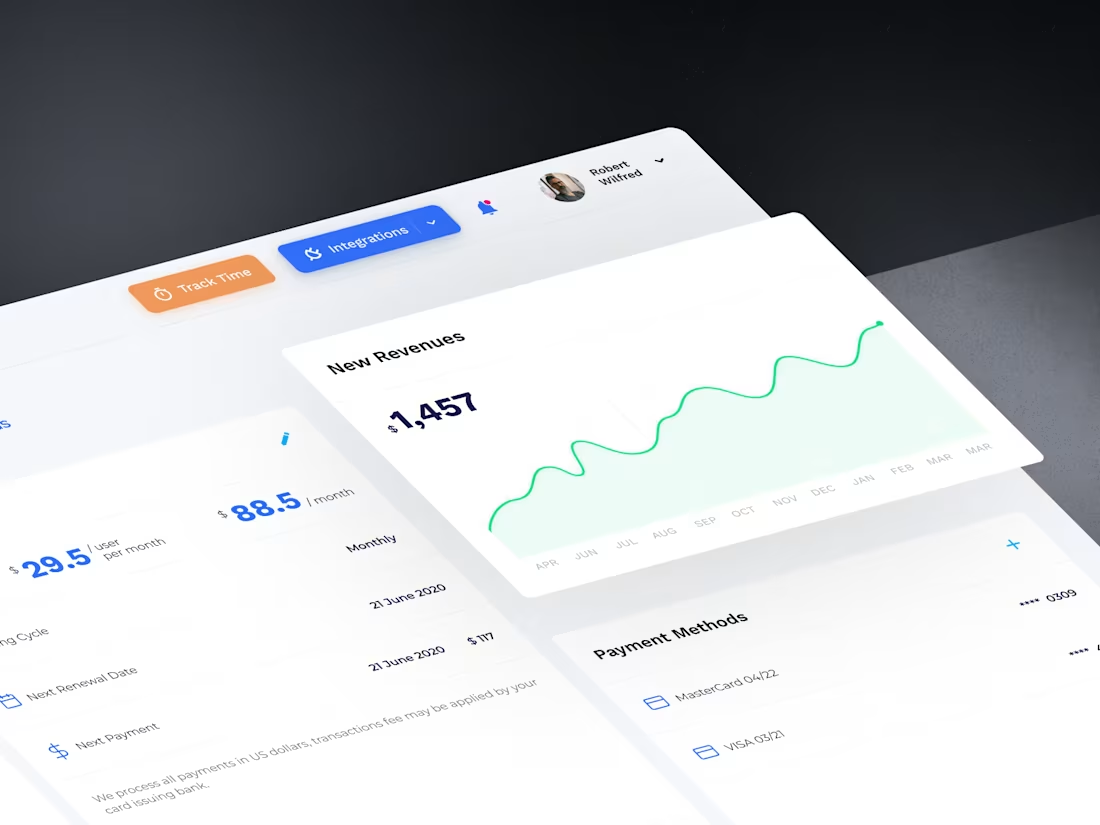
I design dashboards and admin panels that make complex workflows feel simple. Clean data visualization, logical navigation, and interfaces that reduce onboarding time and support load.
My process:
User research & workflow mapping — I study how your users actually work, what data they need most, and where current friction lives
Information architecture — Restructure navigation, data hierarchy, and feature grouping for intuitive access
Wireframes & prototyping — Interactive low-fidelity prototypes to validate flows before committing to visual design
Data visualization design — Charts, tables, metrics cards, and KPI displays designed for instant comprehension
High-fidelity UI design — Complete interface design with light/dark modes, responsive states, and edge cases
Component library — Production-ready design system your engineers can implement systematically
Who this is for:
SaaS companies with complex admin interfaces
B2B platforms where users spend hours daily in the product
Startups building their first internal tools or client-facing dashboards
Teams whose current dashboard has grown organically and needs a structural overhaul
I've designed dashboards for fintech, healthcare, logistics, and enterprise SaaS. 13+ years of making complex things feel effortless.
Ready to discuss your project? Book a free consultation call: https://yasno-design-agency.plutio.com/p/scheduler/wjRkDFmeDrKLg2YYP
FAQs

Starting at$45 /hr
Tags
Adobe Photoshop
Claude
Figma
Interaction Designer
Mobile Designer
Motion Designer
UI Designer
UX Designer
Web Designer
Service provided by
Nazar Koliano proKyiv, 02000
- $25k+
- Earned
- 14
- Paid projects
- 4.93
- Rating
- 156
- Followers
Dashboard & Admin Panel UI/UX DesignNazar Koliano
Starting at$45 /hr
Tags
Adobe Photoshop
Claude
Figma
Interaction Designer
Mobile Designer
Motion Designer
UI Designer
UX Designer
Web Designer
Complex data doesn't have to mean complex interfaces. If your users are struggling with your dashboard, getting lost in settings, or submitting support tickets because they can't find what they need, your UI is costing you money.
I design dashboards and admin panels that make complex workflows feel simple. Clean data visualization, logical navigation, and interfaces that reduce onboarding time and support load.
My process:
User research & workflow mapping — I study how your users actually work, what data they need most, and where current friction lives
Information architecture — Restructure navigation, data hierarchy, and feature grouping for intuitive access
Wireframes & prototyping — Interactive low-fidelity prototypes to validate flows before committing to visual design
Data visualization design — Charts, tables, metrics cards, and KPI displays designed for instant comprehension
High-fidelity UI design — Complete interface design with light/dark modes, responsive states, and edge cases
Component library — Production-ready design system your engineers can implement systematically
Who this is for:
SaaS companies with complex admin interfaces
B2B platforms where users spend hours daily in the product
Startups building their first internal tools or client-facing dashboards
Teams whose current dashboard has grown organically and needs a structural overhaul
I've designed dashboards for fintech, healthcare, logistics, and enterprise SaaS. 13+ years of making complex things feel effortless.
Ready to discuss your project? Book a free consultation call: https://yasno-design-agency.plutio.com/p/scheduler/wjRkDFmeDrKLg2YYP
FAQs
$45 /hr