
Web Sites and Application Frontend UI designKalyan P
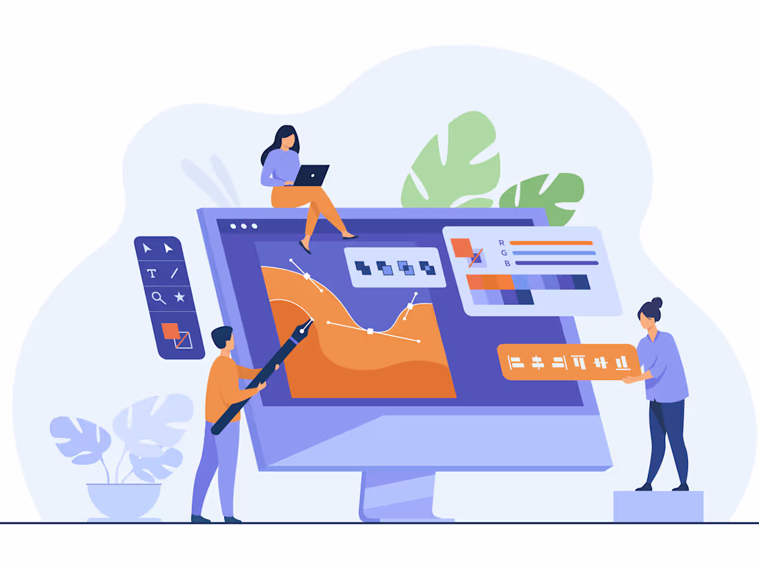
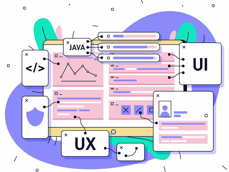
Elevate your website or web app with a comprehensive UI design approach. From initial low-fidelity wireframes to high-fidelity mockups and interactive prototypes, the journey includes a style guide, responsive designs, and a cohesive color palette. Typography guidelines and a custom iconography set ensure a polished look. Deliverables also encompass image assets, a versatile UI kit, and design source files for future modifications. Usability testing reports and final design presentations add depth, while handoff documentation streamlines collaboration with developers. This process, marked by collaborative design and a user-centric focus, results in a visually appealing and user-friendly digital experience.
What's included
Wireframes
📐 Low-fidelity sketches outlining the basic layout and structure.
🖼️ High-fidelity wireframes with detailed design elements.
Interactive Prototypes:
🕹️ Functional prototypes allowing users to interact with the design.
🌐 Demonstrates user flow and dynamic elements within the interface.
High-Fidelity Mockups:
🎨 Detailed and polished visual representations of the user interface.
🖌️ Incorporates final colors, images, and typography.
Style Guide:
📚 Comprehensive documentation outlining design elements.
🌈 Includes guidelines for color schemes, typography, and iconography.
Responsive Design Mockups:
📱 Designs optimized for various screen sizes and resolutions.
🔍 Ensures consistent user experience across devices.
Typography Guidelines:
🆎 Detailed specifications for font styles, sizes, and hierarchy.
📖 Ensures a cohesive and readable text presentation.
Color Palette:
🎨 Defined color scheme aligned with the brand or design preferences.
🎨 Includes primary and secondary colors for consistency.
Iconography Set:
📐 Customized set of icons for use throughout the interface.
🖼️ Ensures visual consistency and clarity.
Image Assets:
🌐 High-resolution images optimized for web use.
📷 Compressed images for faster loading times.
UI Kit:
🧩 Collection of reusable components for consistent design.
🔄 Streamlines the design process and ensures a cohesive look.
Design Source Files:
📂 Original design files in Figma.
🛠️ Allows for future modifications and collaboration.
Final Design Presentation:
🖥️ Presentation outlining design decisions and key features.
📈 A comprehensive overview for stakeholders and developers.
Handoff Documentation:
🤝 Clear instructions and assets for developers to implement the design.
📝 Annotations for specific elements and interactions.
Starting at$50 /hr
Tags
Bootstrap
Figma
HTML5
React
Sass
Frontend Engineer
UX Designer
Web Designer
Service provided by
Kalyan P India
Web Sites and Application Frontend UI designKalyan P
Starting at$50 /hr
Tags
Bootstrap
Figma
HTML5
React
Sass
Frontend Engineer
UX Designer
Web Designer
Elevate your website or web app with a comprehensive UI design approach. From initial low-fidelity wireframes to high-fidelity mockups and interactive prototypes, the journey includes a style guide, responsive designs, and a cohesive color palette. Typography guidelines and a custom iconography set ensure a polished look. Deliverables also encompass image assets, a versatile UI kit, and design source files for future modifications. Usability testing reports and final design presentations add depth, while handoff documentation streamlines collaboration with developers. This process, marked by collaborative design and a user-centric focus, results in a visually appealing and user-friendly digital experience.
What's included
Wireframes
📐 Low-fidelity sketches outlining the basic layout and structure.
🖼️ High-fidelity wireframes with detailed design elements.
Interactive Prototypes:
🕹️ Functional prototypes allowing users to interact with the design.
🌐 Demonstrates user flow and dynamic elements within the interface.
High-Fidelity Mockups:
🎨 Detailed and polished visual representations of the user interface.
🖌️ Incorporates final colors, images, and typography.
Style Guide:
📚 Comprehensive documentation outlining design elements.
🌈 Includes guidelines for color schemes, typography, and iconography.
Responsive Design Mockups:
📱 Designs optimized for various screen sizes and resolutions.
🔍 Ensures consistent user experience across devices.
Typography Guidelines:
🆎 Detailed specifications for font styles, sizes, and hierarchy.
📖 Ensures a cohesive and readable text presentation.
Color Palette:
🎨 Defined color scheme aligned with the brand or design preferences.
🎨 Includes primary and secondary colors for consistency.
Iconography Set:
📐 Customized set of icons for use throughout the interface.
🖼️ Ensures visual consistency and clarity.
Image Assets:
🌐 High-resolution images optimized for web use.
📷 Compressed images for faster loading times.
UI Kit:
🧩 Collection of reusable components for consistent design.
🔄 Streamlines the design process and ensures a cohesive look.
Design Source Files:
📂 Original design files in Figma.
🛠️ Allows for future modifications and collaboration.
Final Design Presentation:
🖥️ Presentation outlining design decisions and key features.
📈 A comprehensive overview for stakeholders and developers.
Handoff Documentation:
🤝 Clear instructions and assets for developers to implement the design.
📝 Annotations for specific elements and interactions.
$50 /hr