
Intuitive Interfaces & Cohesive Brands: UX/UI Visual DesignerKarina Morera
I bridge the gap between aesthetics and function as a Visual Designer specializing in UX/UI. My goal is simple: to create highly usable, visually polished interfaces and digital experiences that directly enhance the client's brand and meet key user needs.
What's included
User Flows & Site Map
Detailed visual maps showing the paths a user takes to complete key tasks and the overall structure of the digital product.
Wireframes
Low-fidelity, black-and-white layouts (using Figma) illustrating the basic structure, content hierarchy, and functionality of each screen or page.
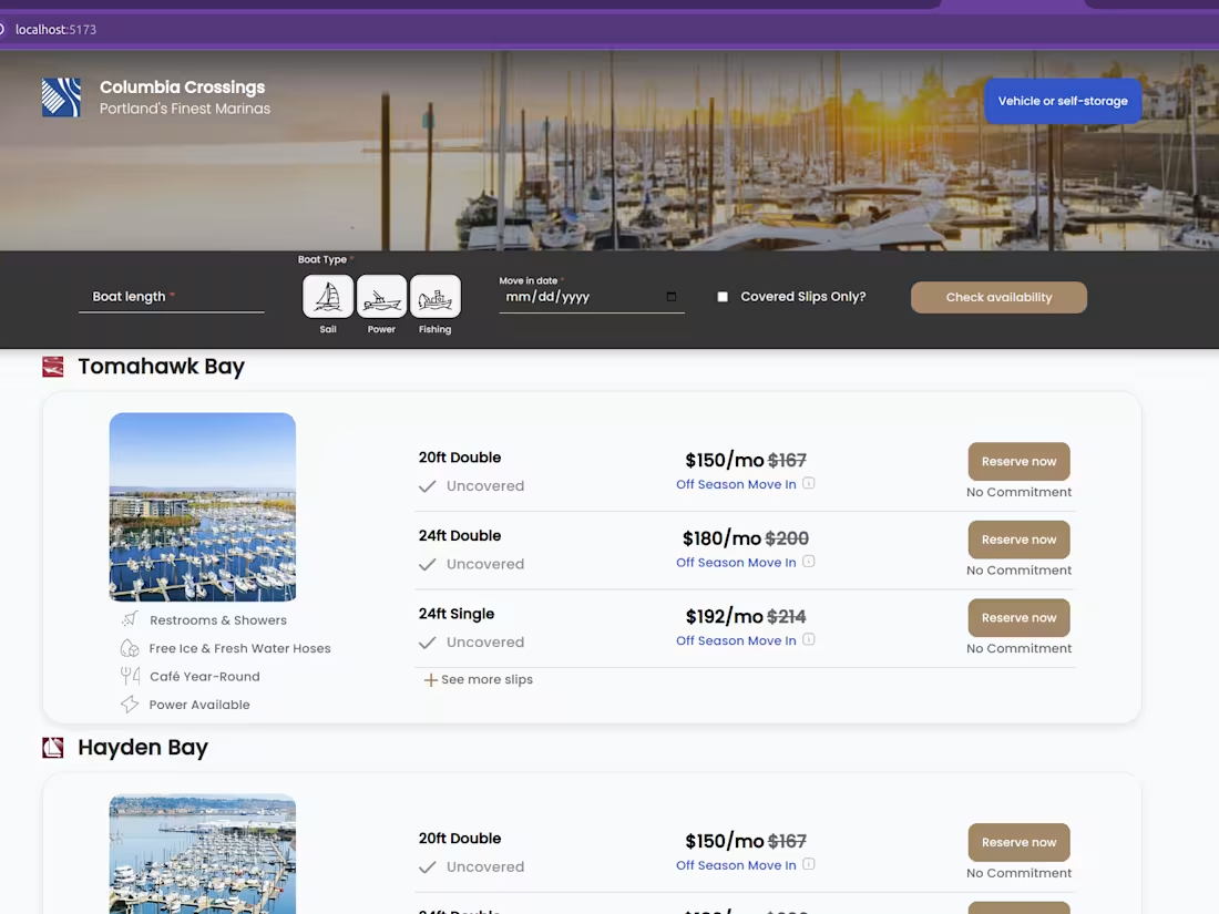
High-Fidelity Mockups
The final, pixel-perfect visual designs (incorporating color, typography, imagery, and brand elements) for all key screens.
Visual Style Guide / Design System
A comprehensive set of standards, reusable components (buttons, forms, navigation), and guidelines for visual style to ensure brand and design consistency across all platforms.
Visual Assets Package
Exported, optimized files (icons, illustrations, images, logos) ready to be handed off to the development team.
Branding Elements
For new or evolving brands: new or refined logos, color palettes, and typography selections that enhance brand identity.
Prototypes
Interactive mockups (using Figma) that simulate the user journey and interactions, allowing for testing and stakeholder review of the user experience.
Information Architecture (IA) Documentation
Clear documentation outlining the organization, structure, and labeling of content, ensuring intuitive navigation and findability.
Starting at$50 /hr
Tags
Adobe XD
Elementor
Figma
Sketch
Webflow
Frontend Engineer
UX Designer
Web Developer
Service provided by
Karina Morera Oakland, USA
- 2
- Followers
Intuitive Interfaces & Cohesive Brands: UX/UI Visual DesignerKarina Morera
Starting at$50 /hr
Tags
Adobe XD
Elementor
Figma
Sketch
Webflow
Frontend Engineer
UX Designer
Web Developer
I bridge the gap between aesthetics and function as a Visual Designer specializing in UX/UI. My goal is simple: to create highly usable, visually polished interfaces and digital experiences that directly enhance the client's brand and meet key user needs.
What's included
User Flows & Site Map
Detailed visual maps showing the paths a user takes to complete key tasks and the overall structure of the digital product.
Wireframes
Low-fidelity, black-and-white layouts (using Figma) illustrating the basic structure, content hierarchy, and functionality of each screen or page.
High-Fidelity Mockups
The final, pixel-perfect visual designs (incorporating color, typography, imagery, and brand elements) for all key screens.
Visual Style Guide / Design System
A comprehensive set of standards, reusable components (buttons, forms, navigation), and guidelines for visual style to ensure brand and design consistency across all platforms.
Visual Assets Package
Exported, optimized files (icons, illustrations, images, logos) ready to be handed off to the development team.
Branding Elements
For new or evolving brands: new or refined logos, color palettes, and typography selections that enhance brand identity.
Prototypes
Interactive mockups (using Figma) that simulate the user journey and interactions, allowing for testing and stakeholder review of the user experience.
Information Architecture (IA) Documentation
Clear documentation outlining the organization, structure, and labeling of content, ensuring intuitive navigation and findability.
$50 /hr