
Design System CreationEmilie Crassard
A scalable design system to streamline your design process and create consistency across all your digital products. Think of it as your go-to toolkit for branding and development.
Perfect for teams managing multiple products or looking to standardize design and development workflows.
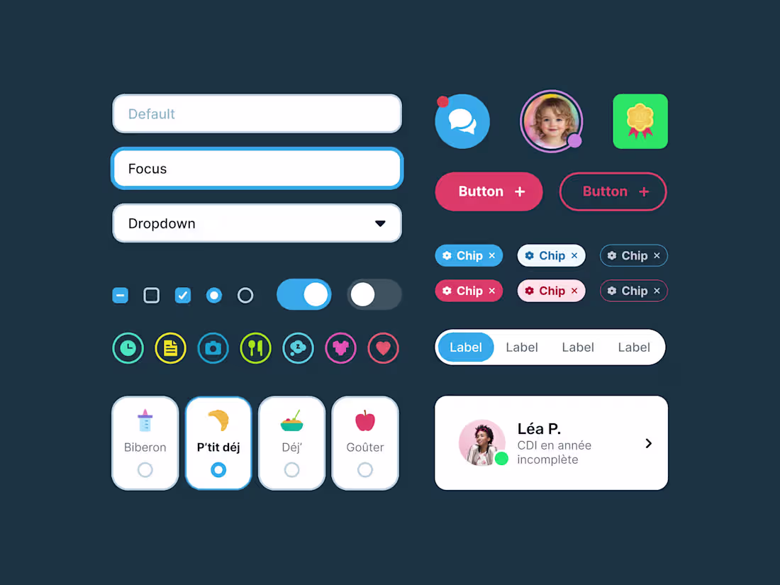
What's included
Component library
Buttons, forms, icons, navigation elements, etc.
Based on atomic design principle.
Style guide
Color palettes, typography, spacing rules, and brand identity guidelines.
Using variables and modes.
Emilie's other services
Contact for pricing
Tags
Figma
Framer
Design Systems Specialist
UI Designer
Web Designer
Service provided by
Emilie Crassard Paris, France
Design System CreationEmilie Crassard
Contact for pricing
Tags
Figma
Framer
Design Systems Specialist
UI Designer
Web Designer
A scalable design system to streamline your design process and create consistency across all your digital products. Think of it as your go-to toolkit for branding and development.
Perfect for teams managing multiple products or looking to standardize design and development workflows.
What's included
Component library
Buttons, forms, icons, navigation elements, etc.
Based on atomic design principle.
Style guide
Color palettes, typography, spacing rules, and brand identity guidelines.
Using variables and modes.
Emilie's other services
Contact for pricing