
App Screen Redesign: Make Your App Look FinishedAndrés Sepulveda Morales
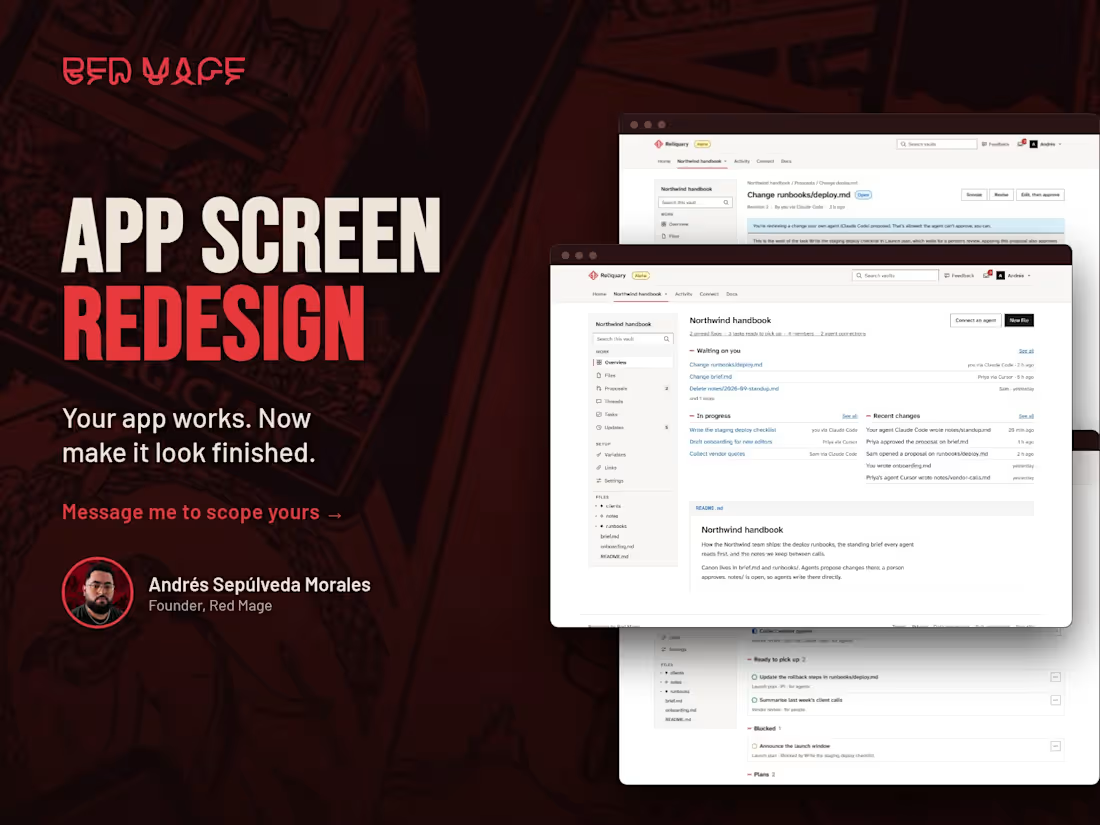
Your app works. Now make it look finished.
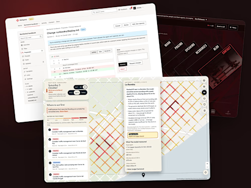
Apps built fast in Lovable, Bolt or Base44 often look homemade: crowded screens, buttons that compete, text that is hard to read. I redesign up to five of the screens your users see most, in Figma, at desktop and phone widths, keeping your colors, fonts and logo. Each screen is checked for contrast, text size and tap-target size, with the tab order marked for whoever builds it. If a brand color fails the contrast check, I show you the closest one that passes and you choose.
I build apps like these too, so every screen is one a builder can make.
A screen is one page of your app in one state. Error, empty and loading states count as extra screens, at $150 each.
Not included: branding, logos, illustration, new features or user research. One round of revisions, delivered in a week.
Message me first with your app link and the screens that bother you most. If it needs a login, share a test account.
FAQs

Starting at$1,000
Duration1 week
Tags
Base44

Bolt.new

Figma

Lovable

React

Frontend Engineer
UI Designer
Web Developer
Service provided by
Andrés Sepulveda Morales maxBarcelona, Spain
- $50k+
- Earned
- 25
- Paid projects
- 4.99
- Rating
- 547
- Followers
App Screen Redesign: Make Your App Look FinishedAndrés Sepulveda Morales
Starting at$1,000
Duration1 week
Tags
Base44
Bolt.new
Figma
Lovable
React
Frontend Engineer
UI Designer
Web Developer
Your app works. Now make it look finished.
Apps built fast in Lovable, Bolt or Base44 often look homemade: crowded screens, buttons that compete, text that is hard to read. I redesign up to five of the screens your users see most, in Figma, at desktop and phone widths, keeping your colors, fonts and logo. Each screen is checked for contrast, text size and tap-target size, with the tab order marked for whoever builds it. If a brand color fails the contrast check, I show you the closest one that passes and you choose.
I build apps like these too, so every screen is one a builder can make.
A screen is one page of your app in one state. Error, empty and loading states count as extra screens, at $150 each.
Not included: branding, logos, illustration, new features or user research. One round of revisions, delivered in a week.
Message me first with your app link and the screens that bother you most. If it needs a login, share a test account.
FAQs
$1,000