
Tailored Design SystemDushica Atanasova
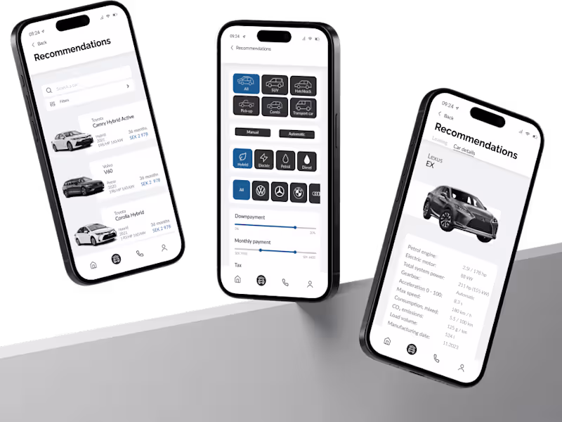
The design system offers a tailored library of UI components, design tokens, and patterns to ensure visual consistency and streamline the design process. With a focus on clean, smart components and advanced features, the system will enhance collaboration between designers and developers for efficient and user-centric product development.
What's included
Auto Layout
Auto Layout enhances the responsiveness of your components, allowing for the creation of dynamic elements while minimizing layer hierarchy. This leads to more adaptable and user-friendly designs.
Up-to-date variants
Eliminate unnecessary variants, making the design process more efficient
Typography
Defined typography scales, font styles, and usage guidelines for different text elements, including headings, paragraphs, and captions.
Color palette
An inclusive and accessible color palette featuring primary, secondary, and tertiary colors, along with guidelines for applying them to different UI elements and states.
Design Tokens and Variables
Maintain consistency across design elements with a curated set of variables for colors, typography, spacing, and more.
Documentation
Best practices and usage guidelines for each design element.
Dushica's other services
Contact for pricing
Tags
Adobe XD
Figma
Framer
UX Designer
UX Engineer
Service provided by
Dushica Atanasova Skopje, North Macedonia
- 3
- Followers
Tailored Design SystemDushica Atanasova
The design system offers a tailored library of UI components, design tokens, and patterns to ensure visual consistency and streamline the design process. With a focus on clean, smart components and advanced features, the system will enhance collaboration between designers and developers for efficient and user-centric product development.
What's included
Auto Layout
Auto Layout enhances the responsiveness of your components, allowing for the creation of dynamic elements while minimizing layer hierarchy. This leads to more adaptable and user-friendly designs.
Up-to-date variants
Eliminate unnecessary variants, making the design process more efficient
Typography
Defined typography scales, font styles, and usage guidelines for different text elements, including headings, paragraphs, and captions.
Color palette
An inclusive and accessible color palette featuring primary, secondary, and tertiary colors, along with guidelines for applying them to different UI elements and states.
Design Tokens and Variables
Maintain consistency across design elements with a curated set of variables for colors, typography, spacing, and more.
Documentation
Best practices and usage guidelines for each design element.
Dushica's other services
Contact for pricing