
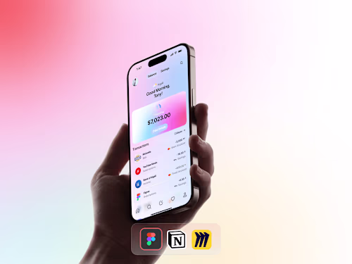
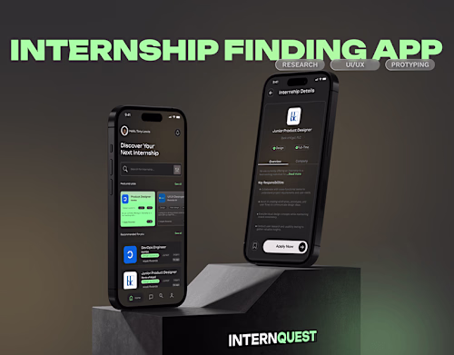
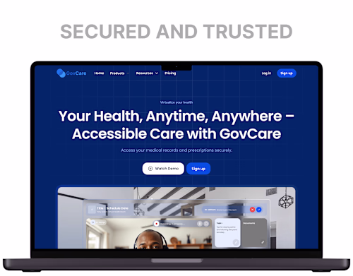
Clear & Easy Product (UI/UX) Design for Mobile and Web Apps.Tony Lewis MANZI
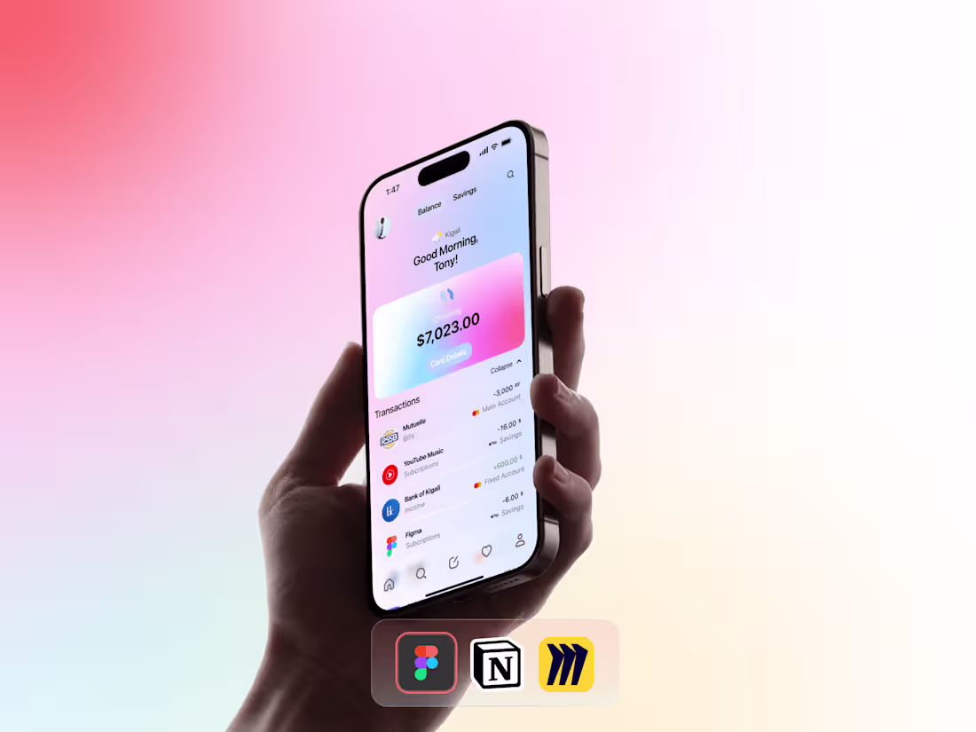
I design intuitive, user-friendly apps and websites that solve real problems. My work blends creativity with research-backed strategies, ensuring every pixel serves a purpose. What sets me apart? No jargon, no guesswork, just clear communication, accessible designs, and a focus on what users actually need, not just what looks good.
What's included
UI/UX Design
A user-friendly design that solves problems and makes your app/website easy to use. Includes:
- Wireframes
Basic layouts showing where buttons, text, and images go.
- Final Designs
Polished screens with colors, fonts, and branding.
- Clickable Prototype
A demo to test how users navigate your app/website.
- Style Guide
Rules for fonts, colors, and buttons to keep designs consistent.
- Mobile & Desktop Versions
Designs that work on all screen sizes.
Product Design
A functional, user-centered design that turns ideas into real, working products. Includes:
- User Research Summary
Insights into what your users need and how they behave.
- Concept Sketches
Early ideas for the product’s look, feel, and features.
- 3D Models/Prototypes
A digital or physical demo to test the product’s design and usability.
- User Journey Maps
A visual story of how people interact with your product.
- Technical Specifications
Details on materials, dimensions, and how parts work together.
- Manufacturing-Ready Files
Final designs formatted for production (e.g., CAD files).
- Usability Report
Feedback on how real users tested the product and suggested improvements.
Mobile App Design
A sleek, easy-to-use app designed for smooth navigation and happy users. Includes:
- App Wireframes
Simple blueprints showing screen layouts and user flow.
- Final App Screens
Finished designs with colors, fonts, and interactive elements.
- Clickable Prototype
A working demo to test taps, swipes, and app navigation.
- App Icon & Launch Screen
Eye-catching visuals for branding and first impressions.
- Mobile Style Guide
Rules for buttons, spacing, and animations to keep the app consistent.
- Responsive Layouts
Designs optimized for phones, tablets, and different screen sizes.
- Microinteractions
Small animations (like button clicks) to make the app feel alive.
- Developer Handoff
Ready-to-code files with specs, assets, and notes for your team.
- User Testing Summary
Feedback from real users to improve ease of use.
- App Store Graphics
Images and descriptions formatted for Google Play/Apple Store.
Responsive Design
A flexible, device-friendly design that looks and works perfectly on phones, tablets, and desktops. Includes:
- Flexible Layouts
Designs that adjust smoothly to any screen size.
- Device-Specific Adaptations
Mobile, tablet, and desktop versions for seamless use.
- Optimized Images & Media
Fast-loading visuals that stay sharp on all devices.
- Responsive Navigation
Menus and buttons that work on small and large screens.
- Breakpoint Documentation
A list of screen sizes where the layout adjusts (e.g., 768px for tablets).
- Cross-Browser/Device Testing
Checks to ensure your design works everywhere (Chrome, Safari, etc.).
- Fluid Grid System
A scalable structure for balanced spacing and proportions.
- Accessibility Checks
Text and buttons stay readable on small screens.
- Responsive Style Guide
Rules for fonts, spacing, and interactions across devices.
- Developer Notes
Clear instructions to build the responsive design.
UX Research
A clear understanding of your users to build products they’ll love. Includes:
User Interviews Summary
Key takeaways from conversations with real users about their needs and frustrations.
User Personas
Profiles of your typical users (goals, habits, pain points).
Journey Maps
A visual story of how users interact with your product, step by step.
Usability Testing Report
Issues users faced during testing and how to fix them.
Competitive Analysis
What similar products do well and where yours can stand out.
Survey/Feedback Results
Charts and summaries of what users said in polls or forms.
Accessibility Audit
Checks to ensure your product works for all users (e.g., colorblind-friendly).
Expert Review
A checklist of fixes based on design best practices.
Affinity Diagram
Grouped themes from user feedback to spot trends.
Prioritized Recommendations
A list of next steps, ranked by impact and ease.
Starting at$94.99 /wk
Tags
Adobe XD
Figma
Miro
Notion
Sketch
Mobile Designer
Product Designer
UX Designer
Service provided by
Tony Lewis MANZI Kigali, Rwanda
- 13
- Followers
Clear & Easy Product (UI/UX) Design for Mobile and Web Apps.Tony Lewis MANZI
Starting at$94.99 /wk
Tags
Adobe XD
Figma
Miro
Notion
Sketch
Mobile Designer
Product Designer
UX Designer
I design intuitive, user-friendly apps and websites that solve real problems. My work blends creativity with research-backed strategies, ensuring every pixel serves a purpose. What sets me apart? No jargon, no guesswork, just clear communication, accessible designs, and a focus on what users actually need, not just what looks good.
What's included
UI/UX Design
A user-friendly design that solves problems and makes your app/website easy to use. Includes:
- Wireframes
Basic layouts showing where buttons, text, and images go.
- Final Designs
Polished screens with colors, fonts, and branding.
- Clickable Prototype
A demo to test how users navigate your app/website.
- Style Guide
Rules for fonts, colors, and buttons to keep designs consistent.
- Mobile & Desktop Versions
Designs that work on all screen sizes.
Product Design
A functional, user-centered design that turns ideas into real, working products. Includes:
- User Research Summary
Insights into what your users need and how they behave.
- Concept Sketches
Early ideas for the product’s look, feel, and features.
- 3D Models/Prototypes
A digital or physical demo to test the product’s design and usability.
- User Journey Maps
A visual story of how people interact with your product.
- Technical Specifications
Details on materials, dimensions, and how parts work together.
- Manufacturing-Ready Files
Final designs formatted for production (e.g., CAD files).
- Usability Report
Feedback on how real users tested the product and suggested improvements.
Mobile App Design
A sleek, easy-to-use app designed for smooth navigation and happy users. Includes:
- App Wireframes
Simple blueprints showing screen layouts and user flow.
- Final App Screens
Finished designs with colors, fonts, and interactive elements.
- Clickable Prototype
A working demo to test taps, swipes, and app navigation.
- App Icon & Launch Screen
Eye-catching visuals for branding and first impressions.
- Mobile Style Guide
Rules for buttons, spacing, and animations to keep the app consistent.
- Responsive Layouts
Designs optimized for phones, tablets, and different screen sizes.
- Microinteractions
Small animations (like button clicks) to make the app feel alive.
- Developer Handoff
Ready-to-code files with specs, assets, and notes for your team.
- User Testing Summary
Feedback from real users to improve ease of use.
- App Store Graphics
Images and descriptions formatted for Google Play/Apple Store.
Responsive Design
A flexible, device-friendly design that looks and works perfectly on phones, tablets, and desktops. Includes:
- Flexible Layouts
Designs that adjust smoothly to any screen size.
- Device-Specific Adaptations
Mobile, tablet, and desktop versions for seamless use.
- Optimized Images & Media
Fast-loading visuals that stay sharp on all devices.
- Responsive Navigation
Menus and buttons that work on small and large screens.
- Breakpoint Documentation
A list of screen sizes where the layout adjusts (e.g., 768px for tablets).
- Cross-Browser/Device Testing
Checks to ensure your design works everywhere (Chrome, Safari, etc.).
- Fluid Grid System
A scalable structure for balanced spacing and proportions.
- Accessibility Checks
Text and buttons stay readable on small screens.
- Responsive Style Guide
Rules for fonts, spacing, and interactions across devices.
- Developer Notes
Clear instructions to build the responsive design.
UX Research
A clear understanding of your users to build products they’ll love. Includes:
User Interviews Summary
Key takeaways from conversations with real users about their needs and frustrations.
User Personas
Profiles of your typical users (goals, habits, pain points).
Journey Maps
A visual story of how users interact with your product, step by step.
Usability Testing Report
Issues users faced during testing and how to fix them.
Competitive Analysis
What similar products do well and where yours can stand out.
Survey/Feedback Results
Charts and summaries of what users said in polls or forms.
Accessibility Audit
Checks to ensure your product works for all users (e.g., colorblind-friendly).
Expert Review
A checklist of fixes based on design best practices.
Affinity Diagram
Grouped themes from user feedback to spot trends.
Prioritized Recommendations
A list of next steps, ranked by impact and ease.
$94.99 /wk