
Professional Data Dashboard DevelopmentRIPSUDHAN MISHRA
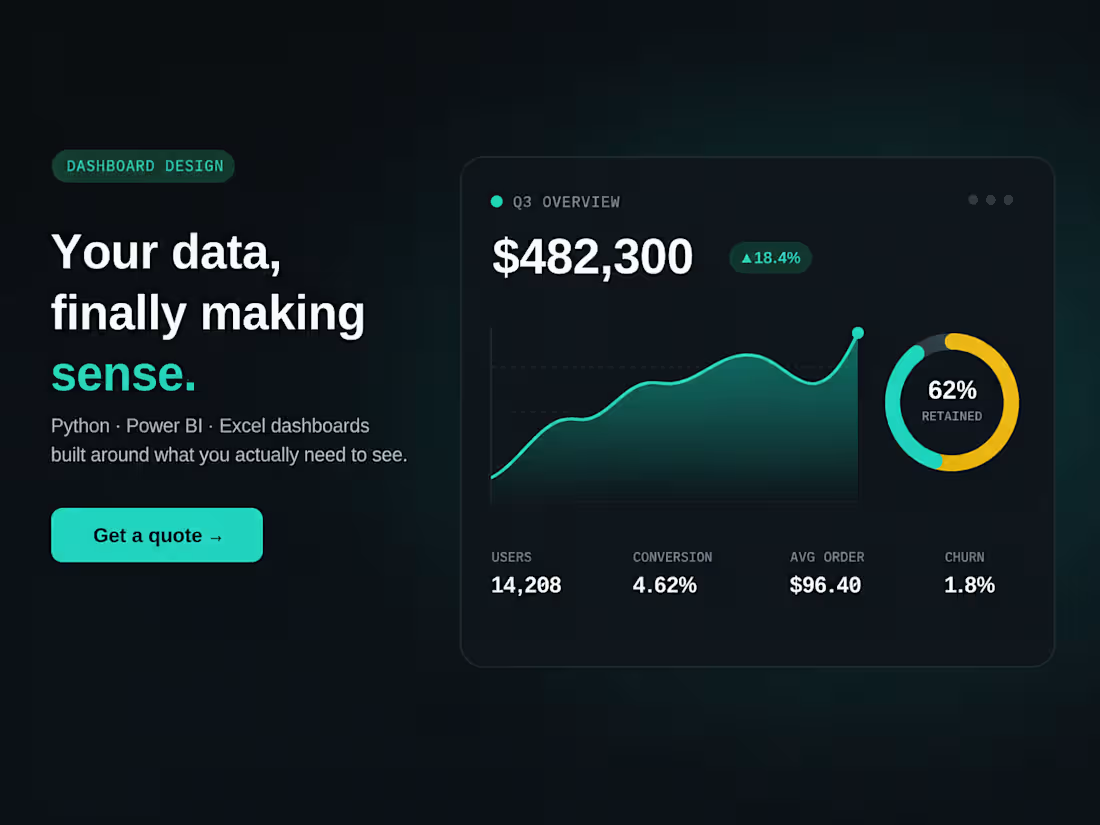
I build clean, interactive dashboards that turn your raw data into something you can actually understand and act on — no more digging through spreadsheets to find the number you need.
What I deliver:
Python-based dashboards (Plotly/Matplotlib) — custom interactive charts as standalone HTML, viewable in any browser, no software installs needed
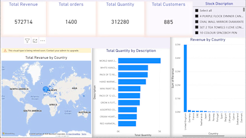
Power BI dashboards — connected to your live data source, with filters, drill-downs, and scheduled refresh so your numbers stay current
Excel dashboards — pivot tables, dynamic charts, and formulas set up so your team can update the data and watch the dashboard update itself, no technical skills required on your end
Custom visualizations tailored to your specific data — bar charts, trend lines, comparison views, hierarchical breakdowns, or more advanced custom visuals if your data calls for it.
Who this is for: small businesses, startups, or teams sitting on data (sales numbers, survey results, operational metrics, research data) who want it visualized clearly instead of staring at rows and columns.
Not sure which tool is right for you? That's part of what you're paying for. If your team lives in Excel, a Python dashboard someone has to maintain in code isn't the right call — I'll recommend the tool that fits how you actually work, not just the one I like building most. Send me a sample of your data and what questions you're trying to answer, and I'll tell you honestly what's the best fit before we start.
FAQs
Example work
RIPSUDHAN's other services
Contact for pricing
Duration1 day
Tags
Microsoft Excel

Microsoft Power BI

Python

business intelligence
dashboard
data analytics
data visualization
interactive charts
reporting
Service provided by
RIPSUDHAN MISHRA Agra, India
- 5
- Followers
Professional Data Dashboard DevelopmentRIPSUDHAN MISHRA
Contact for pricing
Duration1 day
Tags
Microsoft Excel
Microsoft Power BI
Python
business intelligence
dashboard
data analytics
data visualization
interactive charts
reporting
I build clean, interactive dashboards that turn your raw data into something you can actually understand and act on — no more digging through spreadsheets to find the number you need.
What I deliver:
Python-based dashboards (Plotly/Matplotlib) — custom interactive charts as standalone HTML, viewable in any browser, no software installs needed
Power BI dashboards — connected to your live data source, with filters, drill-downs, and scheduled refresh so your numbers stay current
Excel dashboards — pivot tables, dynamic charts, and formulas set up so your team can update the data and watch the dashboard update itself, no technical skills required on your end
Custom visualizations tailored to your specific data — bar charts, trend lines, comparison views, hierarchical breakdowns, or more advanced custom visuals if your data calls for it.
Who this is for: small businesses, startups, or teams sitting on data (sales numbers, survey results, operational metrics, research data) who want it visualized clearly instead of staring at rows and columns.
Not sure which tool is right for you? That's part of what you're paying for. If your team lives in Excel, a Python dashboard someone has to maintain in code isn't the right call — I'll recommend the tool that fits how you actually work, not just the one I like building most. Send me a sample of your data and what questions you're trying to answer, and I'll tell you honestly what's the best fit before we start.
FAQs
Example work
RIPSUDHAN's other services
Contact for pricing